- Power BI forums
- Updates
- News & Announcements
- Get Help with Power BI
- Desktop
- Service
- Report Server
- Power Query
- Mobile Apps
- Developer
- DAX Commands and Tips
- Custom Visuals Development Discussion
- Health and Life Sciences
- Power BI Spanish forums
- Translated Spanish Desktop
- Power Platform Integration - Better Together!
- Power Platform Integrations (Read-only)
- Power Platform and Dynamics 365 Integrations (Read-only)
- Training and Consulting
- Instructor Led Training
- Dashboard in a Day for Women, by Women
- Galleries
- Community Connections & How-To Videos
- COVID-19 Data Stories Gallery
- Themes Gallery
- Data Stories Gallery
- R Script Showcase
- Webinars and Video Gallery
- Quick Measures Gallery
- 2021 MSBizAppsSummit Gallery
- 2020 MSBizAppsSummit Gallery
- 2019 MSBizAppsSummit Gallery
- Events
- Ideas
- Custom Visuals Ideas
- Issues
- Issues
- Events
- Upcoming Events
- Community Blog
- Power BI Community Blog
- Custom Visuals Community Blog
- Community Support
- Community Accounts & Registration
- Using the Community
- Community Feedback
Register now to learn Fabric in free live sessions led by the best Microsoft experts. From Apr 16 to May 9, in English and Spanish.
- Power BI forums
- Forums
- Get Help with Power BI
- Desktop
- How to display a grand total and a filtered total ...
- Subscribe to RSS Feed
- Mark Topic as New
- Mark Topic as Read
- Float this Topic for Current User
- Bookmark
- Subscribe
- Printer Friendly Page
- Mark as New
- Bookmark
- Subscribe
- Mute
- Subscribe to RSS Feed
- Permalink
- Report Inappropriate Content
How to display a grand total and a filtered total in the same bar chart.
Hi Power BI users
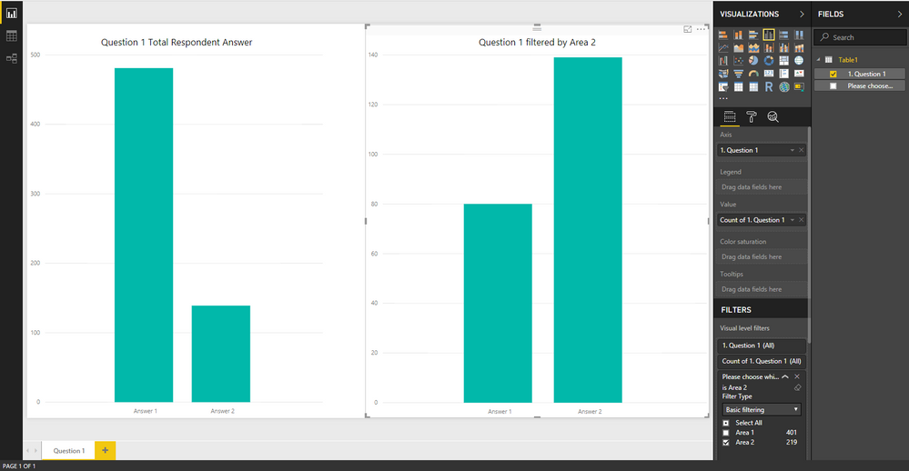
I was wondering if someone can help me with a visualisation problem. I'm trying to visualise some survey questions and the structure of these questions are quite simple in that they are a 5 point likert type question which I'll visualise in a column chart. The complication comes in that associated with the survey questions is also a question asking what area or location each respondent is from. My Business Analyst would like to see in a single column chart total respondent answers for an individual question against a answers to that same question whilst filtered by a specific area. See attached image, I've created two column charts for total response values for question 1 along with total response values for question 1 filtered by Area 2. They would like to see both of them in the same column chart side by side. What method could I use to do this?
Any help would be greatly appreciated.
Kind regards
Mike
Solved! Go to Solution.
- Mark as New
- Bookmark
- Subscribe
- Mute
- Subscribe to RSS Feed
- Permalink
- Report Inappropriate Content
Hi,
My reccomendation would be to either create a measure for both, and then display them as values.
m_Total = COUNT(Q1_Answer)
m_Area2 = Calculate(Count(Q1_Answer),Filter(All(Q1_Table),'Q1_Table'[Area] = "Area 2"))
Alternatively you could create a seperate table which is what I had to do with a recent questionnaire based project of mine... but that's a bit tricky so hopefully this works.
Kind Regards,
Ian
- Mark as New
- Bookmark
- Subscribe
- Mute
- Subscribe to RSS Feed
- Permalink
- Report Inappropriate Content
Hi @Mike282,
Maybe you could add [Area] field to chart X-axis to create a drill down report. Alternatively, you should create measures to get results of "Question1 filter by Area 2" and "Question1 filter by Area 1", then add measures to the fisrt chart.
Regards,
Yuliana Gu
If this post helps, then please consider Accept it as the solution to help the other members find it more quickly.
Helpful resources

Microsoft Fabric Learn Together
Covering the world! 9:00-10:30 AM Sydney, 4:00-5:30 PM CET (Paris/Berlin), 7:00-8:30 PM Mexico City

Power BI Monthly Update - April 2024
Check out the April 2024 Power BI update to learn about new features.

| User | Count |
|---|---|
| 103 | |
| 103 | |
| 87 | |
| 73 | |
| 67 |
| User | Count |
|---|---|
| 119 | |
| 111 | |
| 95 | |
| 79 | |
| 72 |

