- Power BI forums
- Updates
- News & Announcements
- Get Help with Power BI
- Desktop
- Service
- Report Server
- Power Query
- Mobile Apps
- Developer
- DAX Commands and Tips
- Custom Visuals Development Discussion
- Health and Life Sciences
- Power BI Spanish forums
- Translated Spanish Desktop
- Power Platform Integration - Better Together!
- Power Platform Integrations (Read-only)
- Power Platform and Dynamics 365 Integrations (Read-only)
- Training and Consulting
- Instructor Led Training
- Dashboard in a Day for Women, by Women
- Galleries
- Community Connections & How-To Videos
- COVID-19 Data Stories Gallery
- Themes Gallery
- Data Stories Gallery
- R Script Showcase
- Webinars and Video Gallery
- Quick Measures Gallery
- 2021 MSBizAppsSummit Gallery
- 2020 MSBizAppsSummit Gallery
- 2019 MSBizAppsSummit Gallery
- Events
- Ideas
- Custom Visuals Ideas
- Issues
- Issues
- Events
- Upcoming Events
- Community Blog
- Power BI Community Blog
- Custom Visuals Community Blog
- Community Support
- Community Accounts & Registration
- Using the Community
- Community Feedback
Register now to learn Fabric in free live sessions led by the best Microsoft experts. From Apr 16 to May 9, in English and Spanish.
- Power BI forums
- Forums
- Get Help with Power BI
- Desktop
- How to create dumbbell or target actual chart in a...
- Subscribe to RSS Feed
- Mark Topic as New
- Mark Topic as Read
- Float this Topic for Current User
- Bookmark
- Subscribe
- Printer Friendly Page
- Mark as New
- Bookmark
- Subscribe
- Mute
- Subscribe to RSS Feed
- Permalink
- Report Inappropriate Content
How to create dumbbell or target actual chart in a table
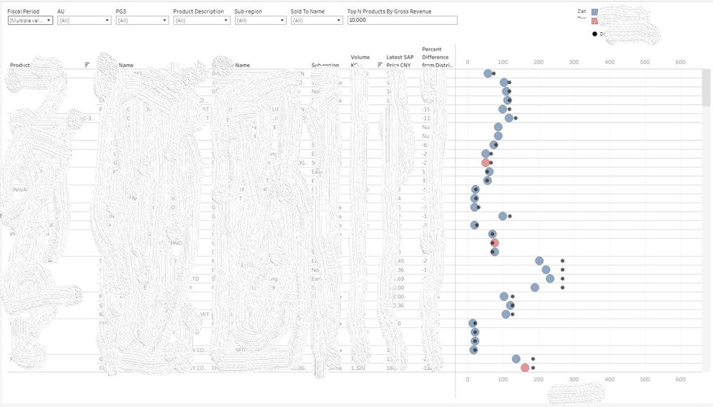
How do I create dumbbell or target actual chart in a table.
blue/red dots are actuals. Black dots are targets.
I want target and actual chart to be shown for a combination of product-username-region. Where product, username, region each are in separate column as shown below.
Please help. thanks.
- Mark as New
- Bookmark
- Subscribe
- Mute
- Subscribe to RSS Feed
- Permalink
- Report Inappropriate Content
Hi Jing,
The screenshot is the expected output. I created that in Tableau. But I have to migrate it to power BI.
The third party external dumbell visuals you have shown does not work for me as I have to publish the visuals.
- Mark as New
- Bookmark
- Subscribe
- Mute
- Subscribe to RSS Feed
- Permalink
- Report Inappropriate Content
Hi @Anonymous
Currently Power BI doesn't have built-in dumbbell chart visuals. To display target&actual values in the same chart, maybe you can try the clustered bar chart or the matrix visual. Put both target and actual fields in Values well. In a clustered bar chart, the axis can have hierarchy. And in a matrix visual, the row headers and column headers support hierarchy. But the shape will be different from a dumbbell chart.
Create a matrix visual in Power BI - Power BI | Microsoft Docs
May I know how do you want to publish the visuals? Why using a custom visual will be a limitation?
Best Regards,
Community Support Team _ Jing
- Mark as New
- Bookmark
- Subscribe
- Mute
- Subscribe to RSS Feed
- Permalink
- Report Inappropriate Content
Thanks Jing,
Realised dumbell chart wont be possible in power BI its a limitation. 3rd part visual does not work when I publish and share online on app.powerbi.com
So ended up only using matrix and adding conditional formatting. (used difference between target and actual as a measure for formatting)
- Mark as New
- Bookmark
- Subscribe
- Mute
- Subscribe to RSS Feed
- Permalink
- Report Inappropriate Content
Hi @Anonymous
Sorry the question description is not clear enough. Which visual are you using currently? Does the screenshot shows the actual result or your expected result? If it's the actual result, how the expected result should be like for a combination of product-username-region?
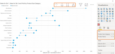
The Dumbbell Bar Chart visual supports Drill and Expand behaviors. Does this can meet your need for axis hierarchy?
Best Regards,
Community Support Team _ Jing
If this post helps, please Accept it as Solution to help other members find it.
Helpful resources

Microsoft Fabric Learn Together
Covering the world! 9:00-10:30 AM Sydney, 4:00-5:30 PM CET (Paris/Berlin), 7:00-8:30 PM Mexico City

Power BI Monthly Update - April 2024
Check out the April 2024 Power BI update to learn about new features.

| User | Count |
|---|---|
| 96 | |
| 94 | |
| 80 | |
| 71 | |
| 64 |
| User | Count |
|---|---|
| 115 | |
| 106 | |
| 96 | |
| 81 | |
| 72 |


