- Power BI forums
- Updates
- News & Announcements
- Get Help with Power BI
- Desktop
- Service
- Report Server
- Power Query
- Mobile Apps
- Developer
- DAX Commands and Tips
- Custom Visuals Development Discussion
- Health and Life Sciences
- Power BI Spanish forums
- Translated Spanish Desktop
- Power Platform Integration - Better Together!
- Power Platform Integrations (Read-only)
- Power Platform and Dynamics 365 Integrations (Read-only)
- Training and Consulting
- Instructor Led Training
- Dashboard in a Day for Women, by Women
- Galleries
- Community Connections & How-To Videos
- COVID-19 Data Stories Gallery
- Themes Gallery
- Data Stories Gallery
- R Script Showcase
- Webinars and Video Gallery
- Quick Measures Gallery
- 2021 MSBizAppsSummit Gallery
- 2020 MSBizAppsSummit Gallery
- 2019 MSBizAppsSummit Gallery
- Events
- Ideas
- Custom Visuals Ideas
- Issues
- Issues
- Events
- Upcoming Events
- Community Blog
- Power BI Community Blog
- Custom Visuals Community Blog
- Community Support
- Community Accounts & Registration
- Using the Community
- Community Feedback
Register now to learn Fabric in free live sessions led by the best Microsoft experts. From Apr 16 to May 9, in English and Spanish.
- Power BI forums
- Forums
- Get Help with Power BI
- Desktop
- Re: How to add vertical line in a line & stacked c...
- Subscribe to RSS Feed
- Mark Topic as New
- Mark Topic as Read
- Float this Topic for Current User
- Bookmark
- Subscribe
- Printer Friendly Page
- Mark as New
- Bookmark
- Subscribe
- Mute
- Subscribe to RSS Feed
- Permalink
- Report Inappropriate Content
How to add vertical line in a line & stacked column chart?
Hello experts!
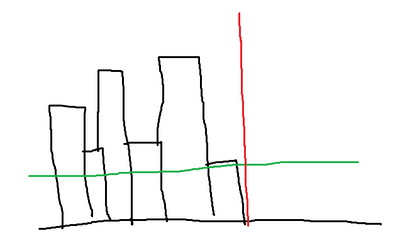
Currently i have the column stacked bar with a green line.. I want to add the red line which is vertical line in the visual.. Is that possible?
Your help is much appreciated.
Thanks.
Regards,
Izzaty
- Mark as New
- Bookmark
- Subscribe
- Mute
- Subscribe to RSS Feed
- Permalink
- Report Inappropriate Content
EDITED and UPDATED for a change of Chart type from Stacked column chart to Line and stacked column chart.
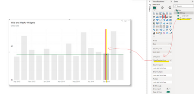
This is referred to as a Constant Line (or reference line) and is accessible via the Analytics Pane when the Visual is Selected.
Both the Line Chart Visual and Stacked Column Chart Visual fully support X and Y Axis Constant Lines and found in the Analytics Pane when the chart visual is selected. The Line and Stacked Column Chart Visual supports X Axis Constant Lines as a feature of the Analytics Pane. However, you can add a Y-Axis Constant line by first creating a measure, and adding it to the Line y-axis as a source. Formatting is handled in Visualizations|Format visual|Viaual|LinesColors. Some visuals have varying levels of support for either or all constant lines when coded into the visual features. When a feature is not fully supported, and you apply a workaround, unplanned results may occur in the rendered visual, however, this technique is known and aged. It is up to the reader to decide when this is appropriate. This advice is an example and for demonstration purposes only. There is no guarantee that this demonstration applies to your use case. The image below of a Line and stacked column Chart demonstrates this technique.
Use the Analytics pane in Power BI Desktop - Power BI | Microsoft Learn
Re: How to Add an vertical line on the Line chart? - Microsoft Fabric Community
- Mark as New
- Bookmark
- Subscribe
- Mute
- Subscribe to RSS Feed
- Permalink
- Report Inappropriate Content
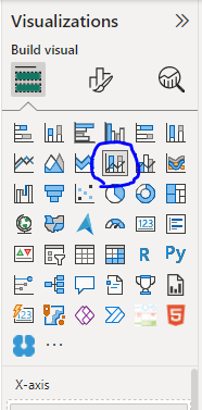
Hi @foodd. I'm unable to see the same setting as yours.. This is my view
You're using the line & stacked column chart right?
- Mark as New
- Bookmark
- Subscribe
- Mute
- Subscribe to RSS Feed
- Permalink
- Report Inappropriate Content
See updated reply.
Helpful resources

Microsoft Fabric Learn Together
Covering the world! 9:00-10:30 AM Sydney, 4:00-5:30 PM CET (Paris/Berlin), 7:00-8:30 PM Mexico City

Power BI Monthly Update - April 2024
Check out the April 2024 Power BI update to learn about new features.

| User | Count |
|---|---|
| 114 | |
| 105 | |
| 78 | |
| 68 | |
| 63 |
| User | Count |
|---|---|
| 148 | |
| 107 | |
| 106 | |
| 84 | |
| 70 |


