- Power BI forums
- Updates
- News & Announcements
- Get Help with Power BI
- Desktop
- Service
- Report Server
- Power Query
- Mobile Apps
- Developer
- DAX Commands and Tips
- Custom Visuals Development Discussion
- Health and Life Sciences
- Power BI Spanish forums
- Translated Spanish Desktop
- Power Platform Integration - Better Together!
- Power Platform Integrations (Read-only)
- Power Platform and Dynamics 365 Integrations (Read-only)
- Training and Consulting
- Instructor Led Training
- Dashboard in a Day for Women, by Women
- Galleries
- Community Connections & How-To Videos
- COVID-19 Data Stories Gallery
- Themes Gallery
- Data Stories Gallery
- R Script Showcase
- Webinars and Video Gallery
- Quick Measures Gallery
- 2021 MSBizAppsSummit Gallery
- 2020 MSBizAppsSummit Gallery
- 2019 MSBizAppsSummit Gallery
- Events
- Ideas
- Custom Visuals Ideas
- Issues
- Issues
- Events
- Upcoming Events
- Community Blog
- Power BI Community Blog
- Custom Visuals Community Blog
- Community Support
- Community Accounts & Registration
- Using the Community
- Community Feedback
Earn a 50% discount on the DP-600 certification exam by completing the Fabric 30 Days to Learn It challenge.
- Power BI forums
- Forums
- Get Help with Power BI
- Desktop
- Re: How to add labels (quantity of records) to a g...
- Subscribe to RSS Feed
- Mark Topic as New
- Mark Topic as Read
- Float this Topic for Current User
- Bookmark
- Subscribe
- Printer Friendly Page
- Mark as New
- Bookmark
- Subscribe
- Mute
- Subscribe to RSS Feed
- Permalink
- Report Inappropriate Content
How to add labels (quantity of records) to a graph showing average days
Hello,
I am trying to make a graph that shows on the y-axis the average amount of days (ex. average days it takes to validate an authorization) per month (x-axis). This graph will show an evolution of the average amount of days it takes to treat a dossier in a column chart.
However, I wanted to add a label that shows how many records/dossiers we get every month to this graph. I haven't found a way of doing this, because a label normally shows the same information that can be found on the graph (namely the average days of treatment)
Is there a way to add the label (quantity) to this graph?
- Mark as New
- Bookmark
- Subscribe
- Mute
- Subscribe to RSS Feed
- Permalink
- Report Inappropriate Content
Hi @Anonymous ,
According to your description, I created some data to show:
1. Create calculated column.
Month = MONTH('Table'[Date])
2. Create measure.
day_time_measure =
CALCULATE(COUNT('Table'[Date]),FILTER('Table','Table'[Month]=MAX('Table'[Month])))

amount_time =
CALCULATE(SUM('Table'[amount]),FILTER('Table','Table'[Month]=MAX('Table'[Month])))
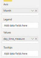
3. Put month into axis, day_ time_ Put measure into value
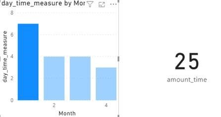
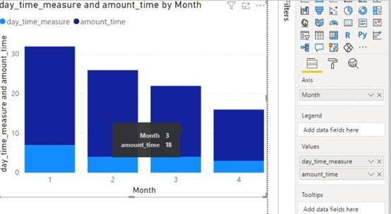
After that, there are two ways to present them
1. Add the amount_ Put time in the card diagram
2. Add the amount_ Put time in the value of column chart
You can downloaded PBIX file from here.
Best Regards,
Liu Yang
If this post helps, then please consider Accept it as the solution to help the other members find it more quickly.
- Mark as New
- Bookmark
- Subscribe
- Mute
- Subscribe to RSS Feed
- Permalink
- Report Inappropriate Content
@Anonymous , Not very clear, You can add a tooltip. I doubt you can label.
See scatter visual can fit in your need: https://docs.microsoft.com/en-us/power-bi/visuals/power-bi-visualization-scatter
Microsoft Power BI Learning Resources, 2023 !!
Learn Power BI - Full Course with Dec-2022, with Window, Index, Offset, 100+ Topics !!
Did I answer your question? Mark my post as a solution! Appreciate your Kudos !! Proud to be a Super User! !!


