- Power BI forums
- Updates
- News & Announcements
- Get Help with Power BI
- Desktop
- Service
- Report Server
- Power Query
- Mobile Apps
- Developer
- DAX Commands and Tips
- Custom Visuals Development Discussion
- Health and Life Sciences
- Power BI Spanish forums
- Translated Spanish Desktop
- Power Platform Integration - Better Together!
- Power Platform Integrations (Read-only)
- Power Platform and Dynamics 365 Integrations (Read-only)
- Training and Consulting
- Instructor Led Training
- Dashboard in a Day for Women, by Women
- Galleries
- Community Connections & How-To Videos
- COVID-19 Data Stories Gallery
- Themes Gallery
- Data Stories Gallery
- R Script Showcase
- Webinars and Video Gallery
- Quick Measures Gallery
- 2021 MSBizAppsSummit Gallery
- 2020 MSBizAppsSummit Gallery
- 2019 MSBizAppsSummit Gallery
- Events
- Ideas
- Custom Visuals Ideas
- Issues
- Issues
- Events
- Upcoming Events
- Community Blog
- Power BI Community Blog
- Custom Visuals Community Blog
- Community Support
- Community Accounts & Registration
- Using the Community
- Community Feedback
Earn a 50% discount on the DP-600 certification exam by completing the Fabric 30 Days to Learn It challenge.
- Power BI forums
- Forums
- Get Help with Power BI
- Desktop
- How do I plot a line chart
- Subscribe to RSS Feed
- Mark Topic as New
- Mark Topic as Read
- Float this Topic for Current User
- Bookmark
- Subscribe
- Printer Friendly Page
- Mark as New
- Bookmark
- Subscribe
- Mute
- Subscribe to RSS Feed
- Permalink
- Report Inappropriate Content
How do I plot a line chart
I don't think power BI likes my data.
I'm trying to plot an average week of data, as a line graph/chart that has been calculated and put in the sheet provided. If I were to do it in excel, I would just select all the data and click the line chart button in the insert ribbon. I am trying to achieve this in power BI.
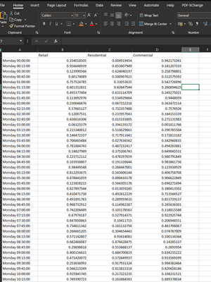
Here is my data:
Currenty I'm only able to graph the counts of my values against the first column and I am unable to stop it from sorting by either values or my first column alphabetically.
How would I go about making a line chart and how would I makes sure power BI is not sorting anything.
Solved! Go to Solution.
- Mark as New
- Bookmark
- Subscribe
- Mute
- Subscribe to RSS Feed
- Permalink
- Report Inappropriate Content
@jm9999999 , In the line visual put the numeric value in y-axis and time value in x-axis[The text].
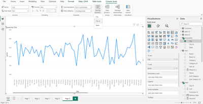
This will sort the x axis on the basis of the text string. Now in the table section, click on the day/time column[text column], this will open column tools on the menu above. Go to sort column by and sort it by index column.
For ex., in this the city names[Text] are sorted on the basis of city ID[numeric]. The sort column by option is visible by clicking on the city button in table pane.
- Mark as New
- Bookmark
- Subscribe
- Mute
- Subscribe to RSS Feed
- Permalink
- Report Inappropriate Content
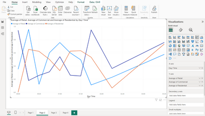
@jm9999999 , If this is what the requirement is,
Then,
1) This plotted for only 10 values of time.
2) Start by checking the data type of the day/time column.
3) X-axis -> time,
Y-axis-> Other fields
4) On Y-axis column in visualization pane, right click the column that can give the option to select the function that is required. In this case, it is the average function.
If sorting continues, go to the three dots of the visual and sort accordingly.
- Mark as New
- Bookmark
- Subscribe
- Mute
- Subscribe to RSS Feed
- Permalink
- Report Inappropriate Content
I had set my day time column to text. When I try to set it to time it drops the name of the day "Monday" and just displays the time and any day after Monday the day/time value errors due to the change in type. How would I make the format "nameOfDate" + "time" be considered time. or at the very least be similarly treated as an index or a timestamp.
- Mark as New
- Bookmark
- Subscribe
- Mute
- Subscribe to RSS Feed
- Permalink
- Report Inappropriate Content
There is no option to just have name of date + time. Have add the date, or create a column that can provide the distinction. In terms of text it will always sort the values one way or another.
Remember to use a 24-hour clock.
- Mark as New
- Bookmark
- Subscribe
- Mute
- Subscribe to RSS Feed
- Permalink
- Report Inappropriate Content
Is there anyway I can go about making a graph with these axis in power BI?
- Mark as New
- Bookmark
- Subscribe
- Mute
- Subscribe to RSS Feed
- Permalink
- Report Inappropriate Content
@jm9999999 Something could be done.
Try uploading the data using power Query and add another column of index.
Click transform data in PowerBI desktop. Then Enter Data, after the data is added go to Add column and add index starting from 1. this would order all the texting.
Then the desired result could be achieved.
- Mark as New
- Bookmark
- Subscribe
- Mute
- Subscribe to RSS Feed
- Permalink
- Report Inappropriate Content
I've tried this,
I am unable to prevent it from sorting my data points unless I put the index first and sort by index. If I do that it doesn't display the day time on the chart. Double clicking on the current sort by option doesn't disable the sorting.
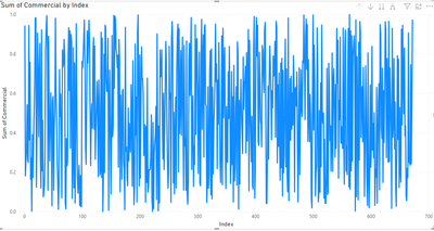
I need the graph in index order but I want the x -axis to display the day time column in index order.
- Mark as New
- Bookmark
- Subscribe
- Mute
- Subscribe to RSS Feed
- Permalink
- Report Inappropriate Content
@jm9999999 , In the line visual put the numeric value in y-axis and time value in x-axis[The text].
This will sort the x axis on the basis of the text string. Now in the table section, click on the day/time column[text column], this will open column tools on the menu above. Go to sort column by and sort it by index column.
For ex., in this the city names[Text] are sorted on the basis of city ID[numeric]. The sort column by option is visible by clicking on the city button in table pane.
- Mark as New
- Bookmark
- Subscribe
- Mute
- Subscribe to RSS Feed
- Permalink
- Report Inappropriate Content
Thank you so much, I have been tearing my hair out over getting this graph right!
Helpful resources
| User | Count |
|---|---|
| 98 | |
| 90 | |
| 82 | |
| 73 | |
| 67 |
| User | Count |
|---|---|
| 115 | |
| 102 | |
| 98 | |
| 71 | |
| 67 |


