- Power BI forums
- Updates
- News & Announcements
- Get Help with Power BI
- Desktop
- Service
- Report Server
- Power Query
- Mobile Apps
- Developer
- DAX Commands and Tips
- Custom Visuals Development Discussion
- Health and Life Sciences
- Power BI Spanish forums
- Translated Spanish Desktop
- Power Platform Integration - Better Together!
- Power Platform Integrations (Read-only)
- Power Platform and Dynamics 365 Integrations (Read-only)
- Training and Consulting
- Instructor Led Training
- Dashboard in a Day for Women, by Women
- Galleries
- Community Connections & How-To Videos
- COVID-19 Data Stories Gallery
- Themes Gallery
- Data Stories Gallery
- R Script Showcase
- Webinars and Video Gallery
- Quick Measures Gallery
- 2021 MSBizAppsSummit Gallery
- 2020 MSBizAppsSummit Gallery
- 2019 MSBizAppsSummit Gallery
- Events
- Ideas
- Custom Visuals Ideas
- Issues
- Issues
- Events
- Upcoming Events
- Community Blog
- Power BI Community Blog
- Custom Visuals Community Blog
- Community Support
- Community Accounts & Registration
- Using the Community
- Community Feedback
Earn a 50% discount on the DP-600 certification exam by completing the Fabric 30 Days to Learn It challenge.
- Power BI forums
- Forums
- Get Help with Power BI
- Desktop
- Help with new Measure
- Subscribe to RSS Feed
- Mark Topic as New
- Mark Topic as Read
- Float this Topic for Current User
- Bookmark
- Subscribe
- Printer Friendly Page
- Mark as New
- Bookmark
- Subscribe
- Mute
- Subscribe to RSS Feed
- Permalink
- Report Inappropriate Content
Help with new Measure
Hello guys,
I'm very new to the world of charts and analysing data and I have to say that I found Power BI very easy to use.
Especially the part where I can just drag and drop collumns from my excel tables.
However now i'm in need to create a little more complicate chart/output.
I have this column (A) containing float numbers (representing percentage values). And another column (B) with number values.
What I'm trying to do is to create a chart that it will have as value only column A and "multiple" filters/conditions from column B.
For example:
1st entry in the chart I want to be: Value column A and condition from column B
2nd entry in the chart: Value column A and condition from column B.
I don't know if I explained it good enough!!
The conditions will be greater than AND smaller than.
Or if it's possible, condition: values that start with specific number.
From a search that I made I found out that I must create a "Measure" with those specific columns and condition for each chart entry that I want. And then drag and drop those Measures into my chart? Correct?
Can someone help me with these custom commands?
Thank you for your time,
Charalambos
Solved! Go to Solution.
- Mark as New
- Bookmark
- Subscribe
- Mute
- Subscribe to RSS Feed
- Permalink
- Report Inappropriate Content
Hi @cstavrou,
In your scenario, you can create the following measures and use the measures to create visuals.
measure1 = CALCULATE(SUM(Table1[ColumnA]),FILTER(Table1,Table1[ColumnB]>50))
measure2 = CALCULATE(SUM(Table1[ColumnA]),FILTER(Table1,Table1[ColumnB]>50&&Table1[ColumnB]<60))
For more details, you can review example in this attached PBIX file.
Thanks,
Lydia Zhang
If this post helps, then please consider Accept it as the solution to help the other members find it more quickly.
- Mark as New
- Bookmark
- Subscribe
- Mute
- Subscribe to RSS Feed
- Permalink
- Report Inappropriate Content
Hi @cstavrou,
Could you please share sample data of your table and post expected result here?
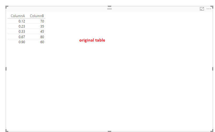
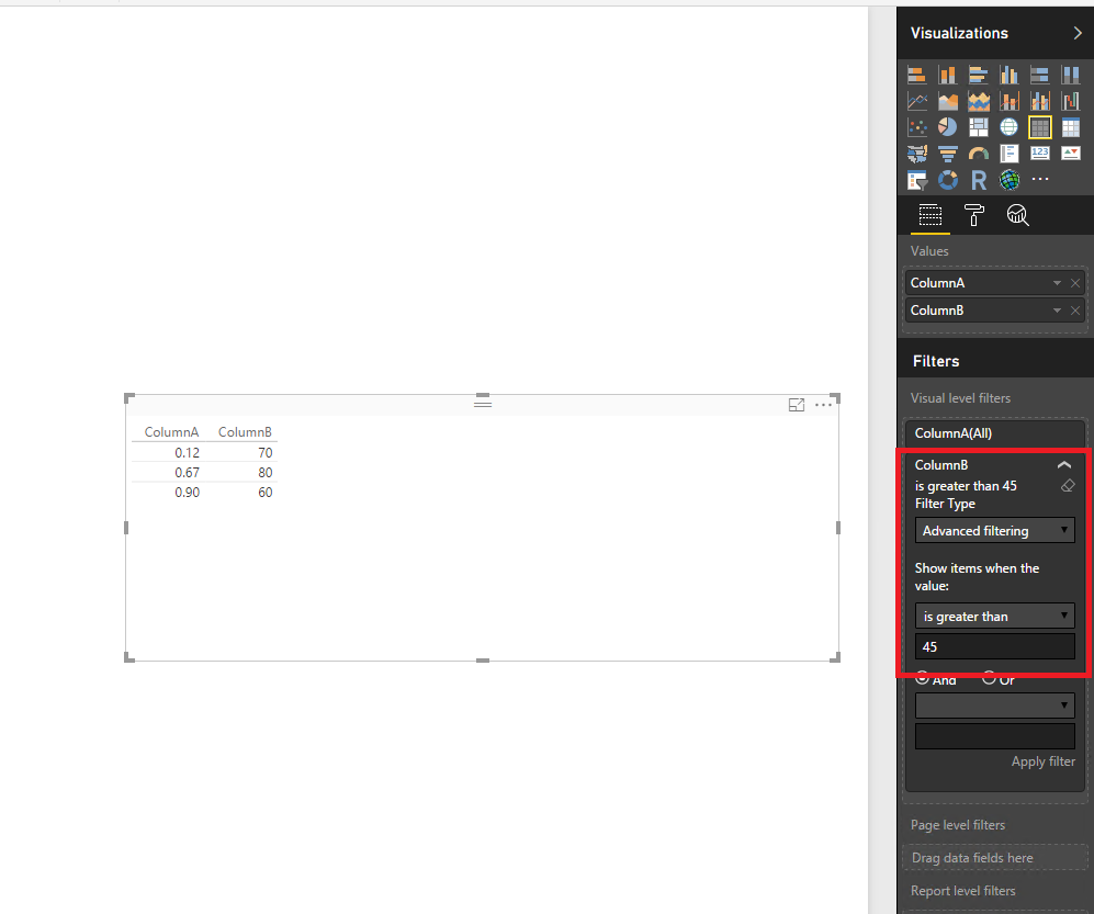
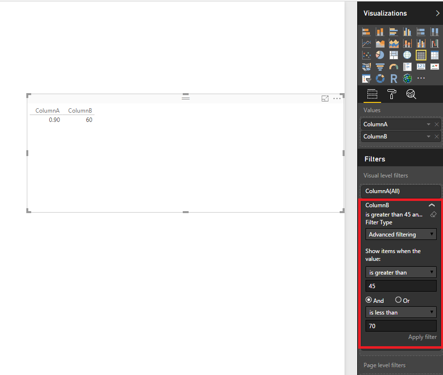
Based on your description, it seems that you want to display specific values of column B and relevant values of Column A in charts. In this case, you can just use visual level filter to achieve this requirement, there is an example for your reference. For more details, you can review this attached PBIX file.
Thanks,
Lydia Zhang
If this post helps, then please consider Accept it as the solution to help the other members find it more quickly.
- Mark as New
- Bookmark
- Subscribe
- Mute
- Subscribe to RSS Feed
- Permalink
- Report Inappropriate Content
Thank you Lydia for replying.
Pretty much the two collumns of my excel are like yours. The first collumn has float numbers and the other integers.
I changed your file to what I'm trying to do:
https://1drv.ms/u/s!Aus-NYvNO-O4hySGE-l65vW7SGxH
Basically I change a little your charts to represent how I want the chart. However I want the two charts to be merged together.
I want to show only one Value on the chart.
Sorry I don't know how to explain it better!!
My scenario based on your table:
Create a chart with only value but multiple filters. For example:
One bar in the chart show SUM of Col. A with filter less than 50
Another bar show SUM of Col. A with filter less than 60 AND higher than 50
and so on..
Basically compine/merge the two charts from here:
https://1drv.ms/u/s!Aus-NYvNO-O4hySGE-l65vW7SGxH
Thank you again for your time,
Charalambos
- Mark as New
- Bookmark
- Subscribe
- Mute
- Subscribe to RSS Feed
- Permalink
- Report Inappropriate Content
Hi @cstavrou,
In your scenario, you can create the following measures and use the measures to create visuals.
measure1 = CALCULATE(SUM(Table1[ColumnA]),FILTER(Table1,Table1[ColumnB]>50))
measure2 = CALCULATE(SUM(Table1[ColumnA]),FILTER(Table1,Table1[ColumnB]>50&&Table1[ColumnB]<60))
For more details, you can review example in this attached PBIX file.
Thanks,
Lydia Zhang
If this post helps, then please consider Accept it as the solution to help the other members find it more quickly.
- Mark as New
- Bookmark
- Subscribe
- Mute
- Subscribe to RSS Feed
- Permalink
- Report Inappropriate Content
Thank you for the reply. This is what I was looking for.
And the PBIX file was very helpfull!
Is there any course online that will help me understand and create such measures/filters using Power BI or even Excel?
Thank you for your time.
Helpful resources

Microsoft Fabric Learn Together
Covering the world! 9:00-10:30 AM Sydney, 4:00-5:30 PM CET (Paris/Berlin), 7:00-8:30 PM Mexico City

Power BI Monthly Update - April 2024
Check out the April 2024 Power BI update to learn about new features.

| User | Count |
|---|---|
| 109 | |
| 102 | |
| 85 | |
| 78 | |
| 70 |
| User | Count |
|---|---|
| 120 | |
| 110 | |
| 95 | |
| 82 | |
| 77 |


