- Power BI forums
- Updates
- News & Announcements
- Get Help with Power BI
- Desktop
- Service
- Report Server
- Power Query
- Mobile Apps
- Developer
- DAX Commands and Tips
- Custom Visuals Development Discussion
- Health and Life Sciences
- Power BI Spanish forums
- Translated Spanish Desktop
- Power Platform Integration - Better Together!
- Power Platform Integrations (Read-only)
- Power Platform and Dynamics 365 Integrations (Read-only)
- Training and Consulting
- Instructor Led Training
- Dashboard in a Day for Women, by Women
- Galleries
- Community Connections & How-To Videos
- COVID-19 Data Stories Gallery
- Themes Gallery
- Data Stories Gallery
- R Script Showcase
- Webinars and Video Gallery
- Quick Measures Gallery
- 2021 MSBizAppsSummit Gallery
- 2020 MSBizAppsSummit Gallery
- 2019 MSBizAppsSummit Gallery
- Events
- Ideas
- Custom Visuals Ideas
- Issues
- Issues
- Events
- Upcoming Events
- Community Blog
- Power BI Community Blog
- Custom Visuals Community Blog
- Community Support
- Community Accounts & Registration
- Using the Community
- Community Feedback
Earn a 50% discount on the DP-600 certification exam by completing the Fabric 30 Days to Learn It challenge.
- Power BI forums
- Forums
- Get Help with Power BI
- Desktop
- Help to create Average Productivity over time
- Subscribe to RSS Feed
- Mark Topic as New
- Mark Topic as Read
- Float this Topic for Current User
- Bookmark
- Subscribe
- Printer Friendly Page
- Mark as New
- Bookmark
- Subscribe
- Mute
- Subscribe to RSS Feed
- Permalink
- Report Inappropriate Content
Help to create Average Productivity over time
Hello Everyone,
I need your Help generating a chart showing the average & Cumalative trend over time for a dataset.
Production Explaination:
In the production process, we create 1 Module, and this module is made up of 16 Skids. Each skid is considered finished when a specific activity is marked as 100% complete,my goal is to analyze our production data to understand the average & Cumalative trend for the number of skids we produce each month.
Dataset Explaination
To illustrate this, I have provided a link to the dataset we are working with,2 tables are interconnected through column (EquipmentId),1st table(ActivtiyLevelProgress) is having the ActivityDescription & Progress while the other column is having the
CWP_or_Skid ,InstallationEnd & InstallationStart.
1st Table ActivityLevelProgress (highlight is the 2 Most important columns)
2nd Table Equipment ((highlight are the 3 Most important columns)
Link to Dataset
SampleDataset
What do i need to do
I need to create a couple of measures 1 Monthly Average,1 total till date (Aggregation),dynamic time X Axis
1- Dynamic time X-Axis based on InstallationEnd & InstallationStart which changes based on ActivityDescription.
2-Monthly Average Measure should count the Number of CWP_or_Skid that are finished based on ActivityDescription & Progress in every month while referring to a dynamic time X-Axis (InstallationEnd & InstallationStart)
3-1 total till date (Aggregation) while counts the total number of CWP_or_Skid that are finished based on ActivityDescription & Progress in every month in an upward trend while referring to a dynamic time X-Axis (InstallationEnd & InstallationStart)
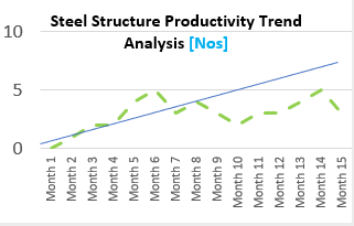
Outcome chart would look like
Dotted is the average & straight line is the
Your insights and expertise will be invaluable in this endeavor.
@amitchandak @lbendlin @Ahmedx @parry2k @Ritaf1983
- Mark as New
- Bookmark
- Subscribe
- Mute
- Subscribe to RSS Feed
- Permalink
- Report Inappropriate Content
Please provide sample data (with sensitive information removed) that covers your issue or question completely, in a usable format (not as a screenshot). Leave out anything not related to the issue.
If you are unsure how to do that please refer to https://community.fabric.microsoft.com/t5/Community-Blog/How-to-provide-sample-data-in-the-Power-BI-...
Please show the expected outcome based on the sample data you provided.
If you want to get answers faster please refer to https://community.fabric.microsoft.com/t5/Desktop/How-to-Get-Your-Question-Answered-Quickly/m-p/1447...
- Mark as New
- Bookmark
- Subscribe
- Mute
- Subscribe to RSS Feed
- Permalink
- Report Inappropriate Content
I have provided a sample dateset in excel format in the orginal post
- Mark as New
- Bookmark
- Subscribe
- Mute
- Subscribe to RSS Feed
- Permalink
- Report Inappropriate Content
access denied - please check
- Mark as New
- Bookmark
- Subscribe
- Mute
- Subscribe to RSS Feed
- Permalink
- Report Inappropriate Content
Thank you for your Response
I have checked the link and it should be working
- Mark as New
- Bookmark
- Subscribe
- Mute
- Subscribe to RSS Feed
- Permalink
- Report Inappropriate Content
Thank you for your clarification..i will do so
Helpful resources
| User | Count |
|---|---|
| 98 | |
| 90 | |
| 78 | |
| 72 | |
| 65 |
| User | Count |
|---|---|
| 114 | |
| 98 | |
| 96 | |
| 68 | |
| 67 |


