- Power BI forums
- Updates
- News & Announcements
- Get Help with Power BI
- Desktop
- Service
- Report Server
- Power Query
- Mobile Apps
- Developer
- DAX Commands and Tips
- Custom Visuals Development Discussion
- Health and Life Sciences
- Power BI Spanish forums
- Translated Spanish Desktop
- Power Platform Integration - Better Together!
- Power Platform Integrations (Read-only)
- Power Platform and Dynamics 365 Integrations (Read-only)
- Training and Consulting
- Instructor Led Training
- Dashboard in a Day for Women, by Women
- Galleries
- Community Connections & How-To Videos
- COVID-19 Data Stories Gallery
- Themes Gallery
- Data Stories Gallery
- R Script Showcase
- Webinars and Video Gallery
- Quick Measures Gallery
- 2021 MSBizAppsSummit Gallery
- 2020 MSBizAppsSummit Gallery
- 2019 MSBizAppsSummit Gallery
- Events
- Ideas
- Custom Visuals Ideas
- Issues
- Issues
- Events
- Upcoming Events
- Community Blog
- Power BI Community Blog
- Custom Visuals Community Blog
- Community Support
- Community Accounts & Registration
- Using the Community
- Community Feedback
Register now to learn Fabric in free live sessions led by the best Microsoft experts. From Apr 16 to May 9, in English and Spanish.
- Power BI forums
- Forums
- Get Help with Power BI
- Desktop
- Having a bar chart partly depending on slicer
- Subscribe to RSS Feed
- Mark Topic as New
- Mark Topic as Read
- Float this Topic for Current User
- Bookmark
- Subscribe
- Printer Friendly Page
- Mark as New
- Bookmark
- Subscribe
- Mute
- Subscribe to RSS Feed
- Permalink
- Report Inappropriate Content
Having a bar chart partly depending on slicer
Hello,
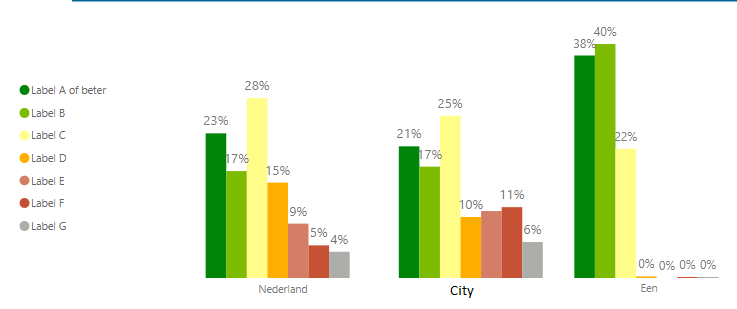
I've a slicer to select a postal code which shows me, amongst others, the average energy label in that region. I would like to compare that with the average in the city and The Netherlands in general. Therefore, I've created three bar charts (see below) because one is dependent on the slicer and the others aren't. I couldn't figure out how to do this in one graph, but this isn't a nice workaround. Could you help me out?
| Region | Label A or better | Label B | Label C | Label D | Label E | Label F | Label G |
| City | 20,6% | 17,4% | 25,3% | 9,5% | 10,5% | 11,1% | 5,6% |
| The Netherlands | 22,6% | 16,7% | 28,1% | 14,9% | 8,5% | 5,1% | 4,1% |
| Postal code 1 | 37,8% | 39,8% | 22,0% | 0,3% | 0,0% | 0,1% | 0,1% |
| Postal code 2 | 14,1% | 10,7% | 32,0% | 16,1% | 19,1% | 5,6% | 2,4% |
| Postal code 3 | 20,7% | 13,1% | 19,1% | 6,7% | 10,6% | 20,2% | 9,7% |
| Postal code 4 | 12,9% | 18,6% | 37,5% | 16,7% | 2,8% | 6,2% | 5,3% |
| Postal code 5 | 5,2% | 12,3% | 14,9% | 10,2% | 13,7% | 22,5% | 21,2% |

Thanks in advance!
Solved! Go to Solution.
- Mark as New
- Bookmark
- Subscribe
- Mute
- Subscribe to RSS Feed
- Permalink
- Report Inappropriate Content
Hi, @Anonymous
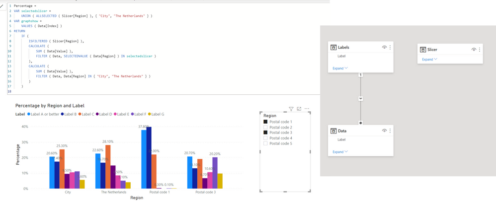
Please check the below picture and the sample pbix file's link down below.
I suggest having a separate slicer table like below.
In order to create the interaction between the separated slicer table and the main table, the below measure has to be created and inserted into the visualization.
Hi, My name is Jihwan Kim.
If this post helps, then please consider accept it as the solution to help other members find it faster, and give a big thumbs up.
Linkedin: linkedin.com/in/jihwankim1975/
Twitter: twitter.com/Jihwan_JHKIM
If this post helps, then please consider accepting it as the solution to help other members find it faster, and give a big thumbs up.
- Mark as New
- Bookmark
- Subscribe
- Mute
- Subscribe to RSS Feed
- Permalink
- Report Inappropriate Content
Thank you! Seems like that's exactly what I need.
- Mark as New
- Bookmark
- Subscribe
- Mute
- Subscribe to RSS Feed
- Permalink
- Report Inappropriate Content
@Anonymous
Can you please provide a sample dataset or PBIX file?
Did I answer your question? Mark my post as a solution!
In doing so, you are also helping me. Thank you!
Proud to be a Super User!
Paul on Linkedin.
- Mark as New
- Bookmark
- Subscribe
- Mute
- Subscribe to RSS Feed
- Permalink
- Report Inappropriate Content
@Anonymous ,The information you have provided is not making the problem clear to me. Can you please explain with an example.
Appreciate your Kudos.
You have try measure like
CALCUALTE([energy], filter(allselected(Table), Table[City] =max(Table[City])))
or
CALCUALTE(Average(Table[energy]), filter(allselected(Table), Table[City] =max(Table[City])))
Microsoft Power BI Learning Resources, 2023 !!
Learn Power BI - Full Course with Dec-2022, with Window, Index, Offset, 100+ Topics !!
Did I answer your question? Mark my post as a solution! Appreciate your Kudos !! Proud to be a Super User! !!
- Mark as New
- Bookmark
- Subscribe
- Mute
- Subscribe to RSS Feed
- Permalink
- Report Inappropriate Content
In the current situation I've a slicer to select postal code 1 to 5. Given the selected postal code the graph shows the energy label. Next to it I've created two bar charts with the energy labels of The Netherlands and the city. Those graphs don't change given the postel code I've selected.
I would like to combine the three graphs into one in which the energy label bars for The Netherlands and the city remain similar whatever postal code is selected, and in which the postal code energylabels vary given the slicer. I would like to do so since the y-axis is then always correct and it feels like I'm not using Power BI as intended right now. I hope this clarifies the issue.
btw: I'm not really familiar with the DAX editior, but keen on trying 🙂
Helpful resources

Microsoft Fabric Learn Together
Covering the world! 9:00-10:30 AM Sydney, 4:00-5:30 PM CET (Paris/Berlin), 7:00-8:30 PM Mexico City

Power BI Monthly Update - April 2024
Check out the April 2024 Power BI update to learn about new features.

| User | Count |
|---|---|
| 105 | |
| 105 | |
| 88 | |
| 73 | |
| 66 |
| User | Count |
|---|---|
| 124 | |
| 113 | |
| 98 | |
| 81 | |
| 72 |

