- Power BI forums
- Updates
- News & Announcements
- Get Help with Power BI
- Desktop
- Service
- Report Server
- Power Query
- Mobile Apps
- Developer
- DAX Commands and Tips
- Custom Visuals Development Discussion
- Health and Life Sciences
- Power BI Spanish forums
- Translated Spanish Desktop
- Power Platform Integration - Better Together!
- Power Platform Integrations (Read-only)
- Power Platform and Dynamics 365 Integrations (Read-only)
- Training and Consulting
- Instructor Led Training
- Dashboard in a Day for Women, by Women
- Galleries
- Community Connections & How-To Videos
- COVID-19 Data Stories Gallery
- Themes Gallery
- Data Stories Gallery
- R Script Showcase
- Webinars and Video Gallery
- Quick Measures Gallery
- 2021 MSBizAppsSummit Gallery
- 2020 MSBizAppsSummit Gallery
- 2019 MSBizAppsSummit Gallery
- Events
- Ideas
- Custom Visuals Ideas
- Issues
- Issues
- Events
- Upcoming Events
- Community Blog
- Power BI Community Blog
- Custom Visuals Community Blog
- Community Support
- Community Accounts & Registration
- Using the Community
- Community Feedback
Register now to learn Fabric in free live sessions led by the best Microsoft experts. From Apr 16 to May 9, in English and Spanish.
- Power BI forums
- Forums
- Get Help with Power BI
- Desktop
- Re: Guage visual not showing full Mix and Max valu...
- Subscribe to RSS Feed
- Mark Topic as New
- Mark Topic as Read
- Float this Topic for Current User
- Bookmark
- Subscribe
- Printer Friendly Page
- Mark as New
- Bookmark
- Subscribe
- Mute
- Subscribe to RSS Feed
- Permalink
- Report Inappropriate Content
Guage visual not showing full Mix and Max values in published App
Hi there,
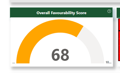
I have created a metric using the guage PowerBI visual and published this as an App into my Workspace, however on the App view, I am seeing a poor and limited display for my min and max values. As you can see in the image below, elipses (...) are added and the full value does not show. The visual is at a good size currently beiing, 181 height and 380 width.
Do I need to turn anything on with the visual settings to avoid this from happening. Any help is greatly appreciated, thanks.
- Mark as New
- Bookmark
- Subscribe
- Mute
- Subscribe to RSS Feed
- Permalink
- Report Inappropriate Content
Hello,
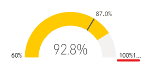
another update : now it's not even working on PowerBI Desktop.
Working fine if number with 2 digits (< 100). Wrong with more that 3 digits.
HELP Microsoft !
- Mark as New
- Bookmark
- Subscribe
- Mute
- Subscribe to RSS Feed
- Permalink
- Report Inappropriate Content
Hi, we have the same issue in my company, our users are gettting confuse, please fix this Microsoft.
- Mark as New
- Bookmark
- Subscribe
- Mute
- Subscribe to RSS Feed
- Permalink
- Report Inappropriate Content
Now is working for me. Thanks for solving it
- Mark as New
- Bookmark
- Subscribe
- Mute
- Subscribe to RSS Feed
- Permalink
- Report Inappropriate Content
Hello,
any chance to get an update of PowerBI Server ? Now it's dot and weird numbers.
Instead of max showing 4000...It shows 40004...
Please, solve it Microsoft !
- Mark as New
- Bookmark
- Subscribe
- Mute
- Subscribe to RSS Feed
- Permalink
- Report Inappropriate Content
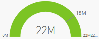
I have the same problem. Also the lables get repeated.
- Mark as New
- Bookmark
- Subscribe
- Mute
- Subscribe to RSS Feed
- Permalink
- Report Inappropriate Content
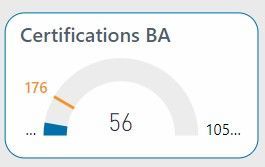
Hello. I have the same issue. Last week my gauges were fine and suddenly, not showing the all max or min values during a day. It was ok friday, monday...and since yesterday, wrong again
It's ok in PowerBI Destop
- Mark as New
- Bookmark
- Subscribe
- Mute
- Subscribe to RSS Feed
- Permalink
- Report Inappropriate Content
Same problem here. Started since last week. Before that, the numbers in the gauge chart were displayed properly.
Probably an update?
You can solve the problem to change the width. The Min and Max values will be displayes below.
- Mark as New
- Bookmark
- Subscribe
- Mute
- Subscribe to RSS Feed
- Permalink
- Report Inappropriate Content
Thanks for the note @GerbenvdHazel
Good to see that the problem is not only for me.
I hope there is an update soon which can resolve this as yes, this didn't used to be the case previously when working with this visualisation type. I am not keen on resizing the visual as it will require more real estate which I don't have to work with.
Kind regards,
Mehal
- Mark as New
- Bookmark
- Subscribe
- Mute
- Subscribe to RSS Feed
- Permalink
- Report Inappropriate Content
Everything works fine again for me. Is the problem also been solved for you?
- Mark as New
- Bookmark
- Subscribe
- Mute
- Subscribe to RSS Feed
- Permalink
- Report Inappropriate Content
Yesterday I called Microsoft (case 2403070050000540).
I've shown the issue and hopefully they can fix in the next update.
- Mark as New
- Bookmark
- Subscribe
- Mute
- Subscribe to RSS Feed
- Permalink
- Report Inappropriate Content
Try this
- On the Visualizations > Build visual pane, remove the Max of Gross Sales value from the Maximum value option.
- Select the paintbrush icon to open the Format visual section.
- Ref: Expand the Gauge axis option and enter appropriate values for the Min and Max settings
- Mark as New
- Bookmark
- Subscribe
- Mute
- Subscribe to RSS Feed
- Permalink
- Report Inappropriate Content
Thanks for the reply.
I just tried this and republished. Still unfortunately getting the same outcome of not being able to see the full Min and Max values.
Thanks. Any other solutions are greatly appreciated.
Helpful resources

Microsoft Fabric Learn Together
Covering the world! 9:00-10:30 AM Sydney, 4:00-5:30 PM CET (Paris/Berlin), 7:00-8:30 PM Mexico City

Power BI Monthly Update - April 2024
Check out the April 2024 Power BI update to learn about new features.

| User | Count |
|---|---|
| 97 | |
| 97 | |
| 82 | |
| 74 | |
| 66 |
| User | Count |
|---|---|
| 120 | |
| 105 | |
| 99 | |
| 81 | |
| 72 |


