- Power BI forums
- Updates
- News & Announcements
- Get Help with Power BI
- Desktop
- Service
- Report Server
- Power Query
- Mobile Apps
- Developer
- DAX Commands and Tips
- Custom Visuals Development Discussion
- Health and Life Sciences
- Power BI Spanish forums
- Translated Spanish Desktop
- Power Platform Integration - Better Together!
- Power Platform Integrations (Read-only)
- Power Platform and Dynamics 365 Integrations (Read-only)
- Training and Consulting
- Instructor Led Training
- Dashboard in a Day for Women, by Women
- Galleries
- Community Connections & How-To Videos
- COVID-19 Data Stories Gallery
- Themes Gallery
- Data Stories Gallery
- R Script Showcase
- Webinars and Video Gallery
- Quick Measures Gallery
- 2021 MSBizAppsSummit Gallery
- 2020 MSBizAppsSummit Gallery
- 2019 MSBizAppsSummit Gallery
- Events
- Ideas
- Custom Visuals Ideas
- Issues
- Issues
- Events
- Upcoming Events
- Community Blog
- Power BI Community Blog
- Custom Visuals Community Blog
- Community Support
- Community Accounts & Registration
- Using the Community
- Community Feedback
Earn a 50% discount on the DP-600 certification exam by completing the Fabric 30 Days to Learn It challenge.
- Power BI forums
- Forums
- Get Help with Power BI
- Desktop
- Grouping table visual
- Subscribe to RSS Feed
- Mark Topic as New
- Mark Topic as Read
- Float this Topic for Current User
- Bookmark
- Subscribe
- Printer Friendly Page
- Mark as New
- Bookmark
- Subscribe
- Mute
- Subscribe to RSS Feed
- Permalink
- Report Inappropriate Content
Grouping table visual
Hi,
I've attempted various DAX statements in order to generate measures and columns that would create a summarised table visual, but I'm encountering difficulties in achieving the desired outcome.
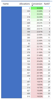
My goal revolves around a table visual, labeled as Fig1, which employs four fields extracted from a table named "Allocations." Presently, this table contains 240 rows, although this count can fluctuate throughout the month.
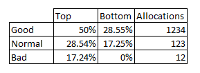
My objective entails evenly distributing the RankT values into three distinct groups: Good, Normal, and Bad. Subsequently, I aim to identify the highest and lowest Conversion Percentages within each of these groups.
Ultimately, my aim is to generate a table visual resembling the one depicted in Fig2 and it needs to work with a selected values from a slicer. Despite my efforts, I'm struggling to realise this vision using DAX statements.
Name - column
Allocations - calculated measure
Conversion - calculated measure
RankT - calculated measure
Fig1
Fig2
Solved! Go to Solution.
- Mark as New
- Bookmark
- Subscribe
- Mute
- Subscribe to RSS Feed
- Permalink
- Report Inappropriate Content
Take a look at this article on ABC Classification. It should help you get what you are looking for.
https://www.daxpatterns.com/abc-classification/
- Mark as New
- Bookmark
- Subscribe
- Mute
- Subscribe to RSS Feed
- Permalink
- Report Inappropriate Content
Take a look at this article on ABC Classification. It should help you get what you are looking for.
https://www.daxpatterns.com/abc-classification/
- Mark as New
- Bookmark
- Subscribe
- Mute
- Subscribe to RSS Feed
- Permalink
- Report Inappropriate Content
Helpful resources
| User | Count |
|---|---|
| 94 | |
| 83 | |
| 78 | |
| 75 | |
| 66 |
| User | Count |
|---|---|
| 115 | |
| 105 | |
| 93 | |
| 65 | |
| 60 |


