- Power BI forums
- Updates
- News & Announcements
- Get Help with Power BI
- Desktop
- Service
- Report Server
- Power Query
- Mobile Apps
- Developer
- DAX Commands and Tips
- Custom Visuals Development Discussion
- Health and Life Sciences
- Power BI Spanish forums
- Translated Spanish Desktop
- Power Platform Integration - Better Together!
- Power Platform Integrations (Read-only)
- Power Platform and Dynamics 365 Integrations (Read-only)
- Training and Consulting
- Instructor Led Training
- Dashboard in a Day for Women, by Women
- Galleries
- Community Connections & How-To Videos
- COVID-19 Data Stories Gallery
- Themes Gallery
- Data Stories Gallery
- R Script Showcase
- Webinars and Video Gallery
- Quick Measures Gallery
- 2021 MSBizAppsSummit Gallery
- 2020 MSBizAppsSummit Gallery
- 2019 MSBizAppsSummit Gallery
- Events
- Ideas
- Custom Visuals Ideas
- Issues
- Issues
- Events
- Upcoming Events
- Community Blog
- Power BI Community Blog
- Custom Visuals Community Blog
- Community Support
- Community Accounts & Registration
- Using the Community
- Community Feedback
Register now to learn Fabric in free live sessions led by the best Microsoft experts. From Apr 16 to May 9, in English and Spanish.
- Power BI forums
- Forums
- Get Help with Power BI
- Desktop
- Function curve & scatterplot in one
- Subscribe to RSS Feed
- Mark Topic as New
- Mark Topic as Read
- Float this Topic for Current User
- Bookmark
- Subscribe
- Printer Friendly Page
- Mark as New
- Bookmark
- Subscribe
- Mute
- Subscribe to RSS Feed
- Permalink
- Report Inappropriate Content
Function curve & scatterplot in one
Hi Community,
...you are my only hope 😉
Is it possible to achieve two bits in one graph in PBI?
Namely:
- scatter plot
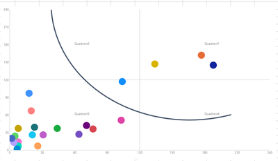
- curve representing the function being defined on the data in the same file?
Here is an example how it needs to look:
Any help much appriciated.
This is the first time I'm adding super users to the topic - if I'm doing it in a inappropriate way please let me know!
@Greg_Deckler , @amitchandak , @Ashish_Mathur , @Syk
Kind regards!
Chris.
- Mark as New
- Bookmark
- Subscribe
- Mute
- Subscribe to RSS Feed
- Permalink
- Report Inappropriate Content
sure contact them, but if ther isnt a native visual on the power bi visuals then you will get the reply to summit it as a idea to see if it gets votes enought for them to include in they features pipeline, or try to find one that serves you in the app store or develop a new one, even contacting them if there its no native visual for it will be the same responses.
Did I answer your question? Mark my post as a solution! / Did it help? Give some Kudos!
Proud to be a Super User!
- Mark as New
- Bookmark
- Subscribe
- Mute
- Subscribe to RSS Feed
- Permalink
- Report Inappropriate Content
hey,
yes you can but this can be a tricky one:
Options/comments:
1) there not native graph to do so - so there no one click way to do it lets say
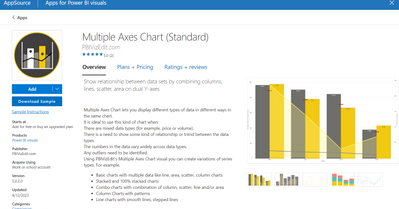
2) search the marketplace to see if someone have upload to it a grapth that does it ( this one show below can do the trick possible - but as you can see this one its a paying one solution, but there could be a free one ( I didnt see one but just did a quick search)
3) development option: you can create your own visual but you need coding skills but theres quick tutorial for power bi visual creation but depending on what you want u will want to update yours skills on coding to do so)
4) force the visual xD - you can put one visual upon another separtly and use the option of traparent background to manually punt on visual on top of another letting the one on the back be visible and make the feeling of 2 in one - but obviusloy this will have some scales and perfomance consideration from having a full visual that does it.
hope this works or help at least getting a north with the topic.
Did I answer your question? Mark my post as a solution! / Did it help? Give some Kudos!
Proud to be a Super User!
- Mark as New
- Bookmark
- Subscribe
- Mute
- Subscribe to RSS Feed
- Permalink
- Report Inappropriate Content
Thank you
StefanoGrimaldi
1) that I know - as I've investigated before posting 🙂
2) I've tested that one some time before I've posted the question - it does not allow you to plot function and distribution of the points on same graph
3) I know there is that option - and I can go that direction (I've made some experiments with https://charticulator.com/) but failed
4) true - you can move this direction - I've tesed this before publishing my query! 🙂
Concluding - seems you and I we have not reached a momentum, where 1 visual can serve the purpose. would you agree?
Perhaps I should reach out to Microsoft PBI admin then?
Penny for your thoughts StefanoGrimaldi? 🙂
Thanks for sharing your thoughts!
Chris.
- Mark as New
- Bookmark
- Subscribe
- Mute
- Subscribe to RSS Feed
- Permalink
- Report Inappropriate Content
the issue in the last option you could adress it by manually forcing the same scale of the axis to make it match.
Did I answer your question? Mark my post as a solution! / Did it help? Give some Kudos!
Proud to be a Super User!
Helpful resources

Microsoft Fabric Learn Together
Covering the world! 9:00-10:30 AM Sydney, 4:00-5:30 PM CET (Paris/Berlin), 7:00-8:30 PM Mexico City

Power BI Monthly Update - April 2024
Check out the April 2024 Power BI update to learn about new features.

| User | Count |
|---|---|
| 104 | |
| 96 | |
| 80 | |
| 67 | |
| 62 |
| User | Count |
|---|---|
| 138 | |
| 107 | |
| 104 | |
| 82 | |
| 63 |


