- Power BI forums
- Updates
- News & Announcements
- Get Help with Power BI
- Desktop
- Service
- Report Server
- Power Query
- Mobile Apps
- Developer
- DAX Commands and Tips
- Custom Visuals Development Discussion
- Health and Life Sciences
- Power BI Spanish forums
- Translated Spanish Desktop
- Power Platform Integration - Better Together!
- Power Platform Integrations (Read-only)
- Power Platform and Dynamics 365 Integrations (Read-only)
- Training and Consulting
- Instructor Led Training
- Dashboard in a Day for Women, by Women
- Galleries
- Community Connections & How-To Videos
- COVID-19 Data Stories Gallery
- Themes Gallery
- Data Stories Gallery
- R Script Showcase
- Webinars and Video Gallery
- Quick Measures Gallery
- 2021 MSBizAppsSummit Gallery
- 2020 MSBizAppsSummit Gallery
- 2019 MSBizAppsSummit Gallery
- Events
- Ideas
- Custom Visuals Ideas
- Issues
- Issues
- Events
- Upcoming Events
- Community Blog
- Power BI Community Blog
- Custom Visuals Community Blog
- Community Support
- Community Accounts & Registration
- Using the Community
- Community Feedback
Register now to learn Fabric in free live sessions led by the best Microsoft experts. From Apr 16 to May 9, in English and Spanish.
- Power BI forums
- Forums
- Get Help with Power BI
- Desktop
- Re: Frequency & Relative Frequency in Categories o...
- Subscribe to RSS Feed
- Mark Topic as New
- Mark Topic as Read
- Float this Topic for Current User
- Bookmark
- Subscribe
- Printer Friendly Page
- Mark as New
- Bookmark
- Subscribe
- Mute
- Subscribe to RSS Feed
- Permalink
- Report Inappropriate Content
Frequency & Relative Frequency in Categories of Categories
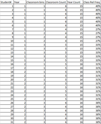
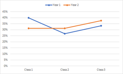
I want to use Power BI to produce both a table and graph as pictured above.
The scenario is as follows: Students are being tracked according to their Year and Classroom,
I want to determine the count of each classroom and then a count of the Year.
Then, I want to produce a relative freq, taking into account the classroom count divided by the year count.
If I were only dealing with one year and one classroom, I would probably use the following formula:
CRFreq = CALCULATE( COUNT('Student Population Table' [Year], ALLEXCEPT('Student Population Table', 'Student Population Table' [Classroom bins])
YFreq = CALCULATE([CRFreq], ALL('Student Population Table')
Using DIVIDE, I could then use CRFreq as my numerator and YFreq as my denominator.
Where I am stumped is how to introduce the more complicated facets of more categories. I've tried various things but keep failing. Any help that can be provided will be greatly appreciated. Also, thank you for your patience to my newness to Power BI.
Please note that I am aware that by creating bins and through the use of a matrix, I can get the values I want. However, what I cannot do is get the data to print to a graph as I want. It will print as a frequency, but not a relative frequency.
Solved! Go to Solution.
- Mark as New
- Bookmark
- Subscribe
- Mute
- Subscribe to RSS Feed
- Permalink
- Report Inappropriate Content
My initial attempt to describe what I am trying to do was poor. I apologize.
I will try again, but use a different scenario.
Let us say that we have data from different laboratories.
One data point tells us the duration to take a widget from point A to point B. Let's call this data point "Widget Time". With various widget times, I understand that I must place them into bins. In fact, I used the new group feature to create these bins (0,2,4,6,8 minutes).
As for the labs, they were initially listed by names. I did not want the names to appear in the data. Thus, duplicated my query (let's call it query 2), and ridded it of all columns except lab names. I removed duplicate names from the query and then indexed the remaining names. Next, pulled the lab numbers back into query1 by merging query2 into query 1. Ultimately, I ended up creating bins for the lab numbers. I did this as my initial attempts to produce a graph from query1 failed and I hoped that producing the Lab # bins might help. Sadly, it did not.
Now, for visuals, one can easily use the matrix to break the data out by lab number and widget bins (Widget bins in columns, Lab bins in rows, and widget times in Values, but presented as percentage of row total. I love the way the matrix presents the data, but I am not as fortunate to transform this exact data output into a graph. From query1, I can produce a frequency, but not a relative frequency.
To produce the relative frequency graph, I do the following:
(1) In query1, I create a new column. In this column, I am basically binning the widget times again, but I do it with an "If" formula (If widget time is <4 then 0, else if less than 8 then 4, etc. etc.). Let's call this WidgeBin2. This step seems unnecessary but I could not get the graph to present properly using the bins created by PBI.
(2) I split off the query into query3. Then, I use the group button to group by lab bin # and WidgeBin2. shows count for each widget bin at each lab.
(3) Next, I split off query3 into query4, but I change the grouping to be for Lab Bin# only. This produces the count of total widget times for each lab. I set this query to not load.
(4) I use the "Merge Query" to bring the lab bin count from query4 into query3.
(5) I add a column to calculate the relative frequency (each widget bin count for each lab divided by the total widget count for each lab). I format this as percent. This columns is labeled as RelFreq.
(6)On closing and loading the data, I chose the line chart visual. Then, from query3, I loaded the following: (a) Into the Axis Field, I placed the WidgeBin2, (b) Into Legend, I placed Lab # but specified "Do Not Summarize", (c) Into Values, I placed RelFreq and presented it as averages.
I would not be surprised if there is a better way to approach this. In fact, if someone discovers a better way, please share. For now, this is the only solution I am able to produce. I hope this helps anyone who may be trying to do the same.
I did review the suggestion for Dynaminc Binning/Bucketing, but at this time, I am not certain how I can use this to produce the desired outcome. Many thanks @amitchandak for your help!
- Mark as New
- Bookmark
- Subscribe
- Mute
- Subscribe to RSS Feed
- Permalink
- Report Inappropriate Content
@CPIBecklon , The information you have provided is not making the problem clear to me. Can you please explain with an example.
Sorry, I am not able related your formula with what you want to achieve.
Appreciate your Kudos.
Also, have you tried binning or segmentation using an independent table. if not then refer if these examples can help
Dynamic Segmentation Bucketing Binning
https://community.powerbi.com/t5/Quick-Measures-Gallery/Dynamic-Segmentation-Bucketing-Binning/m-p/1...
Dynamic Segmentation, Bucketing or Binning: https://youtu.be/CuczXPj0N-k
Microsoft Power BI Learning Resources, 2023 !!
Learn Power BI - Full Course with Dec-2022, with Window, Index, Offset, 100+ Topics !!
Did I answer your question? Mark my post as a solution! Appreciate your Kudos !! Proud to be a Super User! !!
Helpful resources

Microsoft Fabric Learn Together
Covering the world! 9:00-10:30 AM Sydney, 4:00-5:30 PM CET (Paris/Berlin), 7:00-8:30 PM Mexico City

Power BI Monthly Update - April 2024
Check out the April 2024 Power BI update to learn about new features.

| User | Count |
|---|---|
| 99 | |
| 99 | |
| 80 | |
| 77 | |
| 66 |
| User | Count |
|---|---|
| 134 | |
| 106 | |
| 104 | |
| 85 | |
| 73 |


