- Power BI forums
- Updates
- News & Announcements
- Get Help with Power BI
- Desktop
- Service
- Report Server
- Power Query
- Mobile Apps
- Developer
- DAX Commands and Tips
- Custom Visuals Development Discussion
- Health and Life Sciences
- Power BI Spanish forums
- Translated Spanish Desktop
- Power Platform Integration - Better Together!
- Power Platform Integrations (Read-only)
- Power Platform and Dynamics 365 Integrations (Read-only)
- Training and Consulting
- Instructor Led Training
- Dashboard in a Day for Women, by Women
- Galleries
- Community Connections & How-To Videos
- COVID-19 Data Stories Gallery
- Themes Gallery
- Data Stories Gallery
- R Script Showcase
- Webinars and Video Gallery
- Quick Measures Gallery
- 2021 MSBizAppsSummit Gallery
- 2020 MSBizAppsSummit Gallery
- 2019 MSBizAppsSummit Gallery
- Events
- Ideas
- Custom Visuals Ideas
- Issues
- Issues
- Events
- Upcoming Events
- Community Blog
- Power BI Community Blog
- Custom Visuals Community Blog
- Community Support
- Community Accounts & Registration
- Using the Community
- Community Feedback
Register now to learn Fabric in free live sessions led by the best Microsoft experts. From Apr 16 to May 9, in English and Spanish.
- Power BI forums
- Forums
- Get Help with Power BI
- Desktop
- Fixed category values in radar chart visual in pre...
- Subscribe to RSS Feed
- Mark Topic as New
- Mark Topic as Read
- Float this Topic for Current User
- Bookmark
- Subscribe
- Printer Friendly Page
- Mark as New
- Bookmark
- Subscribe
- Mute
- Subscribe to RSS Feed
- Permalink
- Report Inappropriate Content
Fixed category values in radar chart visual in presence of other slicers
Hello,
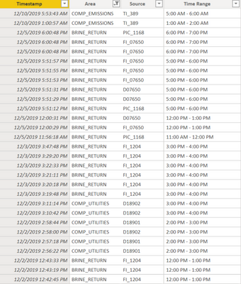
I have some industrial data consisting of 4 columns.
Here, the source denotes the name of the alarm, the timestamp shows the exact time the alarm occured, the area shows the area of the plant from whic the alarm originated. The time range is a calculated column which acts as the category axis for the radar chart. If the alarm occurs between 1 PM and 2 PM, the time range is 1 PM - 2 PM and so on.
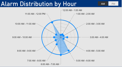
My full dataset has alarms for the whole 24 hour period in a day and I have two radar charts for the time range 12 AM to 12 PM and 12 PM to 12 AM. I am basically trying to show the number of alarms in the two radar charts and make the radar chart look like a clock. So each category (Time Range) in the radar chart shows the number of alarms in that category (Time Range). It looks like this:
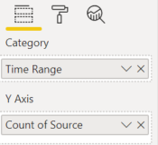
The values in the radar chart are:
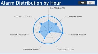
So far, it works perfectly. However, I also need to add a slicer for the area so that the customer can select the area and see the number of alarms only for a particular area on the same radar chart as above. Problem is that, not all areas generate alarms in all the time ranges during the day. Some area might only generate a couple of alarms during the day. Beacuse of this, when I add an area slicer, the radar chart shape changes. An example of this is:
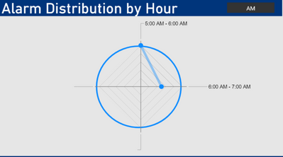
The axis of the radar chart changes and it no longer looks like a clock. Or an even worse example:
Is there a way to add this area slicer without affecting the radar chart categories such that the area which only has two alarms a day, for instance, the radar chart should show the number of alarms for that area in the time range in which it occurs, and show a value of 0 for the other time ranges? My main aim is to preserve the clock like face of the radar chart.
Thank you,
Any help will be greatly appreciated.
- Mark as New
- Bookmark
- Subscribe
- Mute
- Subscribe to RSS Feed
- Permalink
- Report Inappropriate Content
Hi @uni_student,
According to my investigation , currently there is no setting or method to fix this category of radar chart. Only the corresponding category and values are displayed on the radar chart when use the slicer to make filter. Maybe you can contact Power BI Custom Visuals Support to submit your requirement.
Best Regards
Rena
If this post helps, then please consider Accept it as the solution to help the other members find it more quickly.
Helpful resources

Microsoft Fabric Learn Together
Covering the world! 9:00-10:30 AM Sydney, 4:00-5:30 PM CET (Paris/Berlin), 7:00-8:30 PM Mexico City

Power BI Monthly Update - April 2024
Check out the April 2024 Power BI update to learn about new features.

| User | Count |
|---|---|
| 113 | |
| 103 | |
| 75 | |
| 66 | |
| 63 |
| User | Count |
|---|---|
| 142 | |
| 105 | |
| 102 | |
| 81 | |
| 68 |
