- Power BI forums
- Updates
- News & Announcements
- Get Help with Power BI
- Desktop
- Service
- Report Server
- Power Query
- Mobile Apps
- Developer
- DAX Commands and Tips
- Custom Visuals Development Discussion
- Health and Life Sciences
- Power BI Spanish forums
- Translated Spanish Desktop
- Power Platform Integration - Better Together!
- Power Platform Integrations (Read-only)
- Power Platform and Dynamics 365 Integrations (Read-only)
- Training and Consulting
- Instructor Led Training
- Dashboard in a Day for Women, by Women
- Galleries
- Community Connections & How-To Videos
- COVID-19 Data Stories Gallery
- Themes Gallery
- Data Stories Gallery
- R Script Showcase
- Webinars and Video Gallery
- Quick Measures Gallery
- 2021 MSBizAppsSummit Gallery
- 2020 MSBizAppsSummit Gallery
- 2019 MSBizAppsSummit Gallery
- Events
- Ideas
- Custom Visuals Ideas
- Issues
- Issues
- Events
- Upcoming Events
- Community Blog
- Power BI Community Blog
- Custom Visuals Community Blog
- Community Support
- Community Accounts & Registration
- Using the Community
- Community Feedback
Register now to learn Fabric in free live sessions led by the best Microsoft experts. From Apr 16 to May 9, in English and Spanish.
- Power BI forums
- Forums
- Get Help with Power BI
- Desktop
- Re: Serial label error in line chart
- Subscribe to RSS Feed
- Mark Topic as New
- Mark Topic as Read
- Float this Topic for Current User
- Bookmark
- Subscribe
- Printer Friendly Page
- Mark as New
- Bookmark
- Subscribe
- Mute
- Subscribe to RSS Feed
- Permalink
- Report Inappropriate Content
Error in Series label in line graph
Good morning community, how are you?
I have a rare problem with the data labels of a line graph, but it also has a problem with the charting of areas and stacked areas. The label of the first value of the Y Axis always appears (??!). If I modify that first data of the Y axis, the label that always appears accompanies.
Case:
I have a measurement filter to be able to filter the lines in my chart
Filter:
Label display settings
Filter display:
Chart display
Can you tell me if it is a mistake or if there are any additional settings that I am passing?
Thank you!
- Mark as New
- Bookmark
- Subscribe
- Mute
- Subscribe to RSS Feed
- Permalink
- Report Inappropriate Content
Hello - I have the same problem, in my mind it's quite simple: I have a line chart and I'm using the series label as the legend is static and not helping my end users establish what they need to know, the problem is the first measure put in the "Values" for the line chart always shows its ugly head... even when the first measure is filtered out.
I do not believe this is a fault of the developer making the power bi dashboard - but is a problem in the programming of Power Bi itself.... I've seen this particular problem so many times in the last 2 years when developing charts for the major Hosptial I work in that I wish Microsoft would fix the problem eventually (hence my being back looking for a solution a year later after the first time I saw this pop its head..)
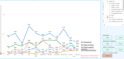
In my case I cant use a legend due to it being static and the amount of lines I'm running in the dashboard as we are looking at HAC's (Hospital Acquired Complications), and so I would like to use the "Series label" feature as is brilliant for allowing my end users to see the highest value for the period. It's really going well and I've made it so that they can drill down into the sub-hac's.. (so 30+ lines total)... but... the first meast measure is always there no matter how its filtered.!...
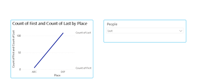
To help us look into this problem I've created a simple way of looking at it:
1) Here is some data for you to enter into a fresh power bi dashboard:
| Place | People | Category | Amount |
| ABC | Last | 1 | 5 |
| DEF | First | 2 | 45 |
| DEF | Last | 2 | 76 |
| ABC | First | 2 | 34 |
| DEF | Last | 1 | 32 |
2) Once the above table is loaded into Power Bi create 2 measures:
Measure 1 =

- Mark as New
- Bookmark
- Subscribe
- Mute
- Subscribe to RSS Feed
- Permalink
- Report Inappropriate Content
Thanks for the contribution, the truth is that I remade the graphic so many times trying to show the labels correctly that I already gave it for lost. As you point out, I'm not using this feature either, as it displays unselected data.
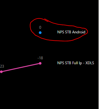
As an additional fact, if I open the chart in focus mode, the unselected measure has a value of 0.
I calculate that this is why it is shown in the graph.
Thanks again.
Best regards
- Mark as New
- Bookmark
- Subscribe
- Mute
- Subscribe to RSS Feed
- Permalink
- Report Inappropriate Content
Many thanks,
I never did add in my solution to this ongoing problem - it works every time for me so that I now use this for very specific data we use in health. I will add a screen shot which although not helpful, shows in my case that the first measure "." doesn't show if its at top or bottom. I also use a slider at left due to complexity of graph.

Solution:
What I do is create a dummy measure that is always higher than any other measure being used (I use counts and rates mostly - but rates per 100, 1,000 and 10,000 inpatients.
Then I make sure its always the first measure add to the graph values, I make the background of the chart and that individual measure the same colour. What I do notice though that instead of it always sitting at the bottom it goes to the top as is always highest.
The name of the dummy measure I use is: .
I love that I can add a single 'period' (or two) as a measure name, and change its colour, so handy whilst things aren't 99% "perfect".
Many thanks for your reply btw, much appreciated.
Kind regards
Andy from Clin Epi
- Mark as New
- Bookmark
- Subscribe
- Mute
- Subscribe to RSS Feed
- Permalink
- Report Inappropriate Content
Great workarround, works perfectly. Only in my case, according to the value of the measurements, I leave that new series at 0 and it is ready.
Thank you!
- Mark as New
- Bookmark
- Subscribe
- Mute
- Subscribe to RSS Feed
- Permalink
- Report Inappropriate Content
Hi @Davoo0o ,
Sorry, not very clear.
What does ’The label of the first value of the Y Axis always appears (??!). ‘ mean?
Does it mean that the fields you marked with yellow always appear? Can't remove fields?
Best Regards,
Stephen Tao
If this post helps, then please consider Accept it as the solution to help the other members find it more quickly.
- Mark as New
- Bookmark
- Subscribe
- Mute
- Subscribe to RSS Feed
- Permalink
- Report Inappropriate Content
Hi I've updated this thread/post for Series Label problem - I've expanded on the issue and provided data and examples of how its not working if you would like to have a go at seeing if you can find a solution?
Helpful resources

Microsoft Fabric Learn Together
Covering the world! 9:00-10:30 AM Sydney, 4:00-5:30 PM CET (Paris/Berlin), 7:00-8:30 PM Mexico City

Power BI Monthly Update - April 2024
Check out the April 2024 Power BI update to learn about new features.

| User | Count |
|---|---|
| 106 | |
| 104 | |
| 78 | |
| 68 | |
| 61 |
| User | Count |
|---|---|
| 144 | |
| 106 | |
| 106 | |
| 82 | |
| 70 |

