- Power BI forums
- Updates
- News & Announcements
- Get Help with Power BI
- Desktop
- Service
- Report Server
- Power Query
- Mobile Apps
- Developer
- DAX Commands and Tips
- Custom Visuals Development Discussion
- Health and Life Sciences
- Power BI Spanish forums
- Translated Spanish Desktop
- Power Platform Integration - Better Together!
- Power Platform Integrations (Read-only)
- Power Platform and Dynamics 365 Integrations (Read-only)
- Training and Consulting
- Instructor Led Training
- Dashboard in a Day for Women, by Women
- Galleries
- Community Connections & How-To Videos
- COVID-19 Data Stories Gallery
- Themes Gallery
- Data Stories Gallery
- R Script Showcase
- Webinars and Video Gallery
- Quick Measures Gallery
- 2021 MSBizAppsSummit Gallery
- 2020 MSBizAppsSummit Gallery
- 2019 MSBizAppsSummit Gallery
- Events
- Ideas
- Custom Visuals Ideas
- Issues
- Issues
- Events
- Upcoming Events
- Community Blog
- Power BI Community Blog
- Custom Visuals Community Blog
- Community Support
- Community Accounts & Registration
- Using the Community
- Community Feedback
Register now to learn Fabric in free live sessions led by the best Microsoft experts. From Apr 16 to May 9, in English and Spanish.
- Power BI forums
- Forums
- Get Help with Power BI
- Desktop
- Dynamic Cards, Switch, Select, conditional, Parame...
- Subscribe to RSS Feed
- Mark Topic as New
- Mark Topic as Read
- Float this Topic for Current User
- Bookmark
- Subscribe
- Printer Friendly Page
- Mark as New
- Bookmark
- Subscribe
- Mute
- Subscribe to RSS Feed
- Permalink
- Report Inappropriate Content
Dynamic Cards, Switch, Select, conditional, Parameters, Show/Hide Cards
Hello,
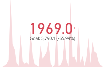
I have a question. I am using a KPI card to display some information. I have a "Actual Sales" which is my indicator, the trend axis is "State" and "Target Sales" is my target goal. (I also have it built as a ratio)
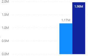
At the aggregate level my data looks wrong. It is summary sales, so I do not have date as a dimension. This is what I expected to see.
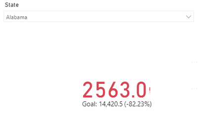
My expectation is to see the total, but I have no idea where the KPI numbers are coming from. Once I use a splicer to drill down to the state, the KPI functions properly.
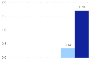
I should be getting 1.17M and 0.34 but the KPI is giving me 1969 and 0.15. Where are these numbers coming from.
My goal should be 1.98M but the KPI is giving me 5790.
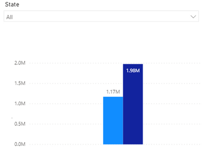
Is there someway to fix this or switch out a card? My though was to show the chart with the page is unfiltered by state. and when a state is selected, switch it to the KPI card. So it would look like this.
Is there a way to show or hide cards based on a condition, parameter or function?
Is it possible?
What would that look like and how can it be accomplished?
Or is there a way to fix the KPI configuration so that it shows indicators of 1.19M and 0.34 with targets of 1.98M and 1.7?
I know it has something to do with the State measure but can't figure it out? Can you add an "All" to the state dimension?
Solved! Go to Solution.
- Mark as New
- Bookmark
- Subscribe
- Mute
- Subscribe to RSS Feed
- Permalink
- Report Inappropriate Content
Hi @Anonymous ,
The KPI chart shows the number of the last axis value.
For example, your axis(state) have too many values, AXXX, BXXX,..... ZXXX.
Then when you put it to the KPI axis, the KPI value will show the sum of sales which state = ZXXX.
Hope I have clarified it.
I think you can try to use a custom visual for your request, or you can use two Cards to show actually and target(normally I will use this method).
Please try.
Aiolos Zhao
Did I answer your question? Mark my post as a solution!
Proud to be a Super User!
- Mark as New
- Bookmark
- Subscribe
- Mute
- Subscribe to RSS Feed
- Permalink
- Report Inappropriate Content
Hi @Anonymous ,
According to my understanding, your question is similar to this post.
You can refer to the explanation here: Re: KPI card visual. if you are not very clear about @AiolosZhao 's explanation.
Best Regards,
Icey
If this post helps, then please consider Accept it as the solution to help the other members find it more quickly.
- Mark as New
- Bookmark
- Subscribe
- Mute
- Subscribe to RSS Feed
- Permalink
- Report Inappropriate Content
Hi @Anonymous ,
The KPI chart shows the number of the last axis value.
For example, your axis(state) have too many values, AXXX, BXXX,..... ZXXX.
Then when you put it to the KPI axis, the KPI value will show the sum of sales which state = ZXXX.
Hope I have clarified it.
I think you can try to use a custom visual for your request, or you can use two Cards to show actually and target(normally I will use this method).
Please try.
Aiolos Zhao
Did I answer your question? Mark my post as a solution!
Proud to be a Super User!
Helpful resources

Microsoft Fabric Learn Together
Covering the world! 9:00-10:30 AM Sydney, 4:00-5:30 PM CET (Paris/Berlin), 7:00-8:30 PM Mexico City

Power BI Monthly Update - April 2024
Check out the April 2024 Power BI update to learn about new features.

| User | Count |
|---|---|
| 104 | |
| 95 | |
| 80 | |
| 67 | |
| 62 |
| User | Count |
|---|---|
| 146 | |
| 110 | |
| 107 | |
| 86 | |
| 63 |
