Jumpstart your career with the Fabric Career Hub
Find everything you need to get certified on Fabric—skills challenges, live sessions, exam prep, role guidance, and more.
Get started- Power BI forums
- Updates
- News & Announcements
- Get Help with Power BI
- Desktop
- Service
- Report Server
- Power Query
- Mobile Apps
- Developer
- DAX Commands and Tips
- Custom Visuals Development Discussion
- Health and Life Sciences
- Power BI Spanish forums
- Translated Spanish Desktop
- Power Platform Integration - Better Together!
- Power Platform Integrations (Read-only)
- Power Platform and Dynamics 365 Integrations (Read-only)
- Training and Consulting
- Instructor Led Training
- Dashboard in a Day for Women, by Women
- Galleries
- Community Connections & How-To Videos
- COVID-19 Data Stories Gallery
- Themes Gallery
- Data Stories Gallery
- R Script Showcase
- Webinars and Video Gallery
- Quick Measures Gallery
- 2021 MSBizAppsSummit Gallery
- 2020 MSBizAppsSummit Gallery
- 2019 MSBizAppsSummit Gallery
- Events
- Ideas
- Custom Visuals Ideas
- Issues
- Issues
- Events
- Upcoming Events
- Community Blog
- Power BI Community Blog
- Custom Visuals Community Blog
- Community Support
- Community Accounts & Registration
- Using the Community
- Community Feedback
Grow your Fabric skills and prepare for the DP-600 certification exam by completing the latest Microsoft Fabric challenge.
- Power BI forums
- Forums
- Get Help with Power BI
- Desktop
- Re: Deneb - dynamic axes values
- Subscribe to RSS Feed
- Mark Topic as New
- Mark Topic as Read
- Float this Topic for Current User
- Bookmark
- Subscribe
- Printer Friendly Page
- Mark as New
- Bookmark
- Subscribe
- Mute
- Subscribe to RSS Feed
- Permalink
- Report Inappropriate Content
Deneb - dynamic axes values
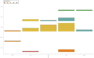
I have this chart
Notice that the y-axis is not to scale (specifically the 0.15). In theory, I could have data at any 0.05 multiple (up to 0.50) in the Y direction and any 0.10 multiple (0.1-0.9) in the X direction. I'd like the user to be able to select which X and Y values to include using filters; in particular, any values with no values (like y=0.25 in this example). This means I cannot include a scale in my Vega Lite. I'm also not able to show the axes as quantitative (destroys overall shape plus eliminates nominal choosing). What is a way to do this?
Also, bonus would be addition of gridlines that create appropriate boxes. Grid only seems to go from the labels through the middle of the stacks.
Here is the code (ProjCount is a measure = COUNT(Table[ProjName]))
{
  "data": {"name": "dataset"},
  "transform": [
    {
      "window": [
        {
          "op": "row_number",
          "as": "cell_order"
        }
      ],
      "groupby": ["X", "Y"],
      "sort": [
        {
          "field": "Project Name",
          "order": "descending"
        }
      ]
    },
    {
      "stack": "cell_order",
      "groupby": ["X", "Y"],
      "sort": [
        {
          "field": "Project Name",
          "order": "descending"
        }
      ],
      "as": ["ymin", "ymax"]
    }
  ],
  "layer": [
    {
      "mark": {
        "type": "bar",
        "stroke": "black",
        "strokeWidth": 0.5,
        "tooltip": true
      },
      "encoding": {
        "y": {
          "field": "Y",
          "type": "nominal",
          "stack": true
        },
        "yOffset": {
          "field": "ymin",
          "scale": {"reverse": true}
        },
        "color": {
          "field": "Overall Score",
          "type": "nominal",
          "scale": {
            "domain": [
              "1",
              "2",
              "3",
              "4",
              "5"
            ],
            "range": [
              "#e15759",
              "#f28e2b",
              "#edc948",
              "#76b7b2",
              "#59a14f"
            ]
          },
          "legend": {
            "orient": "none",
            "legendX": 0,
            "legendY": 0,
            "strokeColor": "black",
            "padding": 4,
            "direction": "horizontal",
            "symbolType": "square",
            "symbolStrokeWidth": 0.5,
            "symbolOpacity": 1,
            "fillColor": "white",
            "title": "Overall Score"
          }
        }
      }
    },
    {
      "mark": {
        "type": "text",
        "color": "black",
        "fontSize": 9
      },
      "encoding": {
        "yOffset": {
          "field": "ymin",
          "scale": {"reverse": true}
        }
      }
    }
  ],
  "encoding": {
    "x": {
      "field": "X",
      "type": "nominal",
      "sort": "ascending",
      "axis": {
        "title": "X",
        "domain": true,
        "ticks": true,
        "labelAngle": 0
      }
    },
    "y": {
      "field": "Y",
      "type": "nominal",
      "sort": "descending",
      "axis": {
        "title": "Y",
        "domain": true,
        "ticks": true
      }
    }
  }
}
Thanks.
- Mark as New
- Bookmark
- Subscribe
- Mute
- Subscribe to RSS Feed
- Permalink
- Report Inappropriate Content
Hi @patBear,
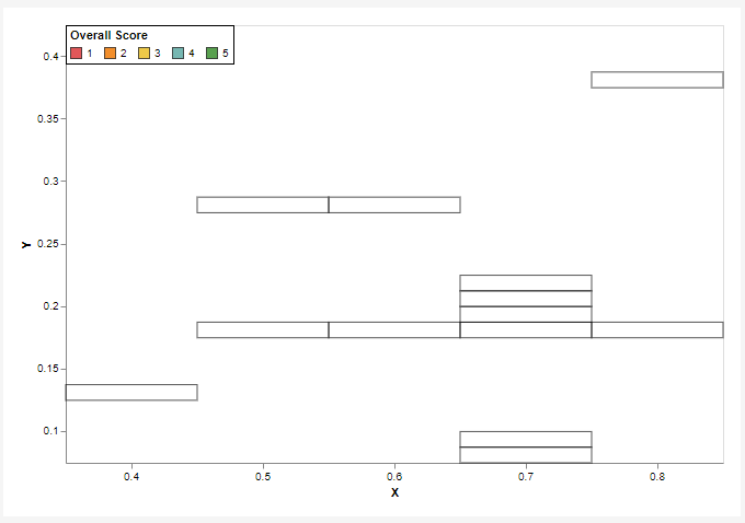
Just so I understand the challenge, I assume that you want to interpolate values into a categorical axis between min and max values of each domain?
Is this the kind of output you're looking for?
If so, I may have something, but it's expression-heavy, and assumes that your X and Y values are numeric (they're text in your supplied dataset). I just want to be sure I'm along the right track before I post a possible approach.
Thanks,
Daniel
Did I answer your question? Mark my post as a solution!
Proud to be a Super User!
My course: Introduction to Developing Power BI Visuals
On how to ask a technical question, if you really want an answer (courtesy of SQLBI)
- Mark as New
- Bookmark
- Subscribe
- Mute
- Subscribe to RSS Feed
- Permalink
- Report Inappropriate Content
@dm-p This is the general idea of the challenge. What I don't see in your image is where the user would be able to select which y (or x) values to include/exclude. So perhaps the user would like the y-axis to not show the 0.25 and 0.3 values (alternately, show only the 0.1, 0.15, 0.2, 0.35, and 0.4). Can that be done in your approach?
- Mark as New
- Bookmark
- Subscribe
- Mute
- Subscribe to RSS Feed
- Permalink
- Report Inappropriate Content
Would you mind providing the sample data as well?
- Mark as New
- Bookmark
- Subscribe
- Mute
- Subscribe to RSS Feed
- Permalink
- Report Inappropriate Content
Here is a portion of it that should be sufficient
{"Project Name": "a", "X": "0.7", "Y": "0.1", "Overall Score": 2}, {"Project Name": "b", "X": "0.7", "Y": "0.2", "Overall Score": 3}, {"Project Name": "c", "X": "0.8", "Y": "0.4", "Overall Score": 5}, {"Project Name": "d", "X": "0.7", "Y": "0.2", "Overall Score": 3}, {"Project Name": "e", "X": "0.8", "Y": "0.2", "Overall Score": 4}, {"Project Name": "f", "X": "0.5", "Y": "0.2", "Overall Score": 3}, {"Project Name": "g", "X": "0.7", "Y": "0.2", "Overall Score": 3}, {"Project Name": "h", "X": "0.6", "Y": "0.2", "Overall Score": 3}, {"Project Name": "i", "X": "0.6", "Y": "0.3", "Overall Score": 4}, {"Project Name": "j", "X": "0.7", "Y": "0.1", "Overall Score": 2}, {"Project Name": "k", "X": "0.5", "Y": "0.3", "Overall Score": 3}, {"Project Name": "l", "X": "0.7", "Y": "0.2", "Overall Score": 3}, {"Project Name": "al", "X": "0.4", "Y": "0.15", "Overall Score": 2}
Helpful resources
| User | Count |
|---|---|
| 86 | |
| 82 | |
| 68 | |
| 64 | |
| 55 |
| User | Count |
|---|---|
| 120 | |
| 99 | |
| 91 | |
| 83 | |
| 65 |


