- Power BI forums
- Updates
- News & Announcements
- Get Help with Power BI
- Desktop
- Service
- Report Server
- Power Query
- Mobile Apps
- Developer
- DAX Commands and Tips
- Custom Visuals Development Discussion
- Health and Life Sciences
- Power BI Spanish forums
- Translated Spanish Desktop
- Power Platform Integration - Better Together!
- Power Platform Integrations (Read-only)
- Power Platform and Dynamics 365 Integrations (Read-only)
- Training and Consulting
- Instructor Led Training
- Dashboard in a Day for Women, by Women
- Galleries
- Community Connections & How-To Videos
- COVID-19 Data Stories Gallery
- Themes Gallery
- Data Stories Gallery
- R Script Showcase
- Webinars and Video Gallery
- Quick Measures Gallery
- 2021 MSBizAppsSummit Gallery
- 2020 MSBizAppsSummit Gallery
- 2019 MSBizAppsSummit Gallery
- Events
- Ideas
- Custom Visuals Ideas
- Issues
- Issues
- Events
- Upcoming Events
- Community Blog
- Power BI Community Blog
- Custom Visuals Community Blog
- Community Support
- Community Accounts & Registration
- Using the Community
- Community Feedback
Register now to learn Fabric in free live sessions led by the best Microsoft experts. From Apr 16 to May 9, in English and Spanish.
- Power BI forums
- Forums
- Get Help with Power BI
- Desktop
- Re: Data tables - need help
- Subscribe to RSS Feed
- Mark Topic as New
- Mark Topic as Read
- Float this Topic for Current User
- Bookmark
- Subscribe
- Printer Friendly Page
- Mark as New
- Bookmark
- Subscribe
- Mute
- Subscribe to RSS Feed
- Permalink
- Report Inappropriate Content
Data tables - need help
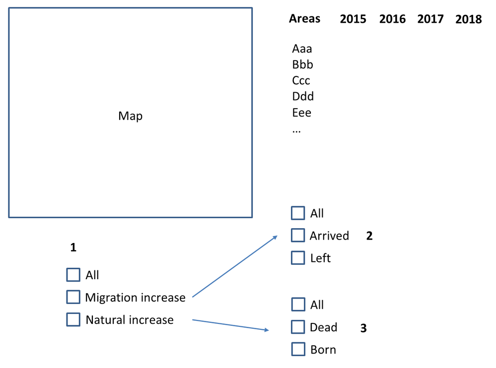
Hello guys! I wanna build smth. like this (screenshot) but I can’t get the way to build my general tables. What columns do I need to create in my excel file?
And 1 more thing. Is it possible when I press “All”(1) there are 4 filters (2 and 3), when I press “Migration increase” or ”Natural increase” there are only 2 filters (2 or 3 depend on the pressed button)?
- Mark as New
- Bookmark
- Subscribe
- Mute
- Subscribe to RSS Feed
- Permalink
- Report Inappropriate Content
Not exactly sure what you are going for here. Do you not have any source data? What does it look like? Please see this post regarding How to Get Your Question Answered Quickly: https://community.powerbi.com/t5/Community-Blog/How-to-Get-Your-Question-Answered-Quickly/ba-p/38490
@ me in replies or I'll lose your thread!!!
Instead of a Kudo, please vote for this idea
Become an expert!: Enterprise DNA
External Tools: MSHGQM
YouTube Channel!: Microsoft Hates Greg
Latest book!: The Definitive Guide to Power Query (M)
DAX is easy, CALCULATE makes DAX hard...
- Mark as New
- Bookmark
- Subscribe
- Mute
- Subscribe to RSS Feed
- Permalink
- Report Inappropriate Content
I want to repeat this work http://aitoff.ru/migrationrbt (1-st widget) but i'm not sure what columns do i need to create in my microsoft excel file.
- Mark as New
- Bookmark
- Subscribe
- Mute
- Subscribe to RSS Feed
- Permalink
- Report Inappropriate Content
Hi @rocky777,
Not quite understand about what you want. What is smth? Please share us more information about your requirement. If you want to display a picture, you just need this picture URL. And set its Data Category to Image URL in Power BI.
For your second question. It is able to achieve. You just need to create relationship between these filters. And what are the relationships?
Thanks,
Xi Jin.
- Mark as New
- Bookmark
- Subscribe
- Mute
- Subscribe to RSS Feed
- Permalink
- Report Inappropriate Content
That picture is the example I want my project to look like. I need to build a comparison table (Area / Years). Values depend on the pressed filter (“Migration increase”, “Natural increase”, “arrived”, “left”, “born”, “dead”).
“Migration increase” = “arrived” – “left”
“Natural increase” = “born” – “dead”
I’d like to repeat this project http://aitoff.ru/migrationrbt (the 1-st widget).
Here is the data source: 4 the same tables 2015-2018 with different values.
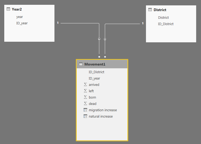
I don't know how to build the relationships properly to achive the desired result like in the project i linked above.
- Mark as New
- Bookmark
- Subscribe
- Mute
- Subscribe to RSS Feed
- Permalink
- Report Inappropriate Content
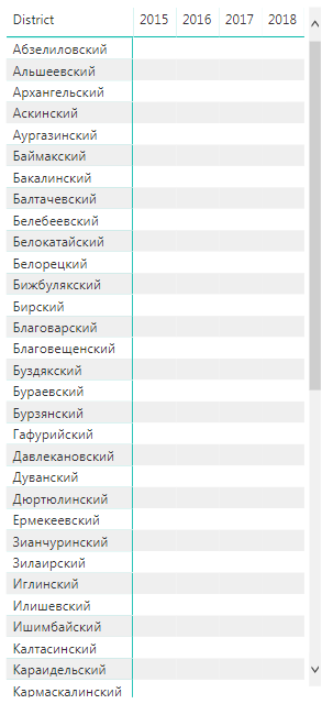
So here is the final table and the the screenshot with the relationships. Now i i'd like to add slicers (“Migration increase”, “Natural increase”, “arrived”, “left”, “born”, “dead”). The problem is that i don't understand what relationships i need to add to make those slicers.
One more time: I want slicers to look like when u press “Migration increase” there are 2 more (“arrived” and “left”), when you press “Natural increase” there are other 2 (“born” and “dead”), and both together.
“Migration increase” = “arrived” – “left”
“Natural increase” = “born” – “dead”
Thank you for your patience!
Helpful resources

Microsoft Fabric Learn Together
Covering the world! 9:00-10:30 AM Sydney, 4:00-5:30 PM CET (Paris/Berlin), 7:00-8:30 PM Mexico City

Power BI Monthly Update - April 2024
Check out the April 2024 Power BI update to learn about new features.

| User | Count |
|---|---|
| 104 | |
| 95 | |
| 80 | |
| 67 | |
| 62 |
| User | Count |
|---|---|
| 147 | |
| 109 | |
| 107 | |
| 85 | |
| 63 |


