- Power BI forums
- Updates
- News & Announcements
- Get Help with Power BI
- Desktop
- Service
- Report Server
- Power Query
- Mobile Apps
- Developer
- DAX Commands and Tips
- Custom Visuals Development Discussion
- Health and Life Sciences
- Power BI Spanish forums
- Translated Spanish Desktop
- Power Platform Integration - Better Together!
- Power Platform Integrations (Read-only)
- Power Platform and Dynamics 365 Integrations (Read-only)
- Training and Consulting
- Instructor Led Training
- Dashboard in a Day for Women, by Women
- Galleries
- Community Connections & How-To Videos
- COVID-19 Data Stories Gallery
- Themes Gallery
- Data Stories Gallery
- R Script Showcase
- Webinars and Video Gallery
- Quick Measures Gallery
- 2021 MSBizAppsSummit Gallery
- 2020 MSBizAppsSummit Gallery
- 2019 MSBizAppsSummit Gallery
- Events
- Ideas
- Custom Visuals Ideas
- Issues
- Issues
- Events
- Upcoming Events
- Community Blog
- Power BI Community Blog
- Custom Visuals Community Blog
- Community Support
- Community Accounts & Registration
- Using the Community
- Community Feedback
Register now to learn Fabric in free live sessions led by the best Microsoft experts. From Apr 16 to May 9, in English and Spanish.
- Power BI forums
- Forums
- Get Help with Power BI
- Desktop
- Re: Data color in table or matrix
- Subscribe to RSS Feed
- Mark Topic as New
- Mark Topic as Read
- Float this Topic for Current User
- Bookmark
- Subscribe
- Printer Friendly Page
- Mark as New
- Bookmark
- Subscribe
- Mute
- Subscribe to RSS Feed
- Permalink
- Report Inappropriate Content
Data color in table or matrix
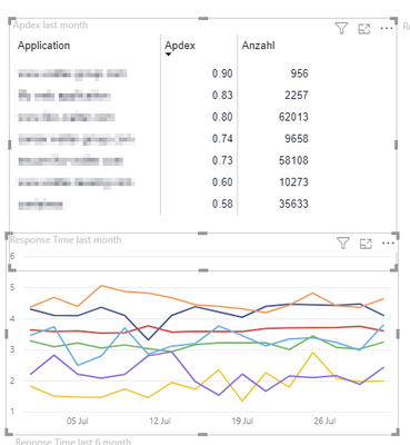
Hi, Is it possible to have the table entries (for example rows) in the data color (the one that is also used in the visualization for bars etc).
I don't see how I can fix that with conditional formatting and it should not be static of course.
This example, I'd like to be able to not display a legend below, because the color match the entries in the table (either background, dots, or text color would be fine).
Thanks for your help
- Mark as New
- Bookmark
- Subscribe
- Mute
- Subscribe to RSS Feed
- Permalink
- Report Inappropriate Content
HI @SysLostInBI,
Perhaps you can try to use the custom theme to setting default data color sets, these charts and visual will auto transformed colors based on color dataset defend if you used legend on your charts.
Use report themes in Power BI Desktop
AFAIK, conditions color formatting not works on the chart with legends. Perhaps you can refer to parry2k's suggestion to use R or python visual to manually plot your graph based on data table field values.
Regards,
Xiaoxin Sheng
If this post helps, please consider accept as solution to help other members find it more quickly.
- Mark as New
- Bookmark
- Subscribe
- Mute
- Subscribe to RSS Feed
- Permalink
- Report Inappropriate Content
Wow impressive, the amount of feedback in this short time.
I was pretty sure that my lack of experience is the problem - but seems to be a limitation.
All your help is much appreciated, I wonder why nobody mentioned an R script solution.
I'm not experienced enough yet - but do you think it is even possible / or the right solution to try it with an R script?
Btw, I'm not ignoring the solutions of using a table with colour or specify them with conditional-formating. I'm going to look into that of course.
- Mark as New
- Bookmark
- Subscribe
- Mute
- Subscribe to RSS Feed
- Permalink
- Report Inappropriate Content
@SysLostInBI you can surely use R script/visuals but you have to be careful when you publish these reports on Power BI Service and to make sure R libraries you use, supported by Power BI service, otherwise if you have the skill set, you can surely use it. Just be cautious.
Subscribe to the @PowerBIHowTo YT channel for an upcoming video on List and Record functions in Power Query!!
Learn Power BI and Fabric - subscribe to our YT channel - Click here: @PowerBIHowTo
If my solution proved useful, I'd be delighted to receive Kudos. When you put effort into asking a question, it's equally thoughtful to acknowledge and give Kudos to the individual who helped you solve the problem. It's a small gesture that shows appreciation and encouragement! ❤
Did I answer your question? Mark my post as a solution. Proud to be a Super User! Appreciate your Kudos 🙂
Feel free to email me with any of your BI needs.
- Mark as New
- Bookmark
- Subscribe
- Mute
- Subscribe to RSS Feed
- Permalink
- Report Inappropriate Content
Currently there's no 'automatic' way to link the colors used in the line chart to those used in the matrix/table.
There's a modified work around you may consider - if you only have a handful of potential 'applications' - as it does involve setting the colors. Consider the following:
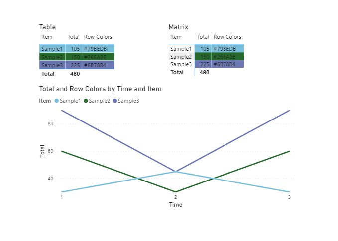
In this example - you could use a SWITCH statement to declare the color of each 'application':
Then set the conditional formatting of each column to "Field Value" - and point it to this formula.
However, once it's set up - it should persist - even as applications come and go. But it will not account for new applications that aren't included in the list.
- Mark as New
- Bookmark
- Subscribe
- Mute
- Subscribe to RSS Feed
- Permalink
- Report Inappropriate Content
This is the closest thing I could find currently available, but I don't it it will help, as when you add Application to the Legend of the Bar Chart, it will override these conditional colors...
https://powerbi.jamesdales.com/2019/02/21/line-charts-with-conditional-formatting/
Hope you find something!
FOrrest
Please give Kudos or Mark as a Solution!
https://www.linkedin.com/in/forrest-hill-04480730/
Proud to give back to the community!
Thank You!
- Mark as New
- Bookmark
- Subscribe
- Mute
- Subscribe to RSS Feed
- Permalink
- Report Inappropriate Content
@SysLostInBI While you can't adjust the legend on a visual, you can try to match that matrix to match it.
I have data by US state names, and when I put that on a line chart, it defaults the legend to be alphabetical and the colors run through default colors.
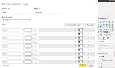
1. In transform data: I created a dimension table for the states, by duplicating the data table, choosing only the states column, removing duplicates, sorting it alphabetical, then added an Index Column. The goal is to get 0-49 for each of the state names starting with Alabama. It's great to that here so that if say a new state does get added, it will just add it automatically.
2. After applying those changes, I create a relationship to that dimension table on the state name. and change where i used that state name in my visuals to use the new dimension table version.
3. I then created a measure to get me the that index.

Just go across the top in the default colors, then 2nd row, etc. Mine also had some greens, so I just went and got it from the data colors that defaulted in on the line chart.
Respectfully,
Zoe Douglas (DataZoe)
Follow me on LinkedIn at https://www.linkedin.com/in/zoedouglas-data
See my reports and blog at https://www.datazoepowerbi.com/
- Mark as New
- Bookmark
- Subscribe
- Mute
- Subscribe to RSS Feed
- Permalink
- Report Inappropriate Content
Hi @SysLostInBI
I would have loved if Power BI had a extensive functiolality like this.
You can post a Idea for the same.
As of Now, I would manually select the color for each datra in line chart conditional formatting is not an option for this
, and conditionally format the top chart.
Did I resolve your issue? Mark my post as a solution! Appreciate your Kudos, Press the thumbs up button!!
Regards,
Pranit
Hope it resolves your issue? Did I answer your question? Mark my post as a solution! Appreciate your Kudos, Press the thumbs up button!! Linkedin Profile |
- Mark as New
- Bookmark
- Subscribe
- Mute
- Subscribe to RSS Feed
- Permalink
- Report Inappropriate Content
@SysLostInBI , Conditional formatting can not be done visual using legends
Microsoft Power BI Learning Resources, 2023 !!
Learn Power BI - Full Course with Dec-2022, with Window, Index, Offset, 100+ Topics !!
Did I answer your question? Mark my post as a solution! Appreciate your Kudos !! Proud to be a Super User! !!
Helpful resources

Microsoft Fabric Learn Together
Covering the world! 9:00-10:30 AM Sydney, 4:00-5:30 PM CET (Paris/Berlin), 7:00-8:30 PM Mexico City

Power BI Monthly Update - April 2024
Check out the April 2024 Power BI update to learn about new features.

| User | Count |
|---|---|
| 106 | |
| 105 | |
| 79 | |
| 69 | |
| 61 |
| User | Count |
|---|---|
| 143 | |
| 104 | |
| 103 | |
| 82 | |
| 70 |


