- Power BI forums
- Updates
- News & Announcements
- Get Help with Power BI
- Desktop
- Service
- Report Server
- Power Query
- Mobile Apps
- Developer
- DAX Commands and Tips
- Custom Visuals Development Discussion
- Health and Life Sciences
- Power BI Spanish forums
- Translated Spanish Desktop
- Power Platform Integration - Better Together!
- Power Platform Integrations (Read-only)
- Power Platform and Dynamics 365 Integrations (Read-only)
- Training and Consulting
- Instructor Led Training
- Dashboard in a Day for Women, by Women
- Galleries
- Community Connections & How-To Videos
- COVID-19 Data Stories Gallery
- Themes Gallery
- Data Stories Gallery
- R Script Showcase
- Webinars and Video Gallery
- Quick Measures Gallery
- 2021 MSBizAppsSummit Gallery
- 2020 MSBizAppsSummit Gallery
- 2019 MSBizAppsSummit Gallery
- Events
- Ideas
- Custom Visuals Ideas
- Issues
- Issues
- Events
- Upcoming Events
- Community Blog
- Power BI Community Blog
- Custom Visuals Community Blog
- Community Support
- Community Accounts & Registration
- Using the Community
- Community Feedback
Register now to learn Fabric in free live sessions led by the best Microsoft experts. From Apr 16 to May 9, in English and Spanish.
- Power BI forums
- Forums
- Get Help with Power BI
- Desktop
- Re: Creating a line chart using non summarized val...
- Subscribe to RSS Feed
- Mark Topic as New
- Mark Topic as Read
- Float this Topic for Current User
- Bookmark
- Subscribe
- Printer Friendly Page
- Mark as New
- Bookmark
- Subscribe
- Mute
- Subscribe to RSS Feed
- Permalink
- Report Inappropriate Content
Creating a line chart using non summarized values
I'm looking to do a simple line chart with a date range as the X axis, and the actual value of 4 different scenarios overlapping as the Y axis. So data table looks something like this:
| Month | Base | Large | Moderate | Small | Flat |
| 10/1/2017 | 250000 | 250000 | 250000 | 250000 | 250000 |
| 11/1/2017 | 250000 | 256780 | 256780 | 250000 | 250000 |
| 12/1/2017 | 250000 | 266280 | 266280 | 259500 | 250000 |
| 1/1/2018 | 250000 | 279594 | 279594 | 272475 | 262500 |
| 2/1/2018 | 250000 | 279594 | 279594 | 272475 | 262500 |
| 3/1/2018 | 250000 | 283094 | 283094 | 272475 | 262500 |
| 4/1/2018 | 250000 | 283094 | 283094 | 272475 | 262500 |
| 5/1/2018 | 250000 | 291594 | 291594 | 280975 | 262500 |
It seems the line or area chart constantly summarize the columns of data in some way. I've already ensured that in the modeling tab - all values are correctly formatted to decimal number or date as appropriate.
This is crazy simple in Excel as you can simply highlight the table and Insert - Line Chart, but I'd prefer to take advantage of the formatting capabilities of Power BI is possible.
Solved! Go to Solution.
- Mark as New
- Bookmark
- Subscribe
- Mute
- Subscribe to RSS Feed
- Permalink
- Report Inappropriate Content
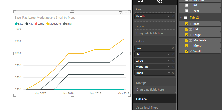
I copied and pasted your data into PowerBI, is this what you are trying to build? My numbers are Whole Numbers instead of Decimals, but it shoudln't make a difference... Un-hiearchy your date, does that help resolve the gropuing? All my values are set to SUM, but that's OK b/c I have each date listed on the Axis.
FOrrest
Please give Kudos or Mark as a Solution!
https://www.linkedin.com/in/forrest-hill-04480730/
Proud to give back to the community!
Thank You!
- Mark as New
- Bookmark
- Subscribe
- Mute
- Subscribe to RSS Feed
- Permalink
- Report Inappropriate Content
I guess removing the hierarchy does it. More fundamentally though, i guess there's no way to actually choose not to aggregate data.
Any chance you know how to get the X-axis to show more granularity?
Thanks much for the assistance
- Mark as New
- Bookmark
- Subscribe
- Mute
- Subscribe to RSS Feed
- Permalink
- Report Inappropriate Content
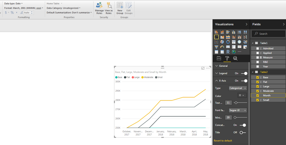
If you change the X-Axis Type to Categorial, it will list every value you provide (generally). Remember to change your Date Formatting to something like MMMM,yyyy so it's not overwhelming in length... Hope this helps...
Please give Kudos or Mark as a Solution!
https://www.linkedin.com/in/forrest-hill-04480730/
Proud to give back to the community!
Thank You!
Helpful resources

Microsoft Fabric Learn Together
Covering the world! 9:00-10:30 AM Sydney, 4:00-5:30 PM CET (Paris/Berlin), 7:00-8:30 PM Mexico City

Power BI Monthly Update - April 2024
Check out the April 2024 Power BI update to learn about new features.

| User | Count |
|---|---|
| 104 | |
| 96 | |
| 79 | |
| 67 | |
| 62 |
| User | Count |
|---|---|
| 137 | |
| 106 | |
| 104 | |
| 81 | |
| 63 |


