Jumpstart your career with the Fabric Career Hub
Find everything you need to get certified on Fabric—skills challenges, live sessions, exam prep, role guidance, and a 50 percent discount on exams.
Get started- Power BI forums
- Updates
- News & Announcements
- Get Help with Power BI
- Desktop
- Service
- Report Server
- Power Query
- Mobile Apps
- Developer
- DAX Commands and Tips
- Custom Visuals Development Discussion
- Health and Life Sciences
- Power BI Spanish forums
- Translated Spanish Desktop
- Power Platform Integration - Better Together!
- Power Platform Integrations (Read-only)
- Power Platform and Dynamics 365 Integrations (Read-only)
- Training and Consulting
- Instructor Led Training
- Dashboard in a Day for Women, by Women
- Galleries
- Community Connections & How-To Videos
- COVID-19 Data Stories Gallery
- Themes Gallery
- Data Stories Gallery
- R Script Showcase
- Webinars and Video Gallery
- Quick Measures Gallery
- 2021 MSBizAppsSummit Gallery
- 2020 MSBizAppsSummit Gallery
- 2019 MSBizAppsSummit Gallery
- Events
- Ideas
- Custom Visuals Ideas
- Issues
- Issues
- Events
- Upcoming Events
- Community Blog
- Power BI Community Blog
- Custom Visuals Community Blog
- Community Support
- Community Accounts & Registration
- Using the Community
- Community Feedback
Earn a 50% discount on the DP-600 certification exam by completing the Fabric 30 Days to Learn It challenge.
- Power BI forums
- Forums
- Get Help with Power BI
- Desktop
- Creating a Sankey Chart in Power BI
- Subscribe to RSS Feed
- Mark Topic as New
- Mark Topic as Read
- Float this Topic for Current User
- Bookmark
- Subscribe
- Printer Friendly Page
- Mark as New
- Bookmark
- Subscribe
- Mute
- Subscribe to RSS Feed
- Permalink
- Report Inappropriate Content
Creating a Sankey Chart in Power BI
Hello Power BI Community,
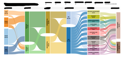
I've been tasked with converting Tableau reports to Power BI, and one of the challenges I'm encountering is recreating a Sankey chart similar to the one we have in Tableau. I've attached a screenshot of the Sankey chart from Tableau for reference.
In Tableau, I was able to create this Sankey chart using custom steps, but I'm aware that Power BI has certain limitations when it comes to creating complex visualisations like Sankey charts.
My specific question is:
**How can I create a Sankey chart in Power BI that resembles the one in Tableau?**
I'm looking for guidance on any workarounds, custom visualizations, or alternative techniques that can help me achieve a similar visualization in Power BI.
Any insights, tips, or recommended resources on creating Sankey charts in Power BI would be immensely helpful as I strive to maintain the functionality and visual appeal of our reports during the transition from Tableau to Power BI.
Thank you for your support and expertise.
Best regards,
Manoj Prabhakar
Solved! Go to Solution.
- Mark as New
- Bookmark
- Subscribe
- Mute
- Subscribe to RSS Feed
- Permalink
- Report Inappropriate Content
you can use the sankey chart custom vissualization.
now as you said, sankey chart are tricky in power bi and somehow complex.
Alertbo Russo in his video explains step by step how you should tackle this . (( from how your data table should be into how to create the sankey chart ) .
https://www.youtube.com/watch?v=dNrXOAfX6CM&t=859s
now the video is a little bit complex, but you can still watch it and gain alot of insights from it to be able to start working on creating your desired sankey .
(NB : you need to use some dax functions ( path functions ) ) --> https://dax.guide/path/
let me know if this helps .
If my answer helped sort things out for you, i would appreciate a thumbs up 👍 and mark it as the solution ✅
It makes a difference and might help someone else too. Thanks for spreading the good vibes! 🤠
Helpful resources
| User | Count |
|---|---|
| 96 | |
| 86 | |
| 78 | |
| 72 | |
| 67 |
| User | Count |
|---|---|
| 110 | |
| 104 | |
| 84 | |
| 65 | |
| 63 |


