- Power BI forums
- Updates
- News & Announcements
- Get Help with Power BI
- Desktop
- Service
- Report Server
- Power Query
- Mobile Apps
- Developer
- DAX Commands and Tips
- Custom Visuals Development Discussion
- Health and Life Sciences
- Power BI Spanish forums
- Translated Spanish Desktop
- Power Platform Integration - Better Together!
- Power Platform Integrations (Read-only)
- Power Platform and Dynamics 365 Integrations (Read-only)
- Training and Consulting
- Instructor Led Training
- Dashboard in a Day for Women, by Women
- Galleries
- Community Connections & How-To Videos
- COVID-19 Data Stories Gallery
- Themes Gallery
- Data Stories Gallery
- R Script Showcase
- Webinars and Video Gallery
- Quick Measures Gallery
- 2021 MSBizAppsSummit Gallery
- 2020 MSBizAppsSummit Gallery
- 2019 MSBizAppsSummit Gallery
- Events
- Ideas
- Custom Visuals Ideas
- Issues
- Issues
- Events
- Upcoming Events
- Community Blog
- Power BI Community Blog
- Custom Visuals Community Blog
- Community Support
- Community Accounts & Registration
- Using the Community
- Community Feedback
Register now to learn Fabric in free live sessions led by the best Microsoft experts. From Apr 16 to May 9, in English and Spanish.
- Power BI forums
- Forums
- Get Help with Power BI
- Desktop
- Creating a Column based on a Ranking Measure
- Subscribe to RSS Feed
- Mark Topic as New
- Mark Topic as Read
- Float this Topic for Current User
- Bookmark
- Subscribe
- Printer Friendly Page
- Mark as New
- Bookmark
- Subscribe
- Mute
- Subscribe to RSS Feed
- Permalink
- Report Inappropriate Content
Creating a Column based on a Ranking Measure
Hello Everyone!
I am trying to create a column based on the ranking of values.
Let me explain a bit more.
I have the following table:
| Color | Count |
| Black | 25 |
| Blue | 20 |
| Green | 15 |
| Brown | 14 |
| Purple | 12 |
| Red | 10 |
| Cyan | 9 |
I created a Ranking Measure that ranks the counts in descending order as follows:
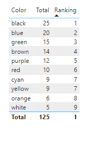
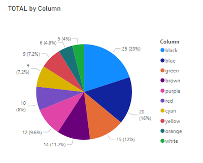
If I need to represent the data as a pie chart, this is what I get:
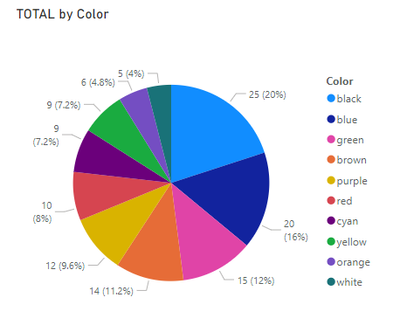
What I would like to see, is to have a Pie Chart with the top 3 colors and the rest of the colors labelled as "Other".
Since we cannot use a measure as a legend, I am guessing Im gonna have to create a column based on the ranking measure I created before and use that as my legend? Is that correct?
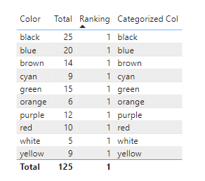
This is what I did:
Solved! Go to Solution.
- Mark as New
- Bookmark
- Subscribe
- Mute
- Subscribe to RSS Feed
- Permalink
- Report Inappropriate Content
Hi @Gladiator909 ,
According to your description, here are my steps you can follow as a solution.
(1) My test data is the same as yours.
(2) We can create a measure.
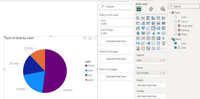
others total = SUMX(FILTER(ALL('Table'), not [Ranking] in {1,2,3}),[TOTAL])(3) We can create a table.
Table 2 =
var _a = SELECTCOLUMNS(FILTER('Table',[Ranking]  in {1,2,3}),"color",[Color],"total",[TOTAL])
var _b=ADDCOLUMNS(DATATABLE (
    "Color", STRING,
    {
        { "Others" }
    }
)
,"total",[others total])
return UNION(_a,_b)
(4) Then the result is as follows.
Best Regards,
Neeko Tang
If this post helps, then please consider Accept it as the solution to help the other members find it more quickly.
- Mark as New
- Bookmark
- Subscribe
- Mute
- Subscribe to RSS Feed
- Permalink
- Report Inappropriate Content
can you share what you got back, and also can you share your data in text format?
If I took the time to answer your question and I came up with a solution, please mark my post as a solution and /or give kudos freely for the effort 🙂 Thank you!
Proud to be a Super User!
- Mark as New
- Bookmark
- Subscribe
- Mute
- Subscribe to RSS Feed
- Permalink
- Report Inappropriate Content
@vanessafvg Thanks for the reply.
The pie chart looks like this:
I think its because the underlying table looks like this now:
its not letting me attach the table as a text file. Any idea how I can do that?
- Mark as New
- Bookmark
- Subscribe
- Mute
- Subscribe to RSS Feed
- Permalink
- Report Inappropriate Content
just copy and past the text in, that should be good enough.
If I took the time to answer your question and I came up with a solution, please mark my post as a solution and /or give kudos freely for the effort 🙂 Thank you!
Proud to be a Super User!
- Mark as New
- Bookmark
- Subscribe
- Mute
- Subscribe to RSS Feed
- Permalink
- Report Inappropriate Content
Thank you for your help.
Color Count
red 10
blue 20
green 15
yellow 9
white 5
black 25
purple 12
orange 6
cyan 9
brown 14
- Mark as New
- Bookmark
- Subscribe
- Mute
- Subscribe to RSS Feed
- Permalink
- Report Inappropriate Content
You are on the right track with SWITCH, just think the syntax is incorrect:
New Category = SWITCH(
                  TRUE(),
                  [Ranking]<=3,'Table'[Color],
                  "Other" )
Then use this new column in your pie chart visual.
If this does not resolve your issue, google something like "power bi group others" and pretty sure you will find a solution there.
Regards,
Helpful resources

Microsoft Fabric Learn Together
Covering the world! 9:00-10:30 AM Sydney, 4:00-5:30 PM CET (Paris/Berlin), 7:00-8:30 PM Mexico City

Power BI Monthly Update - April 2024
Check out the April 2024 Power BI update to learn about new features.

| User | Count |
|---|---|
| 100 | |
| 99 | |
| 76 | |
| 67 | |
| 61 |
| User | Count |
|---|---|
| 142 | |
| 106 | |
| 103 | |
| 85 | |
| 70 |
