Jumpstart your career with the Fabric Career Hub
Find everything you need to get certified on Fabric—skills challenges, live sessions, exam prep, role guidance, and a 50 percent discount on exams.
Get started- Power BI forums
- Updates
- News & Announcements
- Get Help with Power BI
- Desktop
- Service
- Report Server
- Power Query
- Mobile Apps
- Developer
- DAX Commands and Tips
- Custom Visuals Development Discussion
- Health and Life Sciences
- Power BI Spanish forums
- Translated Spanish Desktop
- Power Platform Integration - Better Together!
- Power Platform Integrations (Read-only)
- Power Platform and Dynamics 365 Integrations (Read-only)
- Training and Consulting
- Instructor Led Training
- Dashboard in a Day for Women, by Women
- Galleries
- Community Connections & How-To Videos
- COVID-19 Data Stories Gallery
- Themes Gallery
- Data Stories Gallery
- R Script Showcase
- Webinars and Video Gallery
- Quick Measures Gallery
- 2021 MSBizAppsSummit Gallery
- 2020 MSBizAppsSummit Gallery
- 2019 MSBizAppsSummit Gallery
- Events
- Ideas
- Custom Visuals Ideas
- Issues
- Issues
- Events
- Upcoming Events
- Community Blog
- Power BI Community Blog
- Custom Visuals Community Blog
- Community Support
- Community Accounts & Registration
- Using the Community
- Community Feedback
Earn a 50% discount on the DP-600 certification exam by completing the Fabric 30 Days to Learn It challenge.
- Power BI forums
- Forums
- Get Help with Power BI
- Desktop
- Re: Create a dashboard by Quarter
- Subscribe to RSS Feed
- Mark Topic as New
- Mark Topic as Read
- Float this Topic for Current User
- Bookmark
- Subscribe
- Printer Friendly Page
- Mark as New
- Bookmark
- Subscribe
- Mute
- Subscribe to RSS Feed
- Permalink
- Report Inappropriate Content
Create a dashboard by Quarter
Hello,
I have a spreadsheet with 3 colums. User, Date and Quarter (1,2,3,4). I want to create a bar chart Dashboard that shows how many users are in Quarter 1, 2, 3 and 4. My guess is some how I need to add up each user? but I'm new to Power Bi. So, looking for any guidance or ideas.
Thank you!
Solved! Go to Solution.
- Mark as New
- Bookmark
- Subscribe
- Mute
- Subscribe to RSS Feed
- Permalink
- Report Inappropriate Content
Hey @Anonymous ,
import the spreadsheet to Power BI Desktop, after that you will have a table named like the sheet of the spreadsheet.
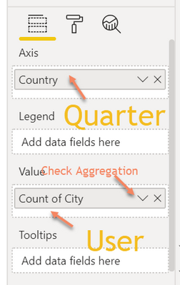
Create a clustered column chart (make sure the chart is selected), drag the quarter column to the Axis, and the User column to the Value field of the chart. Make sure that the aggregation function Count (Distinct) is selected, by using the little arrow inside the field:
Hopefully, this gets you started.
Maybe this site will provide valuable information: https://docs.microsoft.com/en-us/power-bi/guided-learning/
Regards,
Tom
Did I answer your question? Mark my post as a solution, this will help others!
Proud to be a Super User!
I accept Kudos 😉
Hamburg, Germany
- Mark as New
- Bookmark
- Subscribe
- Mute
- Subscribe to RSS Feed
- Permalink
- Report Inappropriate Content
Hey @Anonymous
This is actually fairly simple. Once you have the spreadsheet in Power BI:
1. Click the Bar Chart visual
2. Then in the field pane drag your date to the axis.
3. Then, if it didn't automatically create the date hierarchy you can do so by clicking the drop-down menu on the value in the pane.
4. Then simply delete the Year, Month, and Day items by clicking the "x" next to them and you are left with the Quarter.
5. Then drag your User column to the Value section in the field pane. From here you can click the drop-down menu to select count or distinct count depening on if you want all instances of users or only the number of individual users who appear within the given quarter.
If this helps please kudo.
If this solves your problem please accept it as a solution.
- Mark as New
- Bookmark
- Subscribe
- Mute
- Subscribe to RSS Feed
- Permalink
- Report Inappropriate Content
Hey @Anonymous ,
import the spreadsheet to Power BI Desktop, after that you will have a table named like the sheet of the spreadsheet.
Create a clustered column chart (make sure the chart is selected), drag the quarter column to the Axis, and the User column to the Value field of the chart. Make sure that the aggregation function Count (Distinct) is selected, by using the little arrow inside the field:
Hopefully, this gets you started.
Maybe this site will provide valuable information: https://docs.microsoft.com/en-us/power-bi/guided-learning/
Regards,
Tom
Did I answer your question? Mark my post as a solution, this will help others!
Proud to be a Super User!
I accept Kudos 😉
Hamburg, Germany
- Mark as New
- Bookmark
- Subscribe
- Mute
- Subscribe to RSS Feed
- Permalink
- Report Inappropriate Content
Tom, Thank you! This helped a lot.
Helpful resources
| User | Count |
|---|---|
| 90 | |
| 74 | |
| 67 | |
| 63 | |
| 55 |
| User | Count |
|---|---|
| 101 | |
| 92 | |
| 74 | |
| 60 | |
| 59 |


