- Power BI forums
- Updates
- News & Announcements
- Get Help with Power BI
- Desktop
- Service
- Report Server
- Power Query
- Mobile Apps
- Developer
- DAX Commands and Tips
- Custom Visuals Development Discussion
- Health and Life Sciences
- Power BI Spanish forums
- Translated Spanish Desktop
- Power Platform Integration - Better Together!
- Power Platform Integrations (Read-only)
- Power Platform and Dynamics 365 Integrations (Read-only)
- Training and Consulting
- Instructor Led Training
- Dashboard in a Day for Women, by Women
- Galleries
- Community Connections & How-To Videos
- COVID-19 Data Stories Gallery
- Themes Gallery
- Data Stories Gallery
- R Script Showcase
- Webinars and Video Gallery
- Quick Measures Gallery
- 2021 MSBizAppsSummit Gallery
- 2020 MSBizAppsSummit Gallery
- 2019 MSBizAppsSummit Gallery
- Events
- Ideas
- Custom Visuals Ideas
- Issues
- Issues
- Events
- Upcoming Events
- Community Blog
- Power BI Community Blog
- Custom Visuals Community Blog
- Community Support
- Community Accounts & Registration
- Using the Community
- Community Feedback
Register now to learn Fabric in free live sessions led by the best Microsoft experts. From Apr 16 to May 9, in English and Spanish.
- Power BI forums
- Forums
- Get Help with Power BI
- Desktop
- Create Line Chart from a Table with multiple Date ...
- Subscribe to RSS Feed
- Mark Topic as New
- Mark Topic as Read
- Float this Topic for Current User
- Bookmark
- Subscribe
- Printer Friendly Page
- Mark as New
- Bookmark
- Subscribe
- Mute
- Subscribe to RSS Feed
- Permalink
- Report Inappropriate Content
Create Line Chart from a Table with multiple Date Columns
Hello all,
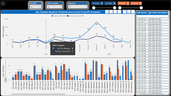
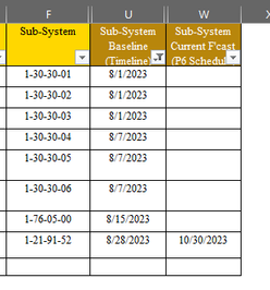
I am creating a line and clustered column chart in which has multiple columns of dates that share the same object ID (Sub-Systems) in each row.
In this case we have 2 columns of dates (soon to be 4)
-Baseline (Timeline)
-Forecast (P6 Schedule)
I created a calendar table in which has a relationship to the Baseline (Timeline) as it contains the most dates.
When creating the Reports the Forecast (P6 Schedule) is not accurate as it counts a value if there is a date, but plots it in the month of Baseline (Timeline)
Example: For August there is 8 Sub-Systems, which have the date for August 2023 in the Baseline (timeline) column. But it Counts 1 for P6 (Date) although the date is not for August.
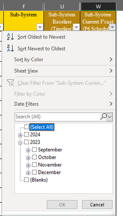
Even though there is no dates Pre-September on the Forecast (P6 Schedule)
How can I make the Forecast P6 line to plot for its actual dates?
Also, is there an option in which allows me to filter out a y axis line and only focus on one? So the table can show the object ID of the line when selected. As there is no values returned when focusing on Forecast P6
Solved! Go to Solution.
- Mark as New
- Bookmark
- Subscribe
- Mute
- Subscribe to RSS Feed
- Permalink
- Report Inappropriate Content
Hi, @jovani
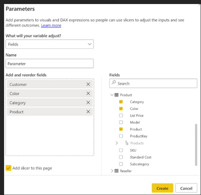
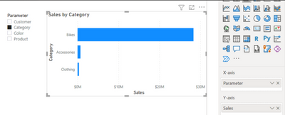
Based on your requirement description, it seems you want to explore if there is an option in which allows me to filter out a y axis line and only focus on one. If you are searching for this method to achieve this in the Power BI report, I suggest you to use the "Field parameter" as the method to achieve this, you can create a "Field parameter" for the Y-Axis for the line chart and place a slicer for the Y-Axis for the line chart to dynamically select the Y-Axis you want to display for the line chart and manage to filter out a y axis line and only focus on one
Let report readers use field parameters to change visuals (preview) - Power BI | Microsoft Learn
Thank you for your time and sharing, and thank you for your support and understanding of PowerBI!
Best Regards,
Aniya Zhang
If this post helps, then please consider Accept it as the solution to help the other members find it more quickly
- Mark as New
- Bookmark
- Subscribe
- Mute
- Subscribe to RSS Feed
- Permalink
- Report Inappropriate Content
Hi,
Create an inactive relationship from the Forecast column to the Date column of the Calendar Table. Use a DAX measure pattern like this
Measure = calculate(sum(Data[Sales]),userelationship(Data[Forecast],Calendar[Date]))
Regards,
Ashish Mathur
http://www.ashishmathur.com
https://www.linkedin.com/in/excelenthusiasts/
- Mark as New
- Bookmark
- Subscribe
- Mute
- Subscribe to RSS Feed
- Permalink
- Report Inappropriate Content
Hi, @jovani
Based on your requirement description, it seems you want to explore if there is an option in which allows me to filter out a y axis line and only focus on one. If you are searching for this method to achieve this in the Power BI report, I suggest you to use the "Field parameter" as the method to achieve this, you can create a "Field parameter" for the Y-Axis for the line chart and place a slicer for the Y-Axis for the line chart to dynamically select the Y-Axis you want to display for the line chart and manage to filter out a y axis line and only focus on one
Let report readers use field parameters to change visuals (preview) - Power BI | Microsoft Learn
Thank you for your time and sharing, and thank you for your support and understanding of PowerBI!
Best Regards,
Aniya Zhang
If this post helps, then please consider Accept it as the solution to help the other members find it more quickly
Helpful resources

Microsoft Fabric Learn Together
Covering the world! 9:00-10:30 AM Sydney, 4:00-5:30 PM CET (Paris/Berlin), 7:00-8:30 PM Mexico City

Power BI Monthly Update - April 2024
Check out the April 2024 Power BI update to learn about new features.

| User | Count |
|---|---|
| 95 | |
| 94 | |
| 79 | |
| 71 | |
| 64 |
| User | Count |
|---|---|
| 120 | |
| 105 | |
| 99 | |
| 81 | |
| 72 |
