- Power BI forums
- Updates
- News & Announcements
- Get Help with Power BI
- Desktop
- Service
- Report Server
- Power Query
- Mobile Apps
- Developer
- DAX Commands and Tips
- Custom Visuals Development Discussion
- Health and Life Sciences
- Power BI Spanish forums
- Translated Spanish Desktop
- Power Platform Integration - Better Together!
- Power Platform Integrations (Read-only)
- Power Platform and Dynamics 365 Integrations (Read-only)
- Training and Consulting
- Instructor Led Training
- Dashboard in a Day for Women, by Women
- Galleries
- Community Connections & How-To Videos
- COVID-19 Data Stories Gallery
- Themes Gallery
- Data Stories Gallery
- R Script Showcase
- Webinars and Video Gallery
- Quick Measures Gallery
- 2021 MSBizAppsSummit Gallery
- 2020 MSBizAppsSummit Gallery
- 2019 MSBizAppsSummit Gallery
- Events
- Ideas
- Custom Visuals Ideas
- Issues
- Issues
- Events
- Upcoming Events
- Community Blog
- Power BI Community Blog
- Custom Visuals Community Blog
- Community Support
- Community Accounts & Registration
- Using the Community
- Community Feedback
Register now to learn Fabric in free live sessions led by the best Microsoft experts. From Apr 16 to May 9, in English and Spanish.
- Power BI forums
- Forums
- Get Help with Power BI
- Desktop
- Conditional Formatting on column chart
- Subscribe to RSS Feed
- Mark Topic as New
- Mark Topic as Read
- Float this Topic for Current User
- Bookmark
- Subscribe
- Printer Friendly Page
- Mark as New
- Bookmark
- Subscribe
- Mute
- Subscribe to RSS Feed
- Permalink
- Report Inappropriate Content
Conditional Formatting on column chart
Hi,
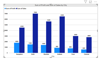
I'm creating column chart in power bi and want apply conditional formating on both bars profits and Sales.
Like if Profit>=3000 then Green, Profit>=1000 then Amber, Profit <1000= Red
Like if Sales>=4000 then Green, Sales>=3000 then Amber, Sales<1500= Red.
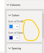
There is no option on column formating tab.
Please help me on this.
Solved! Go to Solution.
- Mark as New
- Bookmark
- Subscribe
- Mute
- Subscribe to RSS Feed
- Permalink
- Report Inappropriate Content
Conditional formatting is not supported by multiple columns in the category.
It is also not effective in terms of data visualization.
Beyond that, it is difficult to compare anything beyond each pair individually,
We burden the user with another type of decoding by using conditional formatting that allows both sales and profit to appear in the same color.
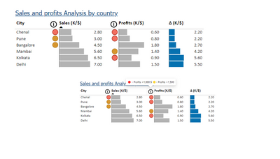
Alternatively, you can use the table graph in the picture, which allows you to compare cities, compare sales and profits, and alert you to the circle's values that you need.
There are quite a few steps in creating, so I am attaching a link where you can download the file and follow my steps.
Link to a sample file
If this post helps, then please consider Accepting it as the solution to help the other members find it more quickly
- Mark as New
- Bookmark
- Subscribe
- Mute
- Subscribe to RSS Feed
- Permalink
- Report Inappropriate Content
HI @Ranjeet_1989,
I test with your sample data but can't apply conditional color formatting on column chart with multiple value fields.
Perhaps you can take a look at Ritaf1983 's suggestion or try to manually plot the graph based on condition on script base visuals. (e.g. R, Python visuals)
Create Power BI visuals using R - Power BI | Microsoft Learn
Create Power BI visuals using Python in Power BI Desktop - Power BI | Microsoft Learn
Plot with conditional colors based on values in R - Stack Overflow
Regards,
Xiaoxin Sheng
If this post helps, please consider accept as solution to help other members find it more quickly.
- Mark as New
- Bookmark
- Subscribe
- Mute
- Subscribe to RSS Feed
- Permalink
- Report Inappropriate Content
Conditional formatting is not supported by multiple columns in the category.
It is also not effective in terms of data visualization.
Beyond that, it is difficult to compare anything beyond each pair individually,
We burden the user with another type of decoding by using conditional formatting that allows both sales and profit to appear in the same color.
Alternatively, you can use the table graph in the picture, which allows you to compare cities, compare sales and profits, and alert you to the circle's values that you need.
There are quite a few steps in creating, so I am attaching a link where you can download the file and follow my steps.
Link to a sample file
If this post helps, then please consider Accepting it as the solution to help the other members find it more quickly
- Mark as New
- Bookmark
- Subscribe
- Mute
- Subscribe to RSS Feed
- Permalink
- Report Inappropriate Content
Hi @Ranjeet_1989,
Can you please share a pbix or some dummy data that keep the raw data structure with expected results? It should help us clarify your scenario and test to coding formula.
How to Get Your Question Answered Quickly
Regards,
Xiaoxin Sheng
If this post helps, please consider accept as solution to help other members find it more quickly.
- Mark as New
- Bookmark
- Subscribe
- Mute
- Subscribe to RSS Feed
- Permalink
- Report Inappropriate Content
| City | Sales | Profit | Month |
| Delhi | 7000 | 1500 | January |
| Mumbai | 5600 | 1400 | February |
| Kolkata | 6500 | 900 | March |
| Chennai | 2800 | 600 | April |
| Bangalore | 4500 | 1800 | May |
| Pune | 3000 | 800 | June |
| Delhi | 1500 | 400 | July |
| Mumbai | 1400 | 700 | August |
| Kolkata | 900 | 300 | September |
| Chennai | 600 | 350 | October |
| Bangalore | 1800 | 450 | November |
| Pune | 800 | 100 | December |
| Delhi | 2000 | 650 | January |
- Mark as New
- Bookmark
- Subscribe
- Mute
- Subscribe to RSS Feed
- Permalink
- Report Inappropriate Content
HI @Ranjeet_1989,
I test with your sample data but can't apply conditional color formatting on column chart with multiple value fields.
Perhaps you can take a look at Ritaf1983 's suggestion or try to manually plot the graph based on condition on script base visuals. (e.g. R, Python visuals)
Create Power BI visuals using R - Power BI | Microsoft Learn
Create Power BI visuals using Python in Power BI Desktop - Power BI | Microsoft Learn
Plot with conditional colors based on values in R - Stack Overflow
Regards,
Xiaoxin Sheng
If this post helps, please consider accept as solution to help other members find it more quickly.
Helpful resources

Microsoft Fabric Learn Together
Covering the world! 9:00-10:30 AM Sydney, 4:00-5:30 PM CET (Paris/Berlin), 7:00-8:30 PM Mexico City

Power BI Monthly Update - April 2024
Check out the April 2024 Power BI update to learn about new features.

| User | Count |
|---|---|
| 113 | |
| 103 | |
| 77 | |
| 66 | |
| 63 |
| User | Count |
|---|---|
| 142 | |
| 105 | |
| 102 | |
| 81 | |
| 68 |


