- Power BI forums
- Updates
- News & Announcements
- Get Help with Power BI
- Desktop
- Service
- Report Server
- Power Query
- Mobile Apps
- Developer
- DAX Commands and Tips
- Custom Visuals Development Discussion
- Health and Life Sciences
- Power BI Spanish forums
- Translated Spanish Desktop
- Power Platform Integration - Better Together!
- Power Platform Integrations (Read-only)
- Power Platform and Dynamics 365 Integrations (Read-only)
- Training and Consulting
- Instructor Led Training
- Dashboard in a Day for Women, by Women
- Galleries
- Community Connections & How-To Videos
- COVID-19 Data Stories Gallery
- Themes Gallery
- Data Stories Gallery
- R Script Showcase
- Webinars and Video Gallery
- Quick Measures Gallery
- 2021 MSBizAppsSummit Gallery
- 2020 MSBizAppsSummit Gallery
- 2019 MSBizAppsSummit Gallery
- Events
- Ideas
- Custom Visuals Ideas
- Issues
- Issues
- Events
- Upcoming Events
- Community Blog
- Power BI Community Blog
- Custom Visuals Community Blog
- Community Support
- Community Accounts & Registration
- Using the Community
- Community Feedback
Earn a 50% discount on the DP-600 certification exam by completing the Fabric 30 Days to Learn It challenge.
- Power BI forums
- Forums
- Get Help with Power BI
- Desktop
- Re: Comparing previous and current year data on a ...
- Subscribe to RSS Feed
- Mark Topic as New
- Mark Topic as Read
- Float this Topic for Current User
- Bookmark
- Subscribe
- Printer Friendly Page
- Mark as New
- Bookmark
- Subscribe
- Mute
- Subscribe to RSS Feed
- Permalink
- Report Inappropriate Content
Comparing previous and current year data on a line chart
Hi
I want to compare the daily trend for FY 16 ( Jul 1st 2015 to June 30th 2016) and FY17( July 1st 2016 to June 30th 2017) on a line chart in two graphs , on the x-axis I want to see only the month and when I hover over the graph i want to see the daily values . The legend should dispaly Fiscal Year (FY16 , FY17).
Can someone help me pn how to accomplish this scenario ?
Thanks,
Priya
Solved! Go to Solution.
- Mark as New
- Bookmark
- Subscribe
- Mute
- Subscribe to RSS Feed
- Permalink
- Report Inappropriate Content
Hi @priyapalanki,
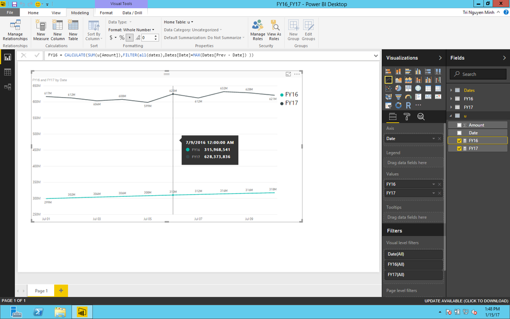
if you have 2 separate tables FY16 and FY17, it's easy now.
- Create Dates table for time pattern
Dates = CALENDARAUTO()
- Create Prev-Date Column
Prev - Date = DATEADD( Dates[Date],-1,YEAR)
- Union 2 separate tables FY16 -FY17 into 1 table:
u = UNION(FY16,FY17)
- Create 2 calculated measure to cumpute total amount of FY16 and FY17:
FY16 = CALCULATE(SUM(u[Amount]),FILTER(all(dates),Dates[Date]=MAX(Dates[Prev - Date]) ))
FY17 = CALCULATE(SUM(u[Amount]),FILTER(all(dates),[FY16]>0 && Dates[Date]=max(Dates[Date]) ))
My sample data and sample pbix file
If this works for you please accept it as solution and also like to give KUDOS.
Best regards
Tri Nguyen
- Mark as New
- Bookmark
- Subscribe
- Mute
- Subscribe to RSS Feed
- Permalink
- Report Inappropriate Content
Hi @priyapalanki,
Do you have any sample data or data structure? so I could quicky try to figure out solution.![]()
- Mark as New
- Bookmark
- Subscribe
- Mute
- Subscribe to RSS Feed
- Permalink
- Report Inappropriate Content
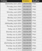
@tringuyenminh92 : Hi , this is my sample data for FY16 .
Here is the visualization on the line chart using the above data. Right now on the axis , it is showing the month and year. When I hover over the graph I see the daily values.
I have another table for FY17 similar to FY16 . Now I want to show the FY17 data on the same chart above the FY16 graph . On the axis , I want to see only the month . On the legend I want to see FY16 and FY17.
Please help me in accomplishing this. Thanks.
Priya
- Mark as New
- Bookmark
- Subscribe
- Mute
- Subscribe to RSS Feed
- Permalink
- Report Inappropriate Content
Hi @priyapalanki,
if you have 2 separate tables FY16 and FY17, it's easy now.
- Create Dates table for time pattern
Dates = CALENDARAUTO()
- Create Prev-Date Column
Prev - Date = DATEADD( Dates[Date],-1,YEAR)
- Union 2 separate tables FY16 -FY17 into 1 table:
u = UNION(FY16,FY17)
- Create 2 calculated measure to cumpute total amount of FY16 and FY17:
FY16 = CALCULATE(SUM(u[Amount]),FILTER(all(dates),Dates[Date]=MAX(Dates[Prev - Date]) ))
FY17 = CALCULATE(SUM(u[Amount]),FILTER(all(dates),[FY16]>0 && Dates[Date]=max(Dates[Date]) ))
My sample data and sample pbix file
If this works for you please accept it as solution and also like to give KUDOS.
Best regards
Tri Nguyen
- Mark as New
- Bookmark
- Subscribe
- Mute
- Subscribe to RSS Feed
- Permalink
- Report Inappropriate Content
@tringuyenminh92 Thanks a lot for providing the solution . Would it be possible to see only the month on the axis ?
- Mark as New
- Bookmark
- Subscribe
- Mute
- Subscribe to RSS Feed
- Permalink
- Report Inappropriate Content
Hi @priyapalanki,
As formula of 2 calcuated measure, it's computing by date level to show daily value in line chart, so far i could not make the X-Axis to show month level. It's so sorry to say that in this moment. ![]()
Helpful resources
| User | Count |
|---|---|
| 102 | |
| 90 | |
| 80 | |
| 71 | |
| 69 |
| User | Count |
|---|---|
| 114 | |
| 100 | |
| 97 | |
| 72 | |
| 68 |


