- Power BI forums
- Updates
- News & Announcements
- Get Help with Power BI
- Desktop
- Service
- Report Server
- Power Query
- Mobile Apps
- Developer
- DAX Commands and Tips
- Custom Visuals Development Discussion
- Health and Life Sciences
- Power BI Spanish forums
- Translated Spanish Desktop
- Power Platform Integration - Better Together!
- Power Platform Integrations (Read-only)
- Power Platform and Dynamics 365 Integrations (Read-only)
- Training and Consulting
- Instructor Led Training
- Dashboard in a Day for Women, by Women
- Galleries
- Community Connections & How-To Videos
- COVID-19 Data Stories Gallery
- Themes Gallery
- Data Stories Gallery
- R Script Showcase
- Webinars and Video Gallery
- Quick Measures Gallery
- 2021 MSBizAppsSummit Gallery
- 2020 MSBizAppsSummit Gallery
- 2019 MSBizAppsSummit Gallery
- Events
- Ideas
- Custom Visuals Ideas
- Issues
- Issues
- Events
- Upcoming Events
- Community Blog
- Power BI Community Blog
- Custom Visuals Community Blog
- Community Support
- Community Accounts & Registration
- Using the Community
- Community Feedback
Register now to learn Fabric in free live sessions led by the best Microsoft experts. From Apr 16 to May 9, in English and Spanish.
- Power BI forums
- Forums
- Get Help with Power BI
- Desktop
- Re: Combo chart - Benchmark Line and value Bars to...
- Subscribe to RSS Feed
- Mark Topic as New
- Mark Topic as Read
- Float this Topic for Current User
- Bookmark
- Subscribe
- Printer Friendly Page
- Mark as New
- Bookmark
- Subscribe
- Mute
- Subscribe to RSS Feed
- Permalink
- Report Inappropriate Content
Combo chart - Benchmark Line and value Bars to Power BI Visuals
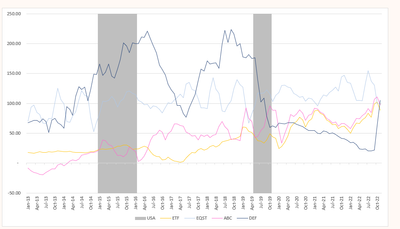
Hi, I'd like to copy the Excel combo chart into Power BI with a Benchmark Line and value Bars, as follows:
However, I'm not able to find a way to include all products.
I want to show the following:
- USA value Bars in gray color (always shown)
- Benchmark Lines for ETF and EQST in two different lines (always shown)
- Lines for ABC and DEF (ideally, should create another slicer to control if the user would like to see all or just one of them).
Currently, the line and stacked column chart function can only show one value at a time.
Unfortunately, all my products, Benchmark Line, and recession bars are under the same table and column (e.g., ETF, EQST, ABC, DEF, etc...).
Do you have any ideas on how to make it happen?
Thanks in advance!
(combo charts in Excel)
- Mark as New
- Bookmark
- Subscribe
- Mute
- Subscribe to RSS Feed
- Permalink
- Report Inappropriate Content
This looks like it can be done in Deneb. Please provide sample data that covers your issue or question completely, in a usable format (not as a screenshot).
Do not include sensitive information or anything not related to the issue or question.
If you are unsure how to upload data please refer to https://community.fabric.microsoft.com/t5/Community-Blog/How-to-provide-sample-data-in-the-Power-BI-...
Please show the expected outcome based on the sample data you provided.
Want faster answers? https://community.fabric.microsoft.com/t5/Desktop/How-to-Get-Your-Question-Answered-Quickly/m-p/1447...
- Mark as New
- Bookmark
- Subscribe
- Mute
- Subscribe to RSS Feed
- Permalink
- Report Inappropriate Content
Dear lbendlin,
Thank you for your previous suggestion. I must apologize as 'Deneb' is too advanced for me.
I tried googling it but still don't know how to use it. Therefore, I am still seeking your guidance and help."
I've created a sample dataset in PBIX, and I hope the information is clear.
I've also attached 2 Excel files:
(1) Raw data used for the sample
(2) Reference chart for how the final chart should look like.
Thank you very much in advance.
- Mark as New
- Bookmark
- Subscribe
- Mute
- Subscribe to RSS Feed
- Permalink
- Report Inappropriate Content
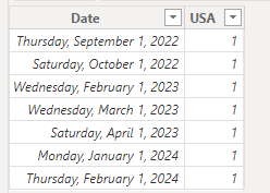
How should I interpret the USA data?
- Mark as New
- Bookmark
- Subscribe
- Mute
- Subscribe to RSS Feed
- Permalink
- Report Inappropriate Content
We add the USA number as a secondary column in Excel to represent the period. Therefore, we enter "1" only to highlight the Y-axis from the minimum to the maximum number.
The actual numbers can be found through USA gdp-growth-rate
In power bi, [USA] number should be the grey colum bar in line chart
- Thanks!
Helpful resources

Microsoft Fabric Learn Together
Covering the world! 9:00-10:30 AM Sydney, 4:00-5:30 PM CET (Paris/Berlin), 7:00-8:30 PM Mexico City

Power BI Monthly Update - April 2024
Check out the April 2024 Power BI update to learn about new features.

| User | Count |
|---|---|
| 108 | |
| 106 | |
| 88 | |
| 74 | |
| 69 |
| User | Count |
|---|---|
| 123 | |
| 112 | |
| 95 | |
| 83 | |
| 73 |


