- Power BI forums
- Updates
- News & Announcements
- Get Help with Power BI
- Desktop
- Service
- Report Server
- Power Query
- Mobile Apps
- Developer
- DAX Commands and Tips
- Custom Visuals Development Discussion
- Health and Life Sciences
- Power BI Spanish forums
- Translated Spanish Desktop
- Power Platform Integration - Better Together!
- Power Platform Integrations (Read-only)
- Power Platform and Dynamics 365 Integrations (Read-only)
- Training and Consulting
- Instructor Led Training
- Dashboard in a Day for Women, by Women
- Galleries
- Community Connections & How-To Videos
- COVID-19 Data Stories Gallery
- Themes Gallery
- Data Stories Gallery
- R Script Showcase
- Webinars and Video Gallery
- Quick Measures Gallery
- 2021 MSBizAppsSummit Gallery
- 2020 MSBizAppsSummit Gallery
- 2019 MSBizAppsSummit Gallery
- Events
- Ideas
- Custom Visuals Ideas
- Issues
- Issues
- Events
- Upcoming Events
- Community Blog
- Power BI Community Blog
- Custom Visuals Community Blog
- Community Support
- Community Accounts & Registration
- Using the Community
- Community Feedback
Register now to learn Fabric in free live sessions led by the best Microsoft experts. From Apr 16 to May 9, in English and Spanish.
- Power BI forums
- Forums
- Get Help with Power BI
- Desktop
- Column Chart value formatting problem
- Subscribe to RSS Feed
- Mark Topic as New
- Mark Topic as Read
- Float this Topic for Current User
- Bookmark
- Subscribe
- Printer Friendly Page
- Mark as New
- Bookmark
- Subscribe
- Mute
- Subscribe to RSS Feed
- Permalink
- Report Inappropriate Content
Column Chart value formatting problem
Ok mentioned this before and thought it was due to tabular editor but it was not.
Now using Field Parameters to switch between absolute values and percentage views.
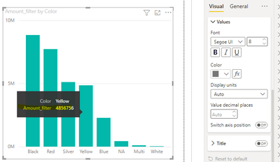
On auto format my absolutes look like this :
I do not want this, I want to show like 153K instead of 0,15M (why is it even showing milions if even the entire column is not even close to 1 M ???!!)
So switched the labels to shows as thousand. Problem solved you would say...however....my % view now looked like:
So whats this?? and why? The tooltip nicely shows 21,96% but the chart shows 0,02K% (what is even that K doing there???)
🤔😖
Anybody that knows how to fix this anoying occurence?
- Mark as New
- Bookmark
- Subscribe
- Mute
- Subscribe to RSS Feed
- Permalink
- Report Inappropriate Content
Hi @rpinxt ,
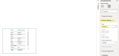
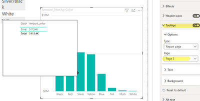
According to your description, you can implement custom units by creating measures to be displayed in tooltip. Refer to the following
Amount_unitsr =
Var TotalSale = sum(FactInternetSales[SalesAmount])
Var FinalSale = DIVIDE(TotalSale, 1000)
Var decimals = "0.0"
RETURN
FORMAT ( FinalSale, decimals & "K" )
If the problem is still not resolved, please provide detailed error information and let me know immediately. Looking forward to your reply.
Best Regards,
Henry
If this post helps, then please consider Accept it as the solution to help the other members find it more quickly.
- Mark as New
- Bookmark
- Subscribe
- Mute
- Subscribe to RSS Feed
- Permalink
- Report Inappropriate Content
Thanks @v-henryk-mstf but cannot have the correct format in tooltips.
They need to be on the labels.
I cannot ask my user to hover over the column if they want to know the amounts or percentages.
The label needs to show the measure in thousands when absolute is selected and percentages when % is selected.
(Ps. the picture with the tooltip is only there to show that there the format is correct but the label does not present the same value)
- Mark as New
- Bookmark
- Subscribe
- Mute
- Subscribe to RSS Feed
- Permalink
- Report Inappropriate Content
Maybe nobody else has these problems?
Could it be because of the setup of my model/sources that the value formatting behaves this strange?
Helpful resources

Microsoft Fabric Learn Together
Covering the world! 9:00-10:30 AM Sydney, 4:00-5:30 PM CET (Paris/Berlin), 7:00-8:30 PM Mexico City

Power BI Monthly Update - April 2024
Check out the April 2024 Power BI update to learn about new features.

| User | Count |
|---|---|
| 106 | |
| 104 | |
| 77 | |
| 68 | |
| 61 |
| User | Count |
|---|---|
| 148 | |
| 107 | |
| 106 | |
| 82 | |
| 70 |


