- Power BI forums
- Updates
- News & Announcements
- Get Help with Power BI
- Desktop
- Service
- Report Server
- Power Query
- Mobile Apps
- Developer
- DAX Commands and Tips
- Custom Visuals Development Discussion
- Health and Life Sciences
- Power BI Spanish forums
- Translated Spanish Desktop
- Power Platform Integration - Better Together!
- Power Platform Integrations (Read-only)
- Power Platform and Dynamics 365 Integrations (Read-only)
- Training and Consulting
- Instructor Led Training
- Dashboard in a Day for Women, by Women
- Galleries
- Community Connections & How-To Videos
- COVID-19 Data Stories Gallery
- Themes Gallery
- Data Stories Gallery
- R Script Showcase
- Webinars and Video Gallery
- Quick Measures Gallery
- 2021 MSBizAppsSummit Gallery
- 2020 MSBizAppsSummit Gallery
- 2019 MSBizAppsSummit Gallery
- Events
- Ideas
- Custom Visuals Ideas
- Issues
- Issues
- Events
- Upcoming Events
- Community Blog
- Power BI Community Blog
- Custom Visuals Community Blog
- Community Support
- Community Accounts & Registration
- Using the Community
- Community Feedback
Register now to learn Fabric in free live sessions led by the best Microsoft experts. From Apr 16 to May 9, in English and Spanish.
- Power BI forums
- Forums
- Get Help with Power BI
- Desktop
- Re: Clustered Stacked Column chart with individual...
- Subscribe to RSS Feed
- Mark Topic as New
- Mark Topic as Read
- Float this Topic for Current User
- Bookmark
- Subscribe
- Printer Friendly Page
- Mark as New
- Bookmark
- Subscribe
- Mute
- Subscribe to RSS Feed
- Permalink
- Report Inappropriate Content
Clustered Stacked Column chart with individual values stacked
Hi,
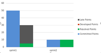
I am trying to plot the data as shown in fig below.
But I don't see visual for a stacked and clustered column chart. There are two separate visuals for both of them. I need to draw second stacked bar with individual values on top of each other and that compares to the values in first column with single value, something like a comparison of the two columns.
Is there any feasible solution to this in Power BI because in excel you can tweak the two charts types but not here or something that I am unaware of?
Solved! Go to Solution.
- Mark as New
- Bookmark
- Subscribe
- Mute
- Subscribe to RSS Feed
- Permalink
- Report Inappropriate Content
Hi, @Anonymous
Try custom visual "Dril Down Combo Pro By ZoomCharts" .
You need to manually define the format of some fields .
Please check atteched file for more details.
Best Regards,
Community Support Team _ Eason
If this post helps, then please consider Accept it as the solution to help the other members find it more quickly.
- Mark as New
- Bookmark
- Subscribe
- Mute
- Subscribe to RSS Feed
- Permalink
- Report Inappropriate Content
Hi, @Anonymous
Sorry,I haven't find any other custom visual that meets your requirements currently.
I am also a trial user. If you have not used this custom visual before, then when you open the report, you will automatically have the access to the paid features for 30 days.
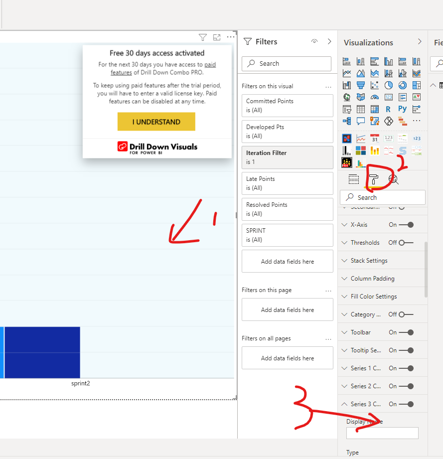
Please check the following steps:
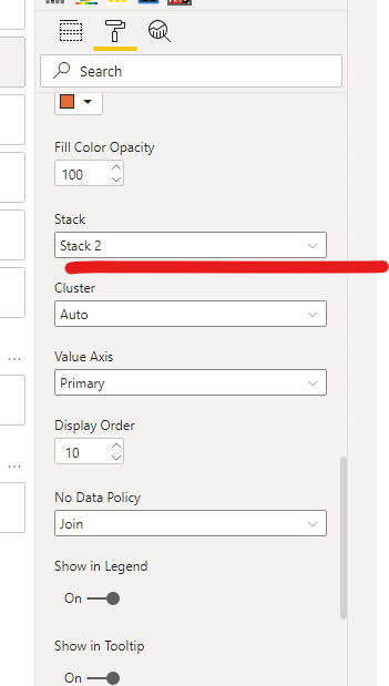
1) select the visual to active it -> 2)select the "format" pane -> 3)select "series 3 Configuration"
Then you will find the custom "Stack" settings
Best Regards,
Community Support Team _ Eason
- Mark as New
- Bookmark
- Subscribe
- Mute
- Subscribe to RSS Feed
- Permalink
- Report Inappropriate Content
That is absolutely fine @v-easonf-msft .
And thanks for your efforts in solving my problem. I really appreciate that.
I did figure it out myself where the stack settings needed to be configured. Thanks again for explaining me the settings in detail here.
You saved my day, you rock :).
If you come to know of any free visual for this kind of problem, please do drop me a line about the same.
Thanks again,
Best Regards,
Nitin
- Mark as New
- Bookmark
- Subscribe
- Mute
- Subscribe to RSS Feed
- Permalink
- Report Inappropriate Content
Hi, @Anonymous
Try custom visual "Dril Down Combo Pro By ZoomCharts" .
You need to manually define the format of some fields .
Please check atteched file for more details.
Best Regards,
Community Support Team _ Eason
If this post helps, then please consider Accept it as the solution to help the other members find it more quickly.
- Mark as New
- Bookmark
- Subscribe
- Mute
- Subscribe to RSS Feed
- Permalink
- Report Inappropriate Content
- Mark as New
- Bookmark
- Subscribe
- Mute
- Subscribe to RSS Feed
- Permalink
- Report Inappropriate Content
Thanks @v-easonf-msft
That does work. However, this requires a license to purchase its pro features. Further, the custom "Stack" settings you specified, I don't find them in my Desktop opened pbix. It seems that stack settings are again for pro license.
Can it be there any other custom visual that does not require any license purchase?
- Mark as New
- Bookmark
- Subscribe
- Mute
- Subscribe to RSS Feed
- Permalink
- Report Inappropriate Content
I am attaching my sample pbix so that it can be referenced as to what I am trying to make it as.
The report contains two tabs, "Plot to draw" and "Plot available in PBI". Hope it explains my purpose.
Clustered Stacked Bar Sample PBIX
- Mark as New
- Bookmark
- Subscribe
- Mute
- Subscribe to RSS Feed
- Permalink
- Report Inappropriate Content
Hi, @Anonymous
Microsoft AppSource custom visual "Multiple Axes Chart-XViz" maybe a good choice.
Check sample file for more details.
Best Regards,
Community Support Team _ Eason
- Mark as New
- Bookmark
- Subscribe
- Mute
- Subscribe to RSS Feed
- Permalink
- Report Inappropriate Content
The problem with this is that you see two different columns with identical set of values viz. "Forecast" vs "Actual" and each split into equal number of stacks. In my case, I have two columns viz. "Committed" vs "Actual". Where "Committed" column is a single stack while "Actual" column is stacked into three individual bars. Hence, the data plot is not the same. Further, I have a single row for different sprint or Country against each individual values in my table. So, another ggplot2 approach is also not plotting the chart as the way I need it to be.
Looking for some good alternates as of now....any help is appreciated.
- Mark as New
- Bookmark
- Subscribe
- Mute
- Subscribe to RSS Feed
- Permalink
- Report Inappropriate Content
Hey @Anonymous ,
unfortunately, this is not possible using default visuals, and I'm also not aware of any custom visual that combines clustered and stacked columns charts.
You can use R or Python to create this, here is a link with examples using R:
https://thetablebar.blogspot.com/2019/11/stacked-bar-chart-ggplot2-r.html
Hopefully, this provides you with some ideas.
Regards,
Tom
Did I answer your question? Mark my post as a solution, this will help others!
Proud to be a Super User!
I accept Kudos 😉
Hamburg, Germany
- Mark as New
- Bookmark
- Subscribe
- Mute
- Subscribe to RSS Feed
- Permalink
- Report Inappropriate Content
@Anonymous , see if this visual can help
https://appsource.microsoft.com/en-us/product/power-bi-visuals/wa200001934?tab=overview
Microsoft Power BI Learning Resources, 2023 !!
Learn Power BI - Full Course with Dec-2022, with Window, Index, Offset, 100+ Topics !!
Did I answer your question? Mark my post as a solution! Appreciate your Kudos !! Proud to be a Super User! !!
Helpful resources

Microsoft Fabric Learn Together
Covering the world! 9:00-10:30 AM Sydney, 4:00-5:30 PM CET (Paris/Berlin), 7:00-8:30 PM Mexico City

Power BI Monthly Update - April 2024
Check out the April 2024 Power BI update to learn about new features.

| User | Count |
|---|---|
| 114 | |
| 105 | |
| 78 | |
| 68 | |
| 63 |
| User | Count |
|---|---|
| 148 | |
| 107 | |
| 106 | |
| 83 | |
| 70 |


