- Power BI forums
- Updates
- News & Announcements
- Get Help with Power BI
- Desktop
- Service
- Report Server
- Power Query
- Mobile Apps
- Developer
- DAX Commands and Tips
- Custom Visuals Development Discussion
- Health and Life Sciences
- Power BI Spanish forums
- Translated Spanish Desktop
- Power Platform Integration - Better Together!
- Power Platform Integrations (Read-only)
- Power Platform and Dynamics 365 Integrations (Read-only)
- Training and Consulting
- Instructor Led Training
- Dashboard in a Day for Women, by Women
- Galleries
- Community Connections & How-To Videos
- COVID-19 Data Stories Gallery
- Themes Gallery
- Data Stories Gallery
- R Script Showcase
- Webinars and Video Gallery
- Quick Measures Gallery
- 2021 MSBizAppsSummit Gallery
- 2020 MSBizAppsSummit Gallery
- 2019 MSBizAppsSummit Gallery
- Events
- Ideas
- Custom Visuals Ideas
- Issues
- Issues
- Events
- Upcoming Events
- Community Blog
- Power BI Community Blog
- Custom Visuals Community Blog
- Community Support
- Community Accounts & Registration
- Using the Community
- Community Feedback
Earn a 50% discount on the DP-600 certification exam by completing the Fabric 30 Days to Learn It challenge.
- Power BI forums
- Forums
- Get Help with Power BI
- Desktop
- Clustered Column Chart - count of services per mon...
- Subscribe to RSS Feed
- Mark Topic as New
- Mark Topic as Read
- Float this Topic for Current User
- Bookmark
- Subscribe
- Printer Friendly Page
- Mark as New
- Bookmark
- Subscribe
- Mute
- Subscribe to RSS Feed
- Permalink
- Report Inappropriate Content
Clustered Column Chart - count of services per month next to count of unique clients per month
New To Power BI, and just starting to delve in data visualization. I'm trying to do something that's not quite working, and I want to make sure I understand why.
First, I have a SQL Server table that keeps track of services rendered to clients. I wanted a bar graph that shows how many services were rendered each month in 2017, so that was pretty simple to set up. Just the service date as my X, and the record's unique ID as my Y. I was able to group the service dates by month, by hitting the down arrow on the service date under "Visualizations", selecting "New Group", and creating a new bin group, with bin size 1 and "month" selected from the dropdown. I was further able to apply a filter to limit the records to those with a service date in 2017.
So I have my number of services rendered (which is really just a count of the records for that month) as my Y axis. But some of those services involve the same client, so I would like to get an idea of the number of unique clients served per month. I created a new measure, using DISTINCTCOUNT([clientID]). When I check this "column", it is instantly placed in the "tooltips" section of the "Visualizations" panel.
So not too bad - you mouse over the column for February 2017, and the tooltip shows you the total services rendered (1,800), and also the number of distinct clients served (1,750). But what I'd really like is to see both datasets as their own columns - one column for *total services* in Feb 2017, and "clustered" against it the number of *unique clients served* for Feb 2017 (and the same for each month in my chart). So far I haven't found any way to do that. Am I missing something - isn't that what the "clustered" part of "clustered column chart" means?
Solved! Go to Solution.
- Mark as New
- Bookmark
- Subscribe
- Mute
- Subscribe to RSS Feed
- Permalink
- Report Inappropriate Content
Never mind, I figured it out on my own. There's a whole Power BI tutorial MS posted, which Power BI tells you nothing about. One of the videos explains how to use date data and how to turn on the drilldown feature, found at: https://docs.microsoft.com/en-us/power-bi/guided-learning/modeling?tutorial-step=7. I did that, and then I created a new column using DAX: distinct_clients = DISTINCTCOUNT([iClientId]). Dragged the column into the bar graph, and the new bar appeared like I wanted.
- Mark as New
- Bookmark
- Subscribe
- Mute
- Subscribe to RSS Feed
- Permalink
- Report Inappropriate Content
Hi @cmaso
Do you connnect to the data source in "Import" mode or "direct query" mode?
Could you share some example data for me to better analyze?
Best Regards
Maggie
- Mark as New
- Bookmark
- Subscribe
- Mute
- Subscribe to RSS Feed
- Permalink
- Report Inappropriate Content
Hi, thank you for responding. I originally tried connecting via "import", but the source table's huge (660K records, each about 160 columns), and that was making the app much too sluggish, so now I'm connecting via "direct query", and that's handling much better.
The sample data is HIPAA-protected, so I can't really share it. But, I might be able to create some dummy data that would do the trick (and include only the relevant fields). Is there any way to attach it, or do I have to paste it as text in here?
Also, I have one immediate, burning question - for the "Clustered Column" type chart, in the "Visualizations" pane, there's the "Axis" label, and then a section below it that reads "Drag data fields here", then the "Legend" label and the section below that reads "Drag data fields here", and then the "Value" label and the section below it that reads "Drag data fields here". The section below the "Value" label will only allow me to drag one field into it. Shouldn't it allow me to drag in a 2nd field?
- Mark as New
- Bookmark
- Subscribe
- Mute
- Subscribe to RSS Feed
- Permalink
- Report Inappropriate Content
Hi @cmaso
To answer your last question:
As tested, It only supports one column to be added to the Value field.
Which is the purpose for you to do this?
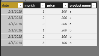
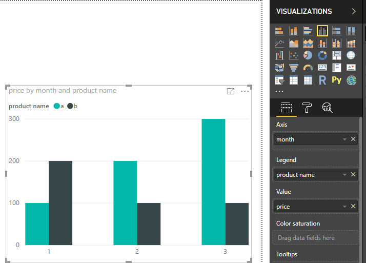
Here is an example to create Clustered Column Chart.
dateset
Best Regards
Maggie
- Mark as New
- Bookmark
- Subscribe
- Mute
- Subscribe to RSS Feed
- Permalink
- Report Inappropriate Content
Okay - In my case, the data looks something like this:
(the dates continue through all months of 2017. Notice that he iClientId can appear in more than 1 row)
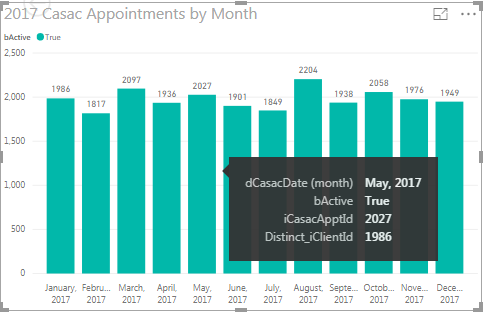
and the graph looks like this:
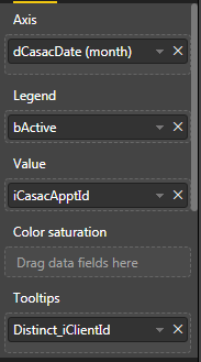
And my panel looks like this:
So I chose dCasacDate as my Axis, and then clicked on the down arrow and created a bin group separated by month.
For iCasacApptId, which is unique for every record, I clicked on the down arrow and selected "Count". So, my Y Axis is a count of all records (by month).
For iClientId, I created a new column using DAX: Distinct_iClientId = DISTINCTCOUNT([iClientId]). When I check this column, it automatically appears under "Tooptips". So in the tooltip in the picture above, we see that for May 2017, the count of iCasacApptId is 2,027, and the value of distinct_iclientId is 1,986. That's good, but I would rather see the distinct_iclientId value as a bar next to the blue-green bar. Is there any way to this?
- Mark as New
- Bookmark
- Subscribe
- Mute
- Subscribe to RSS Feed
- Permalink
- Report Inappropriate Content
Never mind, I figured it out on my own. There's a whole Power BI tutorial MS posted, which Power BI tells you nothing about. One of the videos explains how to use date data and how to turn on the drilldown feature, found at: https://docs.microsoft.com/en-us/power-bi/guided-learning/modeling?tutorial-step=7. I did that, and then I created a new column using DAX: distinct_clients = DISTINCTCOUNT([iClientId]). Dragged the column into the bar graph, and the new bar appeared like I wanted.
Helpful resources
| User | Count |
|---|---|
| 102 | |
| 84 | |
| 77 | |
| 70 | |
| 67 |
| User | Count |
|---|---|
| 113 | |
| 99 | |
| 97 | |
| 72 | |
| 68 |


