- Power BI forums
- Updates
- News & Announcements
- Get Help with Power BI
- Desktop
- Service
- Report Server
- Power Query
- Mobile Apps
- Developer
- DAX Commands and Tips
- Custom Visuals Development Discussion
- Health and Life Sciences
- Power BI Spanish forums
- Translated Spanish Desktop
- Power Platform Integration - Better Together!
- Power Platform Integrations (Read-only)
- Power Platform and Dynamics 365 Integrations (Read-only)
- Training and Consulting
- Instructor Led Training
- Dashboard in a Day for Women, by Women
- Galleries
- Community Connections & How-To Videos
- COVID-19 Data Stories Gallery
- Themes Gallery
- Data Stories Gallery
- R Script Showcase
- Webinars and Video Gallery
- Quick Measures Gallery
- 2021 MSBizAppsSummit Gallery
- 2020 MSBizAppsSummit Gallery
- 2019 MSBizAppsSummit Gallery
- Events
- Ideas
- Custom Visuals Ideas
- Issues
- Issues
- Events
- Upcoming Events
- Community Blog
- Power BI Community Blog
- Custom Visuals Community Blog
- Community Support
- Community Accounts & Registration
- Using the Community
- Community Feedback
Register now to learn Fabric in free live sessions led by the best Microsoft experts. From Apr 16 to May 9, in English and Spanish.
- Power BI forums
- Forums
- Get Help with Power BI
- Desktop
- Re: Change color of a bar based on filter
- Subscribe to RSS Feed
- Mark Topic as New
- Mark Topic as Read
- Float this Topic for Current User
- Bookmark
- Subscribe
- Printer Friendly Page
- Mark as New
- Bookmark
- Subscribe
- Mute
- Subscribe to RSS Feed
- Permalink
- Report Inappropriate Content
Change color of a bar based on filter
Hi,
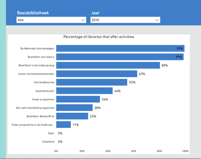
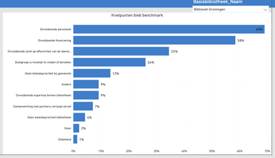
I'm working on a report for libraries. In this report I want to show the total percentage of libraries that offer certain activities. I did that with the following chart:
Now I want the bar to change if a library offers a certain activity. If I filter on a library in the filter 'basisbibliotheek' I want the data of the graph to remain the same (based on the total libraries), but I want the color of the bar to change if I filter a certain library and this library offers an activity.
My data looks like this:
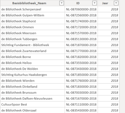
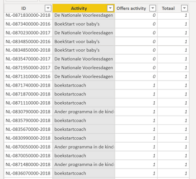
With ID linking the 2 tables, and in table1 the names of the library (on which the filter is based) and in table2 the activities and weather (1) or not (0) the library offers the activity (also in a certain year).
Table1:
Table2:
I tried a few things but nothing worked so far. Thanks in advance!
Solved! Go to Solution.
- Mark as New
- Bookmark
- Subscribe
- Mute
- Subscribe to RSS Feed
- Permalink
- Report Inappropriate Content
Apologies for that. I misunderstood your issue.
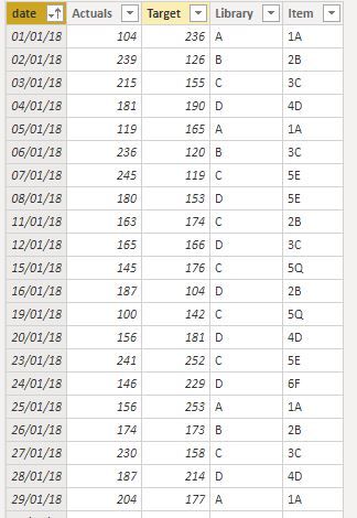
Just to avoid confusion, here is what my fact table looks like:
Try the following:
1) without changing the model, in the bar graph add the other categories as the axis.
2) now create this measure to use in the conditional formatting dialogue (in my Fact table I have "Item" per Library as a representation of your "Other Categories" - if that makes sense)
Selected Item =
VAR calc = CALCULATE(DISTINCTCOUNT('Fact Table'[Item]);
            TREATAS(VALUES('Values Library (for slicer)'[Library]); 'Fact Table'[Library]))
Return
IF(calc = 1;1)
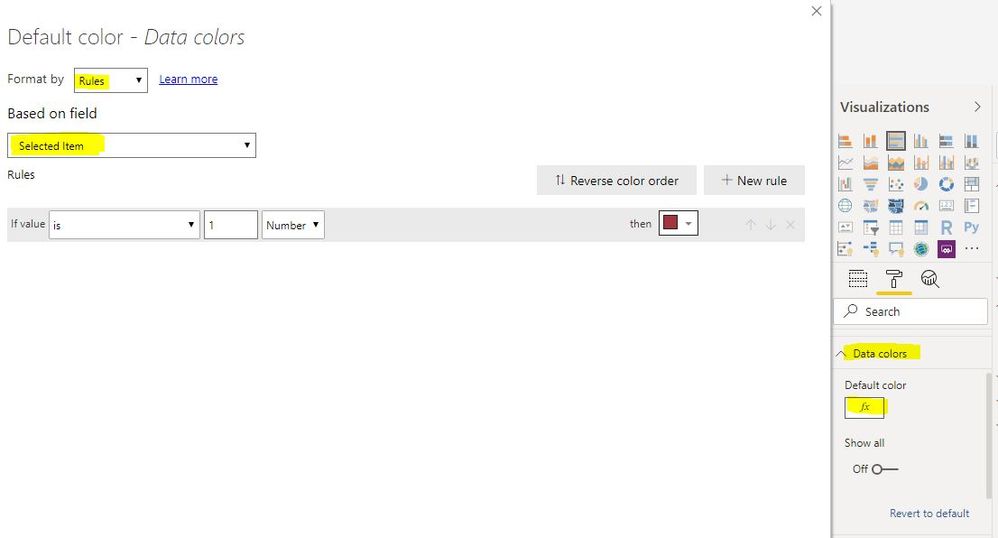
3) follow the steps I outlined previously to set the formatting in the Data Colours of the bar chart, but using this measure and setting the parameter to 1:
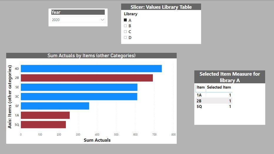
And you should get this:
The table called "Selected Item Measure for...." on the bottom right is so that you can see the items identified in the measure used for Conditional Formatting, and how this in turn selects the corresponding bars in the Bar Chart.
Does this work for you?
Did I answer your question? Mark my post as a solution!
In doing so, you are also helping me. Thank you!
Proud to be a Super User!
Paul on Linkedin.
- Mark as New
- Bookmark
- Subscribe
- Mute
- Subscribe to RSS Feed
- Permalink
- Report Inappropriate Content
Try this, though it needs a bit of work...
I have created a dummy model with random data (I couldn´t copy your tables because you posted them as images). To set the scene:
a) The "Library" in my model represents your library values
b) I am doing a simple sum of actual values as the basis for my measure displayed in the bar chart; use your measure accordingly
and then proceed as follows.
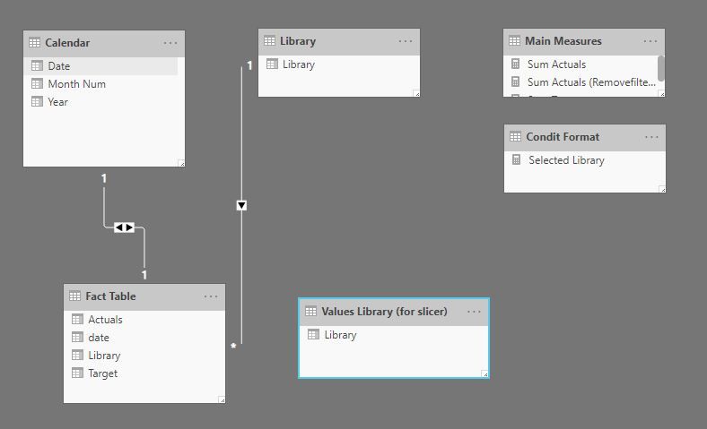
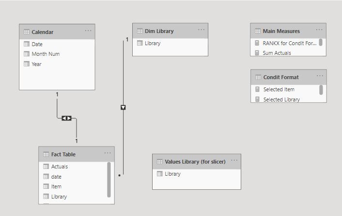
1) create a duplicate of your 'basisbibliotheek' table (different name). Make sure it doesn't have a relationship with your fact table. In my case I duplicated my Library table to create a new table named "Values Library Table (for slicer)"
The model looks like this:
3) Creat the bar chart using the original Library table as you axis.
In my case the axis is from the "Library Table"
4) Add your measure as your values
5) Add your slicers: year from Calendar and Library from the new table you have created. In my case from "Values Library Table"
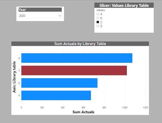
6) Create a measure to use as a conditional formatting rule. in my case this is:
Selected Library = IF(MIN(''Library'[Library]) = SELECTEDVALUE('Values Library (for slicer)'[Library]); 1)
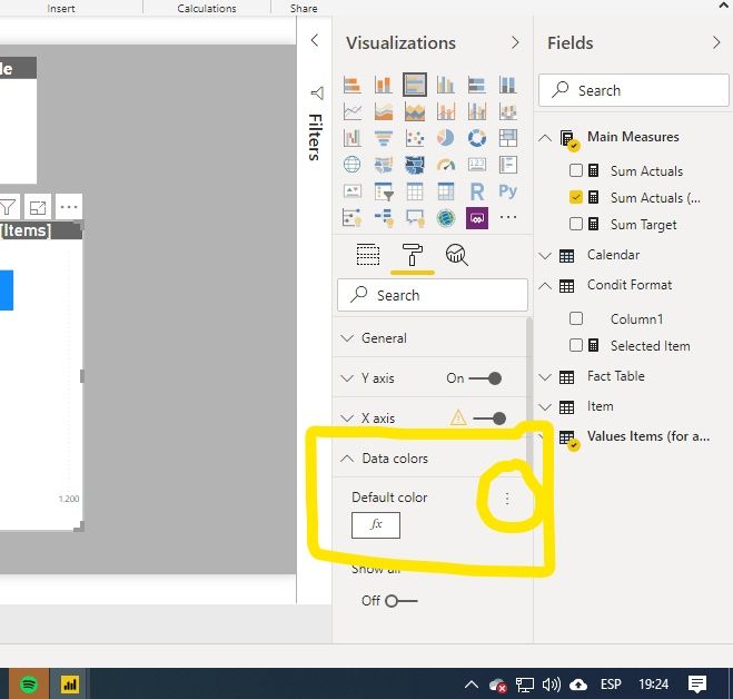
7) Select the bar chart visual and go to the format pane. Under the "Data Colors" option, choose the condit. format elipsis
😎in the dropdown, choose "Format by" - Rules, select your condit formatting measure and set the parameter:
And you should get this:
Hope it isn't too confusing!
PS: if you are using the library slicer to filter other visuals on the page we need to tweak the process. Let me know if you are expecting the slicer to filter other visuals
Did I answer your question? Mark my post as a solution!
In doing so, you are also helping me. Thank you!
Proud to be a Super User!
Paul on Linkedin.
- Mark as New
- Bookmark
- Subscribe
- Mute
- Subscribe to RSS Feed
- Permalink
- Report Inappropriate Content
Hi Paul,
I'm trying to allow the slicer to filter other visuals as well as change the color but I cannot figure out how to get it working. Any advice would be greatly appreciated. I can open up another question if you would prefer that.
Thank you!
ZL
- Mark as New
- Bookmark
- Subscribe
- Mute
- Subscribe to RSS Feed
- Permalink
- Report Inappropriate Content
Following with the same example posted in this thread:
The model is
If you want the slicer to filter other visuals, add a slicer from the Dim Library table (which has a relationship with the fact table, so it will filter the visuals.
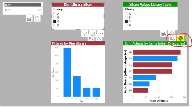
To prevent this Dim library slicer from filtering the visual which we want to highlight values, select the slicer and turn off the interaction with the highlighting visual:
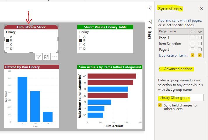
Now that we have set up the page, we need to synch both slicers so that the selection in the Dim Library slicer is replicated by the Slicer: Values Library Table slicer. To do this, go to "View" in the ribbon and select "Sync slicers".
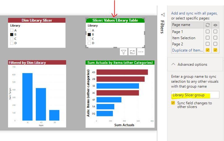
Now select the Dim library slicer and in the pane, expand "Advanced options" and type in a name (in my example "Library Slicer group":
Select the secon slicer and type in the same name:
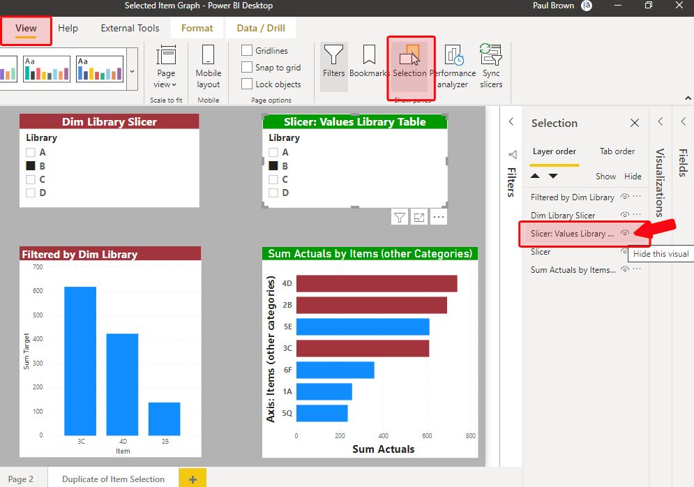
Both slicers are now synched, so any change in one will be enacted in the second. We can now hide the second slicer (Slicer: Values Library Table slicer) from the page since it is synched. Under "View", choose "selection" and hide the slicer by clicking on the eye-icon in the objects listed.
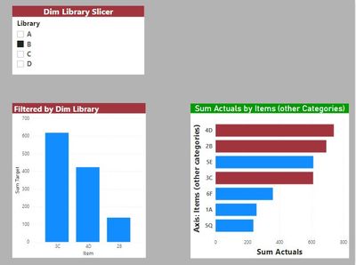
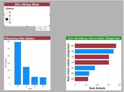
which gets you this:
I hope that helps!
I've attached the sample PBIX for you:
Did I answer your question? Mark my post as a solution!
In doing so, you are also helping me. Thank you!
Proud to be a Super User!
Paul on Linkedin.
- Mark as New
- Bookmark
- Subscribe
- Mute
- Subscribe to RSS Feed
- Permalink
- Report Inappropriate Content
Thank you Paul this is great! I appreciate the fast response!
ZL
- Mark as New
- Bookmark
- Subscribe
- Mute
- Subscribe to RSS Feed
- Permalink
- Report Inappropriate Content
Happy to have helped! Would you mind marking the message as a solution to help others looking for a similar solution?
Did I answer your question? Mark my post as a solution!
In doing so, you are also helping me. Thank you!
Proud to be a Super User!
Paul on Linkedin.
- Mark as New
- Bookmark
- Subscribe
- Mute
- Subscribe to RSS Feed
- Permalink
- Report Inappropriate Content
Thanks @PaulDBrown , I tried out your sollution. However it doesn't solve my question immediately, it might be because I'm pretty new to PowerBI.
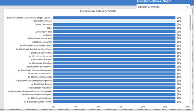
Thing is I dont have my library names on the axes. If I have that, I select the filter and it works (changes color), as you can see on the picture below.
However I don't have the libraries on the axes, but other categories, which are linked to what libraries offer.
So if I select a library I want the options they offer to change color.
Oh and to respond to your other question: no there is only one graph.
- Mark as New
- Bookmark
- Subscribe
- Mute
- Subscribe to RSS Feed
- Permalink
- Report Inappropriate Content
Apologies for that. I misunderstood your issue.
Just to avoid confusion, here is what my fact table looks like:
Try the following:
1) without changing the model, in the bar graph add the other categories as the axis.
2) now create this measure to use in the conditional formatting dialogue (in my Fact table I have "Item" per Library as a representation of your "Other Categories" - if that makes sense)
Selected Item =
VAR calc = CALCULATE(DISTINCTCOUNT('Fact Table'[Item]);
            TREATAS(VALUES('Values Library (for slicer)'[Library]); 'Fact Table'[Library]))
Return
IF(calc = 1;1)
3) follow the steps I outlined previously to set the formatting in the Data Colours of the bar chart, but using this measure and setting the parameter to 1:
And you should get this:
The table called "Selected Item Measure for...." on the bottom right is so that you can see the items identified in the measure used for Conditional Formatting, and how this in turn selects the corresponding bars in the Bar Chart.
Does this work for you?
Did I answer your question? Mark my post as a solution!
In doing so, you are also helping me. Thank you!
Proud to be a Super User!
Paul on Linkedin.
- Mark as New
- Bookmark
- Subscribe
- Mute
- Subscribe to RSS Feed
- Permalink
- Report Inappropriate Content
Yes this works, thanks so much!!
- Mark as New
- Bookmark
- Subscribe
- Mute
- Subscribe to RSS Feed
- Permalink
- Report Inappropriate Content
Hi @Bananenplant ,
If your problem has been solved, please consider Accept it as the solution to help the other members find it more quickly.
Best Regards,
Lionel Chen
- Mark as New
- Bookmark
- Subscribe
- Mute
- Subscribe to RSS Feed
- Permalink
- Report Inappropriate Content
glad we got there eventually!
can you please mark my las post as a solution to help others in search for a similar solution?
thanks!
Did I answer your question? Mark my post as a solution!
In doing so, you are also helping me. Thank you!
Proud to be a Super User!
Paul on Linkedin.
- Mark as New
- Bookmark
- Subscribe
- Mute
- Subscribe to RSS Feed
- Permalink
- Report Inappropriate Content
Hi @Bananenplant ,
Could you show us your DAX formula of [percentage of libraries that offer certain activities], By words description, I don't particularly understand what you mean.
Best Regards,
Lionel Chen
- Mark as New
- Bookmark
- Subscribe
- Mute
- Subscribe to RSS Feed
- Permalink
- Report Inappropriate Content
I used the following DAX formula:
Perc = DIVIDE (SUM(Table 2[Offers activity]);sum(Table2[Totaal]).
I have been looking at a way to send you my PowerBI file, but there isnt, is there? (sorry, new here).
- Mark as New
- Bookmark
- Subscribe
- Mute
- Subscribe to RSS Feed
- Permalink
- Report Inappropriate Content
Hi @Bananenplant,
I think you need to change the interactive interaction...
https://docs.microsoft.com/en-us/power-bi/service-reports-visual-interactions
... and you need to add conditional formatting based on a dax rule.
Regards,
Marcus
Dortmund - Germany
If I answered your question, please mark my post as solution, this will also help others.
Please give Kudos for support.
- Mark as New
- Bookmark
- Subscribe
- Mute
- Subscribe to RSS Feed
- Permalink
- Report Inappropriate Content
Thanks, this might work.. I will look into this tonight!
Helpful resources

Microsoft Fabric Learn Together
Covering the world! 9:00-10:30 AM Sydney, 4:00-5:30 PM CET (Paris/Berlin), 7:00-8:30 PM Mexico City

Power BI Monthly Update - April 2024
Check out the April 2024 Power BI update to learn about new features.

| User | Count |
|---|---|
| 97 | |
| 96 | |
| 82 | |
| 74 | |
| 66 |
| User | Count |
|---|---|
| 121 | |
| 105 | |
| 102 | |
| 82 | |
| 72 |
