- Power BI forums
- Updates
- News & Announcements
- Get Help with Power BI
- Desktop
- Service
- Report Server
- Power Query
- Mobile Apps
- Developer
- DAX Commands and Tips
- Custom Visuals Development Discussion
- Health and Life Sciences
- Power BI Spanish forums
- Translated Spanish Desktop
- Power Platform Integration - Better Together!
- Power Platform Integrations (Read-only)
- Power Platform and Dynamics 365 Integrations (Read-only)
- Training and Consulting
- Instructor Led Training
- Dashboard in a Day for Women, by Women
- Galleries
- Community Connections & How-To Videos
- COVID-19 Data Stories Gallery
- Themes Gallery
- Data Stories Gallery
- R Script Showcase
- Webinars and Video Gallery
- Quick Measures Gallery
- 2021 MSBizAppsSummit Gallery
- 2020 MSBizAppsSummit Gallery
- 2019 MSBizAppsSummit Gallery
- Events
- Ideas
- Custom Visuals Ideas
- Issues
- Issues
- Events
- Upcoming Events
- Community Blog
- Power BI Community Blog
- Custom Visuals Community Blog
- Community Support
- Community Accounts & Registration
- Using the Community
- Community Feedback
Register now to learn Fabric in free live sessions led by the best Microsoft experts. From Apr 16 to May 9, in English and Spanish.
- Power BI forums
- Forums
- Get Help with Power BI
- Desktop
- Re: Can Measure Result be used for Creating a Char...
- Subscribe to RSS Feed
- Mark Topic as New
- Mark Topic as Read
- Float this Topic for Current User
- Bookmark
- Subscribe
- Printer Friendly Page
- Mark as New
- Bookmark
- Subscribe
- Mute
- Subscribe to RSS Feed
- Permalink
- Report Inappropriate Content
Can Measure Result be used for Creating a Chart?
Hi,
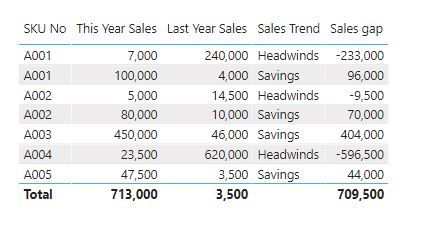
I have a data table as below. I used measure to calculate the Last Year Sales numbers and categorized the Sales Trend. For the Sales Trend, if this year sales is bigger than last year sales, then the trand is Savings, otherwise Headwinds.
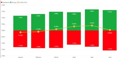
Anyone can tell me how to create the chart as I copied below from the Sales Trend data? I had a hard time to find how Measure result can be used for creating a chart.
Thanks for your insights.
- Mark as New
- Bookmark
- Subscribe
- Mute
- Subscribe to RSS Feed
- Permalink
- Report Inappropriate Content
Hi @Anonymous
Could you tell me if your problem has been solved? If it is, kindly Accept it as the solution. More people will benefit from it. Or you are still confused about it, please provide me with more details about your table and your problem or share me with your pbix file from your onedrive business.
Best Regards,
Rico Zhou
- Mark as New
- Bookmark
- Subscribe
- Mute
- Subscribe to RSS Feed
- Permalink
- Report Inappropriate Content
Hi Rico,
Thanks for the insights.
When I take out the country column from the table you created, the SKU list and sales numbers do not summ up. How to make it summ up, including the Sales Trend?
- Mark as New
- Bookmark
- Subscribe
- Mute
- Subscribe to RSS Feed
- Permalink
- Report Inappropriate Content
@v-rzhou-msft added a few more rows to the model for the example. His solutions should still be correct, I removed the rows for you in the file attached below.
Connect on LinkedIn
- Mark as New
- Bookmark
- Subscribe
- Mute
- Subscribe to RSS Feed
- Permalink
- Report Inappropriate Content
@tex628 Thanks for your feedback.
But, you should not delete the rows. In my real data, I have multiple SKUs by Countries, by Business, stc.
I forgot to say something. If you add the total in the table, the numbers are also not correct.
- Mark as New
- Bookmark
- Subscribe
- Mute
- Subscribe to RSS Feed
- Permalink
- Report Inappropriate Content
There might be some slight missunderstanding here.
In your original excel chart, can you explain what exactly is being summed in the green and red parts of the chart?
Br,
J
Connect on LinkedIn
- Mark as New
- Bookmark
- Subscribe
- Mute
- Subscribe to RSS Feed
- Permalink
- Report Inappropriate Content
@tex628 the chart is only a visual example, not based on the data I provided.
The color represent the total Summ of Sales Gap, it is green if the sum is positive and red if negative. The X axis must be able to changet to Country or SKU.
Can you please work with my sample data here: https://1drv.ms/x/s!Ald6vpsRS30Qg7EMQCC_QnWxy8UyyQ?e=svz1w6
My objectives are to create the table as you can see in 2020 Mix tab and the Chart in the Chart Tab. The X axis of the card must be able to changed to country, group, division, etc to repsesent the summ of Group Mix Amt.
Thanks,
Rizal
- Mark as New
- Bookmark
- Subscribe
- Mute
- Subscribe to RSS Feed
- Permalink
- Report Inappropriate Content
Alright,
When we are comparing the sales of a 2020 row, which criteria from the 2019 row needs to match?
- Exact date?
- Country?
- Group?
- Division?
- SKU?
/ J
Connect on LinkedIn
- Mark as New
- Bookmark
- Subscribe
- Mute
- Subscribe to RSS Feed
- Permalink
- Report Inappropriate Content
- Exact date? Not necessary by date, but by month would be good enough
- Country? Yes
- Group? Yes
- Division? Yes
- SKU? Yes
- Mark as New
- Bookmark
- Subscribe
- Mute
- Subscribe to RSS Feed
- Permalink
- Report Inappropriate Content
With all 5 dimensions as a criteria there is only 70 rows from the 2020 records that have a corresponding 2019 record. I've attched the files below.
/ J
Connect on LinkedIn
- Mark as New
- Bookmark
- Subscribe
- Mute
- Subscribe to RSS Feed
- Permalink
- Report Inappropriate Content
@tex628 Thanks! Would you be able to show me the calculated colum formula?
How about the other columnsi n 2020 Mix Tab? Actually the Mix Trend is not based on Sales numbers, but the Group Mix Amount.
- Mark as New
- Bookmark
- Subscribe
- Mute
- Subscribe to RSS Feed
- Permalink
- Report Inappropriate Content
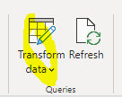
All the calculations are made in power query, so if you navigate to the power query editor you will be able to see exactly what steps i made:
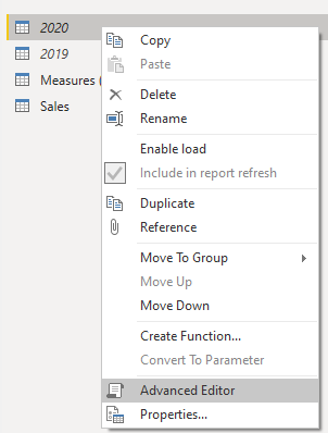
You will need to correct the source adress to the excel file, this is done by right-clicking the 2020 & 2019 queries and pressing advanced editor:
Change this to your own destination:
Regarding the other measurements in the Mix Tab I started you off in the file below, I'm not certain as to how all the columns should be calculated so have a look and let me know if there is any issues:
Connect on LinkedIn
- Mark as New
- Bookmark
- Subscribe
- Mute
- Subscribe to RSS Feed
- Permalink
- Report Inappropriate Content
@tex628 the report look good but there is still one issue as below.
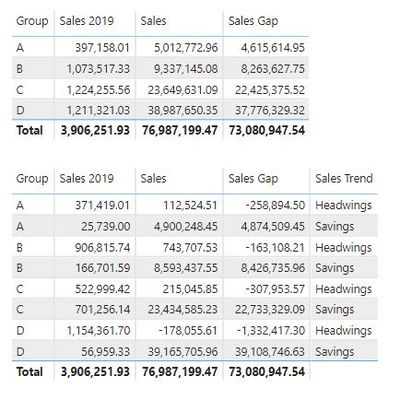
I use the Sales Table to create the tables below. As you can see in the second table, when I add the Sales Trend column, the Group become splited.
- Mark as New
- Bookmark
- Subscribe
- Mute
- Subscribe to RSS Feed
- Permalink
- Report Inappropriate Content
We are currently categorizing every combination of dimensions as either headwing or saving on a row level basis. Using the image above as an example this means that within the group "A" there one or more rows that are considered "Headwings" as well as one moremore that are considered "Savings". Since the Headwings/Savings calculation is made before any calulation in the table is done the column acts as a category, telling you that within the specific group "A" there is a specific sales gap related to the categories.
If you're looking for a categorization that is done in the table calculation you will need to use a measure instead of a calculated column. Since the measure needs to rely on the sales gap the gap also needs to be calculated with a measure.
Sales Gap = [Sales] - [Sales 2019]Sales Trend = IF( [Sales Gap] >= 0 , "Savings" , "Headwings" )
But keep in mind that measures are dynamic and will calculate dependant on the dimensions they are evaluated with. As you are currently only using the "Group" dimension in your table, this essentially means that the sales gaps will be a comparison of the 2020 / 2019 sales for each group.
Hope this helps, let me know how it goes.
/ J
Connect on LinkedIn
- Mark as New
- Bookmark
- Subscribe
- Mute
- Subscribe to RSS Feed
- Permalink
- Report Inappropriate Content
@tex628 Thanks for your insights, now I got the better idea.
I have another question. How can I formulate a Column Calculation for YTD Sales column below? The YTD Sales is based on the Country and SKU. I need your insight to create the column using Calculated Column because I prety much understand how to do it using Measure.
| Country | Date | SKU | Sales | YTD Sales |
| MY | 15 Jan 2020 | M001 | 100 | 100 |
| JP | 23 Jan 2020 | J001 | 75 | 75 |
MY | 20 Feb 2020 | M001 | 120 | 220 (100 + 120) |
| JP | 5 Feb 2020 | J001 | 150 | 225 (75 + 150) |
| JP | 12 Mar 2020 | J002 | 125 | 125 |
| MY | 21 Mar 2020 | M002 | 170 | 170 |
| JP | 5 Mar 2020 | J002 | 10 | 135 (125 + 10) |
- Mark as New
- Bookmark
- Subscribe
- Mute
- Subscribe to RSS Feed
- Permalink
- Report Inappropriate Content
Hi @Anonymous
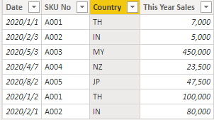
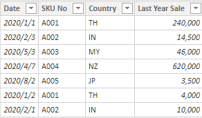
I build two table to have a test.
This year Table:
Last year Table:
Then I use measure to add Last Year Sale into This year table and get sales gap between last year and this year..
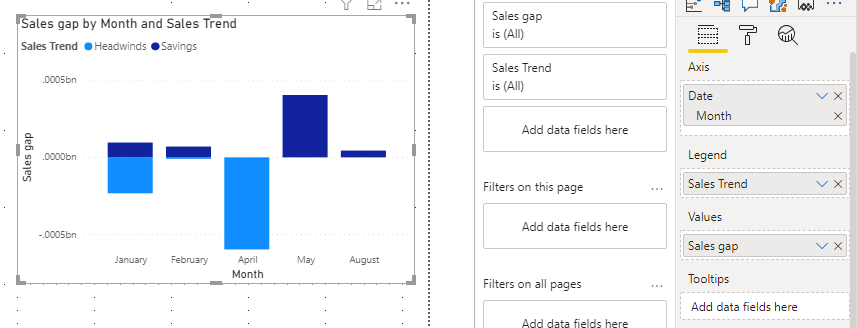
Last Year Sales = CALCULATE(SUM('Last year'[Last Year Sale]),FILTER('Last year','Last year'[Date]=MAX('This year'[Date])))Sales gap = SUM('This year'[This Year Sales])-[Last Year Sales]It is not supported to use measures into “Legend”. So we need to create a calculated column of Sales Trend.
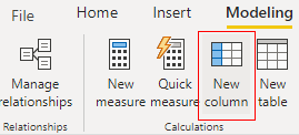
Sales Trend = IF('This year'[This Year Sales]>[Last Year Sales],"Savings","Headwinds")Then we build a stack column chart, result is as below.
Due to I don’t know the value you use to build the line chart, if this reply still couldn’t help you to solve your problem, you may provide me the calculate logic of the line chart and more details about your issue just like share me a screen shot or share your pbix file by onedrive for business.
You can download the pbix file from this link: Can Measure Result be used for Creating a Chart?
Best Regards,
Rico Zhou
If this post helps, then please consider Accept it as the solution to help the other members find it more quickly.
- Mark as New
- Bookmark
- Subscribe
- Mute
- Subscribe to RSS Feed
- Permalink
- Report Inappropriate Content
@Anonymous , One is you need have date table with Month and month year and joined with your date.
You can use stacked line visual
Use Month from date sales trend as a legend.
refer: https://docs.microsoft.com/en-us/power-bi/visuals/power-bi-visualization-combo-chart
Can you share sample data and sample output in table format?
Microsoft Power BI Learning Resources, 2023 !!
Learn Power BI - Full Course with Dec-2022, with Window, Index, Offset, 100+ Topics !!
Did I answer your question? Mark my post as a solution! Appreciate your Kudos !! Proud to be a Super User! !!
- Mark as New
- Bookmark
- Subscribe
- Mute
- Subscribe to RSS Feed
- Permalink
- Report Inappropriate Content
Hi Amit,
Thanks for your prompt respond.
Unfortinatelly your advice doesn't work. As I mentioned earlier, the Sales Trend data is a result of measure and it cannot be used in colums series to generate the chart.
How can I attach the data sample data here?
Helpful resources

Microsoft Fabric Learn Together
Covering the world! 9:00-10:30 AM Sydney, 4:00-5:30 PM CET (Paris/Berlin), 7:00-8:30 PM Mexico City

Power BI Monthly Update - April 2024
Check out the April 2024 Power BI update to learn about new features.

| User | Count |
|---|---|
| 106 | |
| 97 | |
| 80 | |
| 67 | |
| 63 |
| User | Count |
|---|---|
| 147 | |
| 110 | |
| 108 | |
| 85 | |
| 64 |

