- Power BI forums
- Updates
- News & Announcements
- Get Help with Power BI
- Desktop
- Service
- Report Server
- Power Query
- Mobile Apps
- Developer
- DAX Commands and Tips
- Custom Visuals Development Discussion
- Health and Life Sciences
- Power BI Spanish forums
- Translated Spanish Desktop
- Power Platform Integration - Better Together!
- Power Platform Integrations (Read-only)
- Power Platform and Dynamics 365 Integrations (Read-only)
- Training and Consulting
- Instructor Led Training
- Dashboard in a Day for Women, by Women
- Galleries
- Community Connections & How-To Videos
- COVID-19 Data Stories Gallery
- Themes Gallery
- Data Stories Gallery
- R Script Showcase
- Webinars and Video Gallery
- Quick Measures Gallery
- 2021 MSBizAppsSummit Gallery
- 2020 MSBizAppsSummit Gallery
- 2019 MSBizAppsSummit Gallery
- Events
- Ideas
- Custom Visuals Ideas
- Issues
- Issues
- Events
- Upcoming Events
- Community Blog
- Power BI Community Blog
- Custom Visuals Community Blog
- Community Support
- Community Accounts & Registration
- Using the Community
- Community Feedback
Register now to learn Fabric in free live sessions led by the best Microsoft experts. From Apr 16 to May 9, in English and Spanish.
- Power BI forums
- Forums
- Get Help with Power BI
- Desktop
- Burndown Chart for Milestones Tracking
- Subscribe to RSS Feed
- Mark Topic as New
- Mark Topic as Read
- Float this Topic for Current User
- Bookmark
- Subscribe
- Printer Friendly Page
- Mark as New
- Bookmark
- Subscribe
- Mute
- Subscribe to RSS Feed
- Permalink
- Report Inappropriate Content
Burndown Chart for Milestones Tracking
Hi,
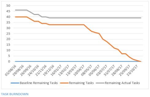
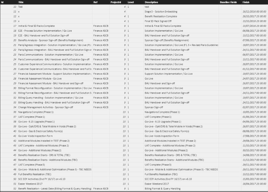
I'm hoping someone on here can help I am attempting to create a burndown chart similar to the attached screen shot within Power BI in order to track baselined finish dates against current finish dates. I have worked out that i will need to create a column within my milestones table that calculates the number of days between the finish date in a row and the latest finish date in the table which will then produce values that decrease the closer you get to the final finish dates. The problem is that i have no idea how to do this and i'm hoping someone here can give me a helping hand with the formula. I tried to use the DATEDIFF function to no avail.
Thanks
Ian
- Mark as New
- Bookmark
- Subscribe
- Mute
- Subscribe to RSS Feed
- Permalink
- Report Inappropriate Content
I have worked out that i will need to create a column within my milestones table that calculates the number of days between the finish date in a row and the latest finish date in the table which will then produce values that decrease the closer you get to the final finish dates. The problem is that i have no idea how to do this and i'm hoping someone here can give me a helping hand with the formula.
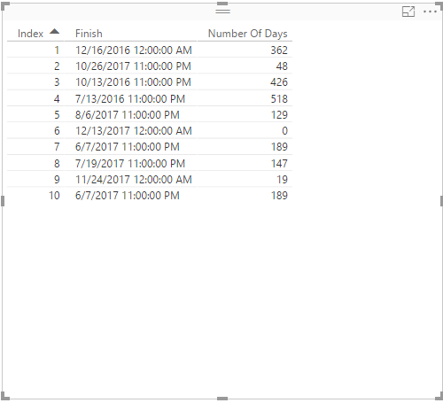
Create the following columns in your table and check if you get desired result.
LatestDateInTable = MAX(Table1[Finish])
Number Of Days = DATEDIFF(Table1[Finish],Table1[LatestDateInTable],DAY)
Regards,
Lydia Zhang
If this post helps, then please consider Accept it as the solution to help the other members find it more quickly.
- Mark as New
- Bookmark
- Subscribe
- Mute
- Subscribe to RSS Feed
- Permalink
- Report Inappropriate Content
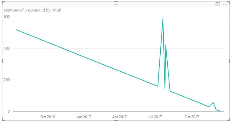
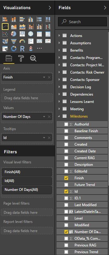
Thanks for this @v-yuezhe-msft, i am finding though that when i create the line chart from the data it's not quite working as expected. it comes up with the below.
- Mark as New
- Bookmark
- Subscribe
- Mute
- Subscribe to RSS Feed
- Permalink
- Report Inappropriate Content
Sorry, a little further narrative is that it seems to sum the items that have the same month/date
- Mark as New
- Bookmark
- Subscribe
- Mute
- Subscribe to RSS Feed
- Permalink
- Report Inappropriate Content
Hi @icantwi,
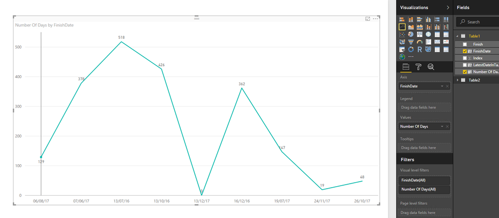
Create a new column using the following DAX, then create a line chart as shown in the following screenshot.
FinishDate = FORMAT(Table1[Finish],"DD/MM/YY")
Regards,
If this post helps, then please consider Accept it as the solution to help the other members find it more quickly.
- Mark as New
- Bookmark
- Subscribe
- Mute
- Subscribe to RSS Feed
- Permalink
- Report Inappropriate Content
Hi ,
Unfortunately that's not quite what I was looking for. Then line shouldn't rise and fall so it should start with everything at the start and then as items complete the values should reduce until 0. Just like the first example i showed.
Kind Regards
Ian
Helpful resources

Microsoft Fabric Learn Together
Covering the world! 9:00-10:30 AM Sydney, 4:00-5:30 PM CET (Paris/Berlin), 7:00-8:30 PM Mexico City

Power BI Monthly Update - April 2024
Check out the April 2024 Power BI update to learn about new features.

| User | Count |
|---|---|
| 105 | |
| 105 | |
| 87 | |
| 73 | |
| 66 |
| User | Count |
|---|---|
| 122 | |
| 112 | |
| 98 | |
| 79 | |
| 72 |
