- Power BI forums
- Updates
- News & Announcements
- Get Help with Power BI
- Desktop
- Service
- Report Server
- Power Query
- Mobile Apps
- Developer
- DAX Commands and Tips
- Custom Visuals Development Discussion
- Health and Life Sciences
- Power BI Spanish forums
- Translated Spanish Desktop
- Power Platform Integration - Better Together!
- Power Platform Integrations (Read-only)
- Power Platform and Dynamics 365 Integrations (Read-only)
- Training and Consulting
- Instructor Led Training
- Dashboard in a Day for Women, by Women
- Galleries
- Community Connections & How-To Videos
- COVID-19 Data Stories Gallery
- Themes Gallery
- Data Stories Gallery
- R Script Showcase
- Webinars and Video Gallery
- Quick Measures Gallery
- 2021 MSBizAppsSummit Gallery
- 2020 MSBizAppsSummit Gallery
- 2019 MSBizAppsSummit Gallery
- Events
- Ideas
- Custom Visuals Ideas
- Issues
- Issues
- Events
- Upcoming Events
- Community Blog
- Power BI Community Blog
- Custom Visuals Community Blog
- Community Support
- Community Accounts & Registration
- Using the Community
- Community Feedback
Earn a 50% discount on the DP-600 certification exam by completing the Fabric 30 Days to Learn It challenge.
- Power BI forums
- Forums
- Get Help with Power BI
- Desktop
- ow itRe: Adding a legend removes/excludes values
- Subscribe to RSS Feed
- Mark Topic as New
- Mark Topic as Read
- Float this Topic for Current User
- Bookmark
- Subscribe
- Printer Friendly Page
- Mark as New
- Bookmark
- Subscribe
- Mute
- Subscribe to RSS Feed
- Permalink
- Report Inappropriate Content
Adding a legend removes/excludes values
Hi!
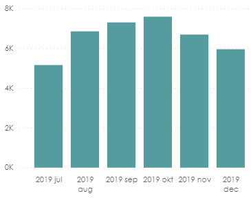
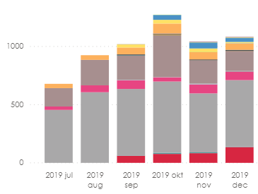
I have created a stacked bar-chart and when adding a Date-variable on the Axis and a measure on the Values it gives the correct output. Once I add a legend the output gives the wrong values. I have no filter enabled other than Year = 2019 and Month = July-December.
The chart without adding a legend (correct values):
The chart with a legend:
So, the only differences between the two charts above are the legend added.
I hope someone can help!
Thanks! 🙂
// BR
Solved! Go to Solution.
- Mark as New
- Bookmark
- Subscribe
- Mute
- Subscribe to RSS Feed
- Permalink
- Report Inappropriate Content
I found the solution:
For some reason the stacked bar chart can maximum display 58 different types of the legend. This means, that when I look at legends more than 58 types it chooses itself which to display.
Therefore, I added a filter to display only the top 58 filters by the measure used.
- Mark as New
- Bookmark
- Subscribe
- Mute
- Subscribe to RSS Feed
- Permalink
- Report Inappropriate Content
@Xilitor , I doubt join of legend with table or formula using some calculation on the legend
Microsoft Power BI Learning Resources, 2023 !!
Learn Power BI - Full Course with Dec-2022, with Window, Index, Offset, 100+ Topics !!
Did I answer your question? Mark my post as a solution! Appreciate your Kudos !! Proud to be a Super User! !!
- Mark as New
- Bookmark
- Subscribe
- Mute
- Subscribe to RSS Feed
- Permalink
- Report Inappropriate Content
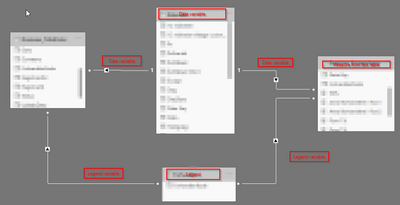
This is how it's connected:
Sorry for the blurring - I am using customer data.
- Mark as New
- Bookmark
- Subscribe
- Mute
- Subscribe to RSS Feed
- Permalink
- Report Inappropriate Content
I found the solution:
For some reason the stacked bar chart can maximum display 58 different types of the legend. This means, that when I look at legends more than 58 types it chooses itself which to display.
Therefore, I added a filter to display only the top 58 filters by the measure used.
- Mark as New
- Bookmark
- Subscribe
- Mute
- Subscribe to RSS Feed
- Permalink
- Report Inappropriate Content
I just using all 3 variables from the same table and I still experience the same problem. So it cannot be regarding the relationships. And I have done no calculations for any of variables for this chart. Could it be because of a back-end problem then?
- Mark as New
- Bookmark
- Subscribe
- Mute
- Subscribe to RSS Feed
- Permalink
- Report Inappropriate Content
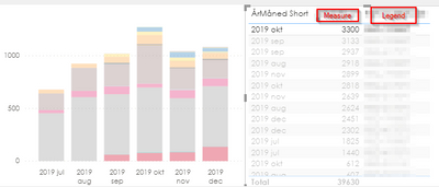
The legend detects the right number in a table but not in the chart.
E.g. selecting the legend in a table with the highest value doesn't highlight in the bar:
Helpful resources
| User | Count |
|---|---|
| 98 | |
| 90 | |
| 77 | |
| 71 | |
| 64 |
| User | Count |
|---|---|
| 114 | |
| 97 | |
| 95 | |
| 68 | |
| 65 |


