- Power BI forums
- Updates
- News & Announcements
- Get Help with Power BI
- Desktop
- Service
- Report Server
- Power Query
- Mobile Apps
- Developer
- DAX Commands and Tips
- Custom Visuals Development Discussion
- Health and Life Sciences
- Power BI Spanish forums
- Translated Spanish Desktop
- Power Platform Integration - Better Together!
- Power Platform Integrations (Read-only)
- Power Platform and Dynamics 365 Integrations (Read-only)
- Training and Consulting
- Instructor Led Training
- Dashboard in a Day for Women, by Women
- Galleries
- Community Connections & How-To Videos
- COVID-19 Data Stories Gallery
- Themes Gallery
- Data Stories Gallery
- R Script Showcase
- Webinars and Video Gallery
- Quick Measures Gallery
- 2021 MSBizAppsSummit Gallery
- 2020 MSBizAppsSummit Gallery
- 2019 MSBizAppsSummit Gallery
- Events
- Ideas
- Custom Visuals Ideas
- Issues
- Issues
- Events
- Upcoming Events
- Community Blog
- Power BI Community Blog
- Custom Visuals Community Blog
- Community Support
- Community Accounts & Registration
- Using the Community
- Community Feedback
Register now to learn Fabric in free live sessions led by the best Microsoft experts. From Apr 16 to May 9, in English and Spanish.
- Power BI forums
- Forums
- Get Help with Power BI
- Desktop
- Adding Markers to Chart
- Subscribe to RSS Feed
- Mark Topic as New
- Mark Topic as Read
- Float this Topic for Current User
- Bookmark
- Subscribe
- Printer Friendly Page
- Mark as New
- Bookmark
- Subscribe
- Mute
- Subscribe to RSS Feed
- Permalink
- Report Inappropriate Content
Adding Markers to Chart
Hello,
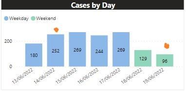
I have a bar chart that counts the number of cases our business unit receives. As an aside, we also have different Events (at any random day) which may influence the number of cases received. I'd like to have a marker (or some visual) to quickly identify when an Event occured. How would you suggest to go about this? Desired outcome is below (Event markers are in orange).
Thanks in advance for your help!
Solved! Go to Solution.
- Mark as New
- Bookmark
- Subscribe
- Mute
- Subscribe to RSS Feed
- Permalink
- Report Inappropriate Content
My suggestion is to use the Combo Clustered Line Chart. This can be a 1 or 0 or actual Event Count.
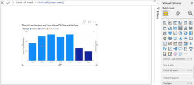
Create a measure to Count your Events. Put this as your Line. Something like this.
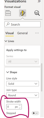
Then you can change line stroke width to 0, and change the Marker per your requirement.
Hope this gives you an idea to work with.
Regards,
- Mark as New
- Bookmark
- Subscribe
- Mute
- Subscribe to RSS Feed
- Permalink
- Report Inappropriate Content
Thank you! I'm curious if there is a mehod to display the name of the event when a user hovers over a marker?
- Mark as New
- Bookmark
- Subscribe
- Mute
- Subscribe to RSS Feed
- Permalink
- Report Inappropriate Content
Yes, you can use the Tooltip functionality.
Drag the field or fields you want to display into the Tooltip well.
Other option is to create a custom Tooltip Page. Search Youtube and you will get all the info you need and much better explanation than I can do here.
Regards,
- Mark as New
- Bookmark
- Subscribe
- Mute
- Subscribe to RSS Feed
- Permalink
- Report Inappropriate Content
@datapal04 ,
To achieve this you have to use line and stacked column chart and then in the Line y axis you have to use event metrics, then you have to enable markers under marker section then reduce the line stroke under line properties.
Now you may get the expects result.
Thanks,
- Mark as New
- Bookmark
- Subscribe
- Mute
- Subscribe to RSS Feed
- Permalink
- Report Inappropriate Content
Please share sample data.
Thanks,
- Mark as New
- Bookmark
- Subscribe
- Mute
- Subscribe to RSS Feed
- Permalink
- Report Inappropriate Content
Here you go. There 2 tables: cases by day and dates for Events.
| Date | Case Numbers | DayType |
| 2022-06-13 0:00 | 180 | Weekday |
| 2022-06-14 0:00 | 252 | Weekday |
| 2022-06-15 0:00 | 269 | Weekday |
| 2022-06-16 0:00 | 244 | Weekday |
| 2022-06-17 0:00 | 269 | Weekday |
| 2022-06-18 0:00 | 129 | Weekend |
| 2022-06-19 0:00 | 96 | Weekend |
| eventname | eventdate |
| Event 1 | 2022-06-14 |
| Event 2 | 2022-10-19 |
- Mark as New
- Bookmark
- Subscribe
- Mute
- Subscribe to RSS Feed
- Permalink
- Report Inappropriate Content
try this,
then,
make line stroke to 0
Thanks,
Helpful resources

Microsoft Fabric Learn Together
Covering the world! 9:00-10:30 AM Sydney, 4:00-5:30 PM CET (Paris/Berlin), 7:00-8:30 PM Mexico City

Power BI Monthly Update - April 2024
Check out the April 2024 Power BI update to learn about new features.

| User | Count |
|---|---|
| 97 | |
| 96 | |
| 82 | |
| 74 | |
| 66 |
| User | Count |
|---|---|
| 121 | |
| 105 | |
| 102 | |
| 82 | |
| 72 |
