- Power BI forums
- Updates
- News & Announcements
- Get Help with Power BI
- Desktop
- Service
- Report Server
- Power Query
- Mobile Apps
- Developer
- DAX Commands and Tips
- Custom Visuals Development Discussion
- Health and Life Sciences
- Power BI Spanish forums
- Translated Spanish Desktop
- Power Platform Integration - Better Together!
- Power Platform Integrations (Read-only)
- Power Platform and Dynamics 365 Integrations (Read-only)
- Training and Consulting
- Instructor Led Training
- Dashboard in a Day for Women, by Women
- Galleries
- Community Connections & How-To Videos
- COVID-19 Data Stories Gallery
- Themes Gallery
- Data Stories Gallery
- R Script Showcase
- Webinars and Video Gallery
- Quick Measures Gallery
- 2021 MSBizAppsSummit Gallery
- 2020 MSBizAppsSummit Gallery
- 2019 MSBizAppsSummit Gallery
- Events
- Ideas
- Custom Visuals Ideas
- Issues
- Issues
- Events
- Upcoming Events
- Community Blog
- Power BI Community Blog
- Custom Visuals Community Blog
- Community Support
- Community Accounts & Registration
- Using the Community
- Community Feedback
Register now to learn Fabric in free live sessions led by the best Microsoft experts. From Apr 16 to May 9, in English and Spanish.
- Power BI forums
- Forums
- Get Help with Power BI
- Desktop
- 100 Stacked Column chart %age not working - Analys...
- Subscribe to RSS Feed
- Mark Topic as New
- Mark Topic as Read
- Float this Topic for Current User
- Bookmark
- Subscribe
- Printer Friendly Page
- Mark as New
- Bookmark
- Subscribe
- Mute
- Subscribe to RSS Feed
- Permalink
- Report Inappropriate Content
100 Stacked Column chart %age not working - Analysis Service
Hi,
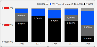
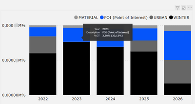
I need to create 100 Stacked Column chart using a measure (Estimated Revenue). However, I am getting weird values in %age format, instead of actual 100% stacked column chart. If I hover the chart for tooltip, the values and percentage inside are correct, but I don't know what is happening in the Y axis or in chart.
Just so you know, it is a measure from Analysis service, so I said
Estimated Revenue = Sum(Fact[Project_Estimated_Revenue])
So, the format in Estimated revenue is in Currency format. I am not sure, if this affects in any way, but I should be getting a simple graph with percentage values. From 0 to 100 and not 0.00000 M % to 0.000010 M %
Could someone tell me what might be happening here? I am not sure what is the problem here. Thank you!
Solved! Go to Solution.
- Mark as New
- Bookmark
- Subscribe
- Mute
- Subscribe to RSS Feed
- Permalink
- Report Inappropriate Content
Hi,
everything worked out, it was just a small glitch. I reset all the formats in this visual and everything was fine. 🙂
- Mark as New
- Bookmark
- Subscribe
- Mute
- Subscribe to RSS Feed
- Permalink
- Report Inappropriate Content
Hi,
everything worked out, it was just a small glitch. I reset all the formats in this visual and everything was fine. 🙂
- Mark as New
- Bookmark
- Subscribe
- Mute
- Subscribe to RSS Feed
- Permalink
- Report Inappropriate Content
Hi,
Just an update on this. I think this is some bug or something, i am always getting 0.00010M% (Max) in Y-axis, no matter which measure I choose. Could someone confirm this?
I am using May 2023 version
- Mark as New
- Bookmark
- Subscribe
- Mute
- Subscribe to RSS Feed
- Permalink
- Report Inappropriate Content
@Reindeer , Go to measure tools, I doubt you have used format or dynamic formatting.
Clear format and choose percent or decimal or check have you used this
https://powerbi.microsoft.com/en-us/blog/deep-dive-into-the-new-dynamic-format-strings-for-measures/
Microsoft Power BI Learning Resources, 2023 !!
Learn Power BI - Full Course with Dec-2022, with Window, Index, Offset, 100+ Topics !!
Did I answer your question? Mark my post as a solution! Appreciate your Kudos !! Proud to be a Super User! !!
- Mark as New
- Bookmark
- Subscribe
- Mute
- Subscribe to RSS Feed
- Permalink
- Report Inappropriate Content
Hi @amitchandak,
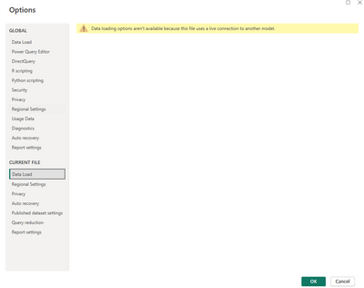
Thanks for your reply. Yes, this is new for me, however, I am connected to Analysis Service and it doesn't allow me to use this tool. I went through your link and I don't have that option to activate dynamic formatting. (See Image Below)
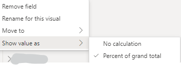
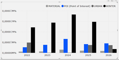
Also, I removed all the formats from the Analysis Service in this measure, but no change in the output. For different testing I tried using different graphs and I see perfect results, but as soon as I select "Show value as - Percent of Grand Total", everything messes up
Graph: Clustered Column Chart
Please note: tooltip shows correct values
I just want to see the same result in Y axis and Data Values. Sorry for any confusion
Helpful resources

Microsoft Fabric Learn Together
Covering the world! 9:00-10:30 AM Sydney, 4:00-5:30 PM CET (Paris/Berlin), 7:00-8:30 PM Mexico City

Power BI Monthly Update - April 2024
Check out the April 2024 Power BI update to learn about new features.

| User | Count |
|---|---|
| 113 | |
| 103 | |
| 76 | |
| 66 | |
| 63 |
| User | Count |
|---|---|
| 142 | |
| 105 | |
| 102 | |
| 81 | |
| 68 |
