- Power BI forums
- Updates
- News & Announcements
- Get Help with Power BI
- Desktop
- Service
- Report Server
- Power Query
- Mobile Apps
- Developer
- DAX Commands and Tips
- Custom Visuals Development Discussion
- Health and Life Sciences
- Power BI Spanish forums
- Translated Spanish Desktop
- Power Platform Integration - Better Together!
- Power Platform Integrations (Read-only)
- Power Platform and Dynamics 365 Integrations (Read-only)
- Training and Consulting
- Instructor Led Training
- Dashboard in a Day for Women, by Women
- Galleries
- Community Connections & How-To Videos
- COVID-19 Data Stories Gallery
- Themes Gallery
- Data Stories Gallery
- R Script Showcase
- Webinars and Video Gallery
- Quick Measures Gallery
- 2021 MSBizAppsSummit Gallery
- 2020 MSBizAppsSummit Gallery
- 2019 MSBizAppsSummit Gallery
- Events
- Ideas
- Custom Visuals Ideas
- Issues
- Issues
- Events
- Upcoming Events
- Community Blog
- Power BI Community Blog
- Custom Visuals Community Blog
- Community Support
- Community Accounts & Registration
- Using the Community
- Community Feedback
Register now to learn Fabric in free live sessions led by the best Microsoft experts. From Apr 16 to May 9, in English and Spanish.
- Power BI forums
- Forums
- Get Help with Power BI
- Desktop
- Re: 100% Stacked Bar - Label density not showing
- Subscribe to RSS Feed
- Mark Topic as New
- Mark Topic as Read
- Float this Topic for Current User
- Bookmark
- Subscribe
- Printer Friendly Page
- Mark as New
- Bookmark
- Subscribe
- Mute
- Subscribe to RSS Feed
- Permalink
- Report Inappropriate Content
100% Stacked Bar - Label density not showing
I have a 100% stacked bar chart but some data labels are missing because of the space. I tried to use the option of the label density but it doesn't show up. The X-axis does not have continuos or categorical option either. Can you help?
https://1drv.ms/u/s!AuMLcKZkL7PFglvr7P5Od3S9E-3_?e=znRm0b
- Mark as New
- Bookmark
- Subscribe
- Mute
- Subscribe to RSS Feed
- Permalink
- Report Inappropriate Content
1 Year later and I still have the same problem. Has this not been resolved yet?
- Mark as New
- Bookmark
- Subscribe
- Mute
- Subscribe to RSS Feed
- Permalink
- Report Inappropriate Content
Hi @marijane ,
Whether the advice given by @Pragati11 has solved your confusion, if the problem has been solved you can mark the reply for the standard answer to help the other members find it more quickly. If not, please point it out.
Looking forward to your feedback.
Best Regards,
Henry
- Mark as New
- Bookmark
- Subscribe
- Mute
- Subscribe to RSS Feed
- Permalink
- Report Inappropriate Content
No, it doesn't solve my problem. I have the same issue.
- Mark as New
- Bookmark
- Subscribe
- Mute
- Subscribe to RSS Feed
- Permalink
- Report Inappropriate Content
I already show one picture of the data labels options but ok I will send more screenshots:
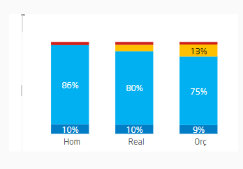
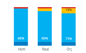
this is the chart, the last percentage is not showing, my goal is show all the percentages of the stacked bar
https://1drv.ms/u/s!AuMLcKZkL7PFglxSAIPOSfTNoaiT?e=kVyEjM
this is the options of x-axis
https://1drv.ms/u/s!AuMLcKZkL7PFgl3mDqKaL4sZ2ldT?e=jcxVbt
this is the options of data labels:
https://1drv.ms/u/s!AuMLcKZkL7PFgl5rlrhTG-RdOuU-?e=RrcMw5
https://1drv.ms/u/s!AuMLcKZkL7PFgl8wutjYPAqdcuna?e=aHto01
Thank you in advance
- Mark as New
- Bookmark
- Subscribe
- Mute
- Subscribe to RSS Feed
- Permalink
- Report Inappropriate Content
Hi @marijane ,
Thanks for sharing the additional screenshots. The one that is helpful is this one:
Now the area of the bars that are red in the stacked bar chart above, is very small. So it will be tricky to display them when compared to the areas of other colors represented on the stacked bars.
Just try to play around with the following formatting settings in Power BI if that helps:
- Mark as New
- Bookmark
- Subscribe
- Mute
- Subscribe to RSS Feed
- Permalink
- Report Inappropriate Content
Hi @Pragati11
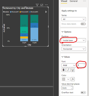
I already tried playing with the options with no success. For instance, this is your suggestion:
- Mark as New
- Bookmark
- Subscribe
- Mute
- Subscribe to RSS Feed
- Permalink
- Report Inappropriate Content
Hi @marijane ,
Not saying using Inside Base option is my suggestion. But I am suggesting what-ever option works best for your scenario use it.
Because your stack with RED color is extremely small area-wise when compared to other color stacks on the bar, therefore a data label can't fit in that area.
- Mark as New
- Bookmark
- Subscribe
- Mute
- Subscribe to RSS Feed
- Permalink
- Report Inappropriate Content
HI @marijane ,
You will need to provide some screenshots around what currently you see and what is your end goal.
https://community.powerbi.com/t5/Desktop/How-to-Get-Your-Question-Answered-Quickly/m-p/1447523
Helpful resources

Microsoft Fabric Learn Together
Covering the world! 9:00-10:30 AM Sydney, 4:00-5:30 PM CET (Paris/Berlin), 7:00-8:30 PM Mexico City

Power BI Monthly Update - April 2024
Check out the April 2024 Power BI update to learn about new features.

| User | Count |
|---|---|
| 98 | |
| 95 | |
| 83 | |
| 70 | |
| 66 |
| User | Count |
|---|---|
| 118 | |
| 106 | |
| 93 | |
| 79 | |
| 72 |


