Jumpstart your career with the Fabric Career Hub
Find everything you need to get certified on Fabric—skills challenges, live sessions, exam prep, role guidance, and more.
Get started- Power BI forums
- Updates
- News & Announcements
- Get Help with Power BI
- Desktop
- Service
- Report Server
- Power Query
- Mobile Apps
- Developer
- DAX Commands and Tips
- Custom Visuals Development Discussion
- Health and Life Sciences
- Power BI Spanish forums
- Translated Spanish Desktop
- Power Platform Integration - Better Together!
- Power Platform Integrations (Read-only)
- Power Platform and Dynamics 365 Integrations (Read-only)
- Training and Consulting
- Instructor Led Training
- Dashboard in a Day for Women, by Women
- Galleries
- Community Connections & How-To Videos
- COVID-19 Data Stories Gallery
- Themes Gallery
- Data Stories Gallery
- R Script Showcase
- Webinars and Video Gallery
- Quick Measures Gallery
- 2021 MSBizAppsSummit Gallery
- 2020 MSBizAppsSummit Gallery
- 2019 MSBizAppsSummit Gallery
- Events
- Ideas
- Custom Visuals Ideas
- Issues
- Issues
- Events
- Upcoming Events
- Community Blog
- Power BI Community Blog
- Custom Visuals Community Blog
- Community Support
- Community Accounts & Registration
- Using the Community
- Community Feedback
Grow your Fabric skills and prepare for the DP-600 certification exam by completing the latest Microsoft Fabric challenge.
- Power BI forums
- Forums
- Get Help with Power BI
- DAX Commands and Tips
- Re: highlight min and max values in line chart
- Subscribe to RSS Feed
- Mark Topic as New
- Mark Topic as Read
- Float this Topic for Current User
- Bookmark
- Subscribe
- Printer Friendly Page
- Mark as New
- Bookmark
- Subscribe
- Mute
- Subscribe to RSS Feed
- Permalink
- Report Inappropriate Content
highlight min and max values in line chart
hello,
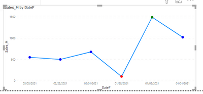
i want to highlight the max and mn values in the line chart
the line chart has the measure :

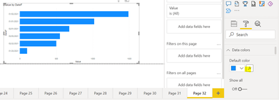
note : i cant find conditional formating for the data colors

Solved! Go to Solution.
- Mark as New
- Bookmark
- Subscribe
- Mute
- Subscribe to RSS Feed
- Permalink
- Report Inappropriate Content
Hi, @lawada
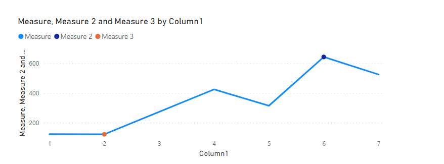
You can try to create two measures and add them to line chart.
Like this:
maxcount = IF ( [placed orders] = MAXX ( ALL ( orders ), [placed orders] ), [placed orders] )mincount = IF ( [placed orders] = MINX ( ALL ( orders ), [placed orders] ), [placed orders] )
- Mark as New
- Bookmark
- Subscribe
- Mute
- Subscribe to RSS Feed
- Permalink
- Report Inappropriate Content
Hi,
Here is how to do this:
1. Create a format measure:
e.g.
2. Create a bar chart and select conditional format here:

3. Create this rule and change the chart to a line chart:

4. End result

I hope this post helps to solve your issue and if it does consider accepting it as a solution and giving the post a thumbs up!
My LinkedIn: https://www.linkedin.com/in/n%C3%A4ttiahov-00001/
Did I answer your question? Mark my post as a solution!
Proud to be a Super User!
- Mark as New
- Bookmark
- Subscribe
- Mute
- Subscribe to RSS Feed
- Permalink
- Report Inappropriate Content
how can i apply this foramting measure to my current measure as im using function (userelationship) to filter by columns from other tables?
- Mark as New
- Bookmark
- Subscribe
- Mute
- Subscribe to RSS Feed
- Permalink
- Report Inappropriate Content
Hi,
You can place your current measure as the second condition of MAXX and MINXX. The idea is to compare the values on a table level and get the values we want to higlight into variables. You also need to modify the _table variable accordingly.
Did I answer your question? Mark my post as a solution!
Proud to be a Super User!
- Mark as New
- Bookmark
- Subscribe
- Mute
- Subscribe to RSS Feed
- Permalink
- Report Inappropriate Content
can you explain how to adjust the _table variable part accoording to the measure i provided? as im using mote than one single table so i cant use summarize function . also i still dont have conditional formatting for the data colors as i mentioned in the pictures i attached
- Mark as New
- Bookmark
- Subscribe
- Mute
- Subscribe to RSS Feed
- Permalink
- Report Inappropriate Content
Hi, @lawada
You can try to create two measures and add them to line chart.
Like this:
maxcount = IF ( [placed orders] = MAXX ( ALL ( orders ), [placed orders] ), [placed orders] )mincount = IF ( [placed orders] = MINX ( ALL ( orders ), [placed orders] ), [placed orders] )
Helpful resources
| User | Count |
|---|---|
| 48 | |
| 44 | |
| 19 | |
| 14 | |
| 14 |
| User | Count |
|---|---|
| 107 | |
| 57 | |
| 29 | |
| 20 | |
| 16 |


