- Power BI forums
- Updates
- News & Announcements
- Get Help with Power BI
- Desktop
- Service
- Report Server
- Power Query
- Mobile Apps
- Developer
- DAX Commands and Tips
- Custom Visuals Development Discussion
- Health and Life Sciences
- Power BI Spanish forums
- Translated Spanish Desktop
- Power Platform Integration - Better Together!
- Power Platform Integrations (Read-only)
- Power Platform and Dynamics 365 Integrations (Read-only)
- Training and Consulting
- Instructor Led Training
- Dashboard in a Day for Women, by Women
- Galleries
- Community Connections & How-To Videos
- COVID-19 Data Stories Gallery
- Themes Gallery
- Data Stories Gallery
- R Script Showcase
- Webinars and Video Gallery
- Quick Measures Gallery
- 2021 MSBizAppsSummit Gallery
- 2020 MSBizAppsSummit Gallery
- 2019 MSBizAppsSummit Gallery
- Events
- Ideas
- Custom Visuals Ideas
- Issues
- Issues
- Events
- Upcoming Events
- Community Blog
- Power BI Community Blog
- Custom Visuals Community Blog
- Community Support
- Community Accounts & Registration
- Using the Community
- Community Feedback
Register now to learn Fabric in free live sessions led by the best Microsoft experts. From Apr 16 to May 9, in English and Spanish.
- Power BI forums
- Forums
- Get Help with Power BI
- DAX Commands and Tips
- Using Slicers To Let Users Toggle Between Count an...
- Subscribe to RSS Feed
- Mark Topic as New
- Mark Topic as Read
- Float this Topic for Current User
- Bookmark
- Subscribe
- Printer Friendly Page
- Mark as New
- Bookmark
- Subscribe
- Mute
- Subscribe to RSS Feed
- Permalink
- Report Inappropriate Content
Using Slicers To Let Users Toggle Between Count and Percentage Measures In 1 Chart + 1 Table
I'm not sure if I'm just used to desigining things in a different way, but it appears to me that PowerBI is rather limited in giving report developers the ability to leverage single charts that could display a dynamic selection of segments and metrics.
Most of the solutions I found to toggle between measures in a viz indicate the need to set up a separate metrics table and then utilize a SWITCH function to switch between the measures you want.
e.g. https://www.fourmoo.com/2017/11/21/power-bi-using-a-slicer-to-show-different-measures/
However, in my example, I have two count measures and one percentage measure.
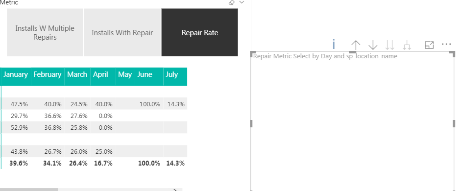
When my SWITCH measure is like this, the "repair rate" measure is formatted as an integer and appears as a 1 or 0 in my table.
Repair Metric Select = SWITCH(TRUE(),
VALUES('Repair Metrics'[Metric])="Installs With Repair",Query1[Installs With Repair],
VALUES('Repair Metrics'[Metric])="Installs W Multiple Repairs",Query1[Installs With Multiple Repair],
VALUES('Repair Metrics'[Metric])="Repair Rate",Query1[Repair Rate],
BLANK())
Like so:
However, when I format it like this:
Repair Metric Select = SWITCH(TRUE(),
VALUES('Repair Metrics'[Metric])="Installs With Repair",Query1[Installs With Repair],
VALUES('Repair Metrics'[Metric])="Installs W Multiple Repairs",Query1[Installs With Multiple Repair],
VALUES('Repair Metrics'[Metric])="Repair Rate",FORMAT(Query1[Repair Rate],"0.0%"),
BLANK())
My table values show up correctly but my line chart will appear blank.

Is there no way for me to populate a table and a line chart with a selection of multi-formatted metrics?
- Mark as New
- Bookmark
- Subscribe
- Mute
- Subscribe to RSS Feed
- Permalink
- Report Inappropriate Content
you can do that with multiple overlaying charts (some not visible) and bookmarks, see here
https://radacad.com/bookmarks-and-buttons-making-power-bi-charts-even-more-interactive
Thank you for the kudos 🙂
Helpful resources

Microsoft Fabric Learn Together
Covering the world! 9:00-10:30 AM Sydney, 4:00-5:30 PM CET (Paris/Berlin), 7:00-8:30 PM Mexico City

Power BI Monthly Update - April 2024
Check out the April 2024 Power BI update to learn about new features.

| User | Count |
|---|---|
| 39 | |
| 25 | |
| 20 | |
| 14 | |
| 8 |
| User | Count |
|---|---|
| 71 | |
| 48 | |
| 46 | |
| 20 | |
| 16 |
