- Power BI forums
- Updates
- News & Announcements
- Get Help with Power BI
- Desktop
- Service
- Report Server
- Power Query
- Mobile Apps
- Developer
- DAX Commands and Tips
- Custom Visuals Development Discussion
- Health and Life Sciences
- Power BI Spanish forums
- Translated Spanish Desktop
- Power Platform Integration - Better Together!
- Power Platform Integrations (Read-only)
- Power Platform and Dynamics 365 Integrations (Read-only)
- Training and Consulting
- Instructor Led Training
- Dashboard in a Day for Women, by Women
- Galleries
- Community Connections & How-To Videos
- COVID-19 Data Stories Gallery
- Themes Gallery
- Data Stories Gallery
- R Script Showcase
- Webinars and Video Gallery
- Quick Measures Gallery
- 2021 MSBizAppsSummit Gallery
- 2020 MSBizAppsSummit Gallery
- 2019 MSBizAppsSummit Gallery
- Events
- Ideas
- Custom Visuals Ideas
- Issues
- Issues
- Events
- Upcoming Events
- Community Blog
- Power BI Community Blog
- Custom Visuals Community Blog
- Community Support
- Community Accounts & Registration
- Using the Community
- Community Feedback
Earn a 50% discount on the DP-600 certification exam by completing the Fabric 30 Days to Learn It challenge.
- Power BI forums
- Forums
- Get Help with Power BI
- DAX Commands and Tips
- Re: Multiple row and Column Add up (Remove Duplica...
- Subscribe to RSS Feed
- Mark Topic as New
- Mark Topic as Read
- Float this Topic for Current User
- Bookmark
- Subscribe
- Printer Friendly Page
- Mark as New
- Bookmark
- Subscribe
- Mute
- Subscribe to RSS Feed
- Permalink
- Report Inappropriate Content
Multiple row and Column Add up (Remove Duplicates)
I am currently working on a project using a grading system and want to display total% of an individuals skillset. The grading system works using the below image (I've only used my own test ID but in the data set it is showing all 930).
Scenario 1 = 10%, Scenario 2 = 20%, Scenario 3 = 30% and Task 1 + Task 2 both give 20% each resulting in the individual being 100% trained. The main issue with this is that the user can have multiple entries for each header, resulting in the total% being over 100% in some cases.
Is there a measure that can be implemented to just look at each of these columns and just take one entry from each and ignore duplicates while adding up to a max of 100%? Happy to give more details.
Solved! Go to Solution.
- Mark as New
- Bookmark
- Subscribe
- Mute
- Subscribe to RSS Feed
- Permalink
- Report Inappropriate Content
Hi @Altonga
You can try the following
%Trained =
MAX ( 'Table'[Scenario1%] ) + MAX ( 'Table'[Scenario2%] )
    + MAX ( 'Table'[Scenario3%] )
    + MAX ( 'Table'[Task1%] )
+ MAX ( 'Table'[Task1%] )- Mark as New
- Bookmark
- Subscribe
- Mute
- Subscribe to RSS Feed
- Permalink
- Report Inappropriate Content
Hi @Altonga
You can try the following
%Trained =
MAX ( 'Table'[Scenario1%] ) + MAX ( 'Table'[Scenario2%] )
    + MAX ( 'Table'[Scenario3%] )
    + MAX ( 'Table'[Task1%] )
+ MAX ( 'Table'[Task1%] )- Mark as New
- Bookmark
- Subscribe
- Mute
- Subscribe to RSS Feed
- Permalink
- Report Inappropriate Content
Hi @tamerj1,
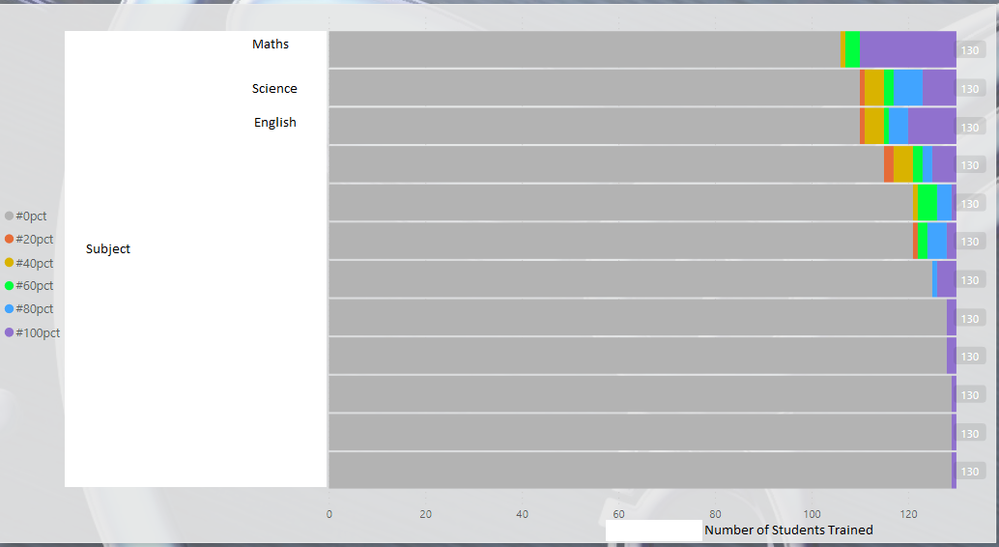
Thank you so much for your reply, this worked perfectly! I have noticed that it has affected one of my other visuals which I was showing a top level view for the training records. Please see below. (The top visual.)
Is there a way to make the data from the previous solution work in such a view?
- Mark as New
- Bookmark
- Subscribe
- Mute
- Subscribe to RSS Feed
- Permalink
- Report Inappropriate Content
- Mark as New
- Bookmark
- Subscribe
- Mute
- Subscribe to RSS Feed
- Permalink
- Report Inappropriate Content
- Mark as New
- Bookmark
- Subscribe
- Mute
- Subscribe to RSS Feed
- Permalink
- Report Inappropriate Content
Hi @tamerj1 , So If there was some way to use the data created from the measure you helped me with before to display on a visual somewhat to the above image? Showing the number of indiviuals who have acheived either 10%, 20% and so on. Apologise if not clear I'm having a hard time explaining it myself haha.
- Mark as New
- Bookmark
- Subscribe
- Mute
- Subscribe to RSS Feed
- Permalink
- Report Inappropriate Content
Hi @Altonga
manually insert a single column table that contains the values you want to slice by, for example 0.1, 0.2, 0.3, etc.. let's call it Scores[Score]. This single column table shall remain disconnected from the main table or sny other table you have in your data model.
now you can use the following measure in a stacked column column chart were Scores[Score] is on the x-axis and the subject is on the legend
SMX ( IF [%Trained] = SELECTEDVALUE ( Scores[Score] ), 1 )
Helpful resources
| User | Count |
|---|---|
| 54 | |
| 22 | |
| 19 | |
| 16 | |
| 11 |
| User | Count |
|---|---|
| 81 | |
| 55 | |
| 40 | |
| 20 | |
| 12 |


