- Power BI forums
- Updates
- News & Announcements
- Get Help with Power BI
- Desktop
- Service
- Report Server
- Power Query
- Mobile Apps
- Developer
- DAX Commands and Tips
- Custom Visuals Development Discussion
- Health and Life Sciences
- Power BI Spanish forums
- Translated Spanish Desktop
- Power Platform Integration - Better Together!
- Power Platform Integrations (Read-only)
- Power Platform and Dynamics 365 Integrations (Read-only)
- Training and Consulting
- Instructor Led Training
- Dashboard in a Day for Women, by Women
- Galleries
- Community Connections & How-To Videos
- COVID-19 Data Stories Gallery
- Themes Gallery
- Data Stories Gallery
- R Script Showcase
- Webinars and Video Gallery
- Quick Measures Gallery
- 2021 MSBizAppsSummit Gallery
- 2020 MSBizAppsSummit Gallery
- 2019 MSBizAppsSummit Gallery
- Events
- Ideas
- Custom Visuals Ideas
- Issues
- Issues
- Events
- Upcoming Events
- Community Blog
- Power BI Community Blog
- Custom Visuals Community Blog
- Community Support
- Community Accounts & Registration
- Using the Community
- Community Feedback
Register now to learn Fabric in free live sessions led by the best Microsoft experts. From Apr 16 to May 9, in English and Spanish.
- Power BI forums
- Forums
- Get Help with Power BI
- DAX Commands and Tips
- Display the selected period in the slice for all y...
- Subscribe to RSS Feed
- Mark Topic as New
- Mark Topic as Read
- Float this Topic for Current User
- Bookmark
- Subscribe
- Printer Friendly Page
- Mark as New
- Bookmark
- Subscribe
- Mute
- Subscribe to RSS Feed
- Permalink
- Report Inappropriate Content
Display the selected period in the slice for all years
Hi community,
I'm having the following case:
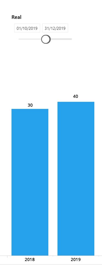
For example, in a date Slicer, I select the period 10/01/2019 - 12/01/2019 . Then, I need to display a bar chart with same
period selected for all years of my dataset.
Example:
I have this data set:
| Year | Month | Total |
| 2018 | jan | 50 |
| 2018 | fev | 22 |
| 2018 | mar | 11 |
| 2018 | abr | 16 |
| 2018 | mai | 23 |
| 2018 | jun | 32 |
| 2018 | jul | 25 |
| 2018 | ago | 11 |
| 2018 | set | 554 |
| 2018 | out | 5 |
| 2018 | nov | 10 |
| 2018 | dez | 15 |
| 2019 | jan | 12 |
| 2019 | fev | 21 |
| 2019 | mar | 19 |
| 2019 | abr | 27 |
| 2019 | mai | 226 |
| 2019 | jun | 222 |
| 2019 | jul | 33 |
| 2019 | ago | 24 |
| 2019 | set | 99 |
| 2019 | out | 10 |
| 2019 | nov | 10 |
| 2019 | dez | 20 |
I need that my result be like the image below:
The Slicer need be a slider format.
Solved! Go to Solution.
- Mark as New
- Bookmark
- Subscribe
- Mute
- Subscribe to RSS Feed
- Permalink
- Report Inappropriate Content
Hi @Wilianfilho_ps - believe it or not, you do not need any measures for this. You can use an Implict Measure by just dragging in the field, but it does require some creative modeling, and it has one assumption, below:
- Create your date table manually. I recommend using this date table, because it is awesome. 😂👍 There are instructions on how to copy and paste that in to Power Query so it works.
- Change the Source row to be whatever dates you want. It starts with Jan 1, 2015 through Dec 31, 2020. I changed it in the attached PBIX to Jan 1, 2018 through Dec 31, 2019 to correspond with your data.
- Add a new column to that Date Table called "Month Day" by adding a custom column in Power Query. It needs to be this formula:
- #date(List.Max(#"Added MonthDay"[Year]), [Month], [Day])
- Set the data type as a date
- This is the assumption - your date slicer will always be for the current year's dates, but will show all related years.
- Close and load
- Mark this date table as a date table.
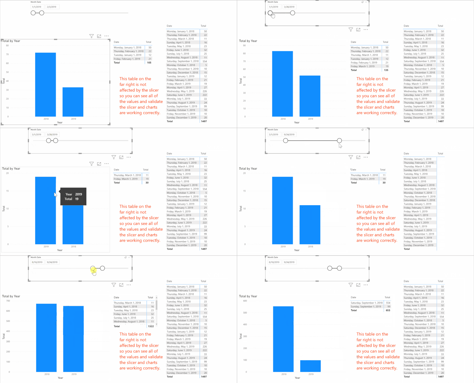
- Add your date slicer, and use this new Month Date field. It should show Jan 1, 2019 through Dec 31, 2019. (I changed the source line of the date table to be 2018 and 2019 per your supplied data.
- Create a bar chart.
- Add a simple measure of SUM(Table[Total]) or just drag the total to it.
- Add the Year field from the date table to the Axis
Here is a link to my PBIX file that you can look at. It is easier when you can see the tables, the model, and the source Power Query data.
Did I answer your question? Mark my post as a solution!
Did my answers help arrive at a solution? Give it a kudos by clicking the Thumbs Up!
DAX is for Analysis. Power Query is for Data Modeling
Proud to be a Super User!
MCSA: BI Reporting- Mark as New
- Bookmark
- Subscribe
- Mute
- Subscribe to RSS Feed
- Permalink
- Report Inappropriate Content
@Wilianfilho_ps - I'm marking this as solved. I hope it helped. If not, please reply back and let us know.
Did I answer your question? Mark my post as a solution!
Did my answers help arrive at a solution? Give it a kudos by clicking the Thumbs Up!
DAX is for Analysis. Power Query is for Data Modeling
Proud to be a Super User!
MCSA: BI Reporting- Mark as New
- Bookmark
- Subscribe
- Mute
- Subscribe to RSS Feed
- Permalink
- Report Inappropriate Content
Hi @Wilianfilho_ps - believe it or not, you do not need any measures for this. You can use an Implict Measure by just dragging in the field, but it does require some creative modeling, and it has one assumption, below:
- Create your date table manually. I recommend using this date table, because it is awesome. 😂👍 There are instructions on how to copy and paste that in to Power Query so it works.
- Change the Source row to be whatever dates you want. It starts with Jan 1, 2015 through Dec 31, 2020. I changed it in the attached PBIX to Jan 1, 2018 through Dec 31, 2019 to correspond with your data.
- Add a new column to that Date Table called "Month Day" by adding a custom column in Power Query. It needs to be this formula:
- #date(List.Max(#"Added MonthDay"[Year]), [Month], [Day])
- Set the data type as a date
- This is the assumption - your date slicer will always be for the current year's dates, but will show all related years.
- Close and load
- Mark this date table as a date table.
- Add your date slicer, and use this new Month Date field. It should show Jan 1, 2019 through Dec 31, 2019. (I changed the source line of the date table to be 2018 and 2019 per your supplied data.
- Create a bar chart.
- Add a simple measure of SUM(Table[Total]) or just drag the total to it.
- Add the Year field from the date table to the Axis
Here is a link to my PBIX file that you can look at. It is easier when you can see the tables, the model, and the source Power Query data.
Did I answer your question? Mark my post as a solution!
Did my answers help arrive at a solution? Give it a kudos by clicking the Thumbs Up!
DAX is for Analysis. Power Query is for Data Modeling
Proud to be a Super User!
MCSA: BI Reporting- Mark as New
- Bookmark
- Subscribe
- Mute
- Subscribe to RSS Feed
- Permalink
- Report Inappropriate Content
@Wilianfilho_ps - have you had a chance to review either of these solutions? If you always have just 2 years of data, @amitchandak's time intelligence is a bit easier to understand and will work.
If you have multiple years, my model change will compensate for that but needs a little more setup to work.
Did I answer your question? Mark my post as a solution!
Did my answers help arrive at a solution? Give it a kudos by clicking the Thumbs Up!
DAX is for Analysis. Power Query is for Data Modeling
Proud to be a Super User!
MCSA: BI Reporting- Mark as New
- Bookmark
- Subscribe
- Mute
- Subscribe to RSS Feed
- Permalink
- Report Inappropriate Content
@Wilianfilho_ps , With a date table, You can use Trailing year measure
Year behind Sales = CALCULATE(SUM(Sales[Sales Amount]),dateadd('Date'[Date],-1,Year))
or you can use SAMEPERIODLASTYEAR
Year behind Sales = CALCULATE(SUM(Sales[Sales Amount]),SAMEPERIODLASTYEAR('Date'[Date]))
To get the best of the time intelligence function. Make sure you have a date calendar and it has been marked as the date in model view. Also, join it with the date column of your fact/s. Refer :radacad sqlbi My Video Series Appreciate your Kudos.
Please provide your feedback comments and advice for new videos
Tutorial Series Dax Vs SQL Direct Query PBI Tips
Appreciate your Kudos.
Microsoft Power BI Learning Resources, 2023 !!
Learn Power BI - Full Course with Dec-2022, with Window, Index, Offset, 100+ Topics !!
Did I answer your question? Mark my post as a solution! Appreciate your Kudos !! Proud to be a Super User! !!
Helpful resources

Microsoft Fabric Learn Together
Covering the world! 9:00-10:30 AM Sydney, 4:00-5:30 PM CET (Paris/Berlin), 7:00-8:30 PM Mexico City

Power BI Monthly Update - April 2024
Check out the April 2024 Power BI update to learn about new features.

| User | Count |
|---|---|
| 45 | |
| 26 | |
| 22 | |
| 13 | |
| 8 |
| User | Count |
|---|---|
| 73 | |
| 51 | |
| 45 | |
| 16 | |
| 12 |


