- Power BI forums
- Updates
- News & Announcements
- Get Help with Power BI
- Desktop
- Service
- Report Server
- Power Query
- Mobile Apps
- Developer
- DAX Commands and Tips
- Custom Visuals Development Discussion
- Health and Life Sciences
- Power BI Spanish forums
- Translated Spanish Desktop
- Power Platform Integration - Better Together!
- Power Platform Integrations (Read-only)
- Power Platform and Dynamics 365 Integrations (Read-only)
- Training and Consulting
- Instructor Led Training
- Dashboard in a Day for Women, by Women
- Galleries
- Community Connections & How-To Videos
- COVID-19 Data Stories Gallery
- Themes Gallery
- Data Stories Gallery
- R Script Showcase
- Webinars and Video Gallery
- Quick Measures Gallery
- 2021 MSBizAppsSummit Gallery
- 2020 MSBizAppsSummit Gallery
- 2019 MSBizAppsSummit Gallery
- Events
- Ideas
- Custom Visuals Ideas
- Issues
- Issues
- Events
- Upcoming Events
- Community Blog
- Power BI Community Blog
- Custom Visuals Community Blog
- Community Support
- Community Accounts & Registration
- Using the Community
- Community Feedback
Register now to learn Fabric in free live sessions led by the best Microsoft experts. From Apr 16 to May 9, in English and Spanish.
- Power BI forums
- Forums
- Get Help with Power BI
- Power Query
- Displaying time (hh:mm:ss) on a chart
- Subscribe to RSS Feed
- Mark Topic as New
- Mark Topic as Read
- Float this Topic for Current User
- Bookmark
- Subscribe
- Printer Friendly Page
- Mark as New
- Bookmark
- Subscribe
- Mute
- Subscribe to RSS Feed
- Permalink
- Report Inappropriate Content
Displaying time (hh:mm:ss) on a chart
Hi everyone,
I'm currently working on a Power BI project and I ran into a problem. I want a bar chart, with different subjects, and for the bars I want a sum of hours worked on each subject (example: I worked 03:30:00 hours on maintenance and a friend worked 01:00:00 hours on maintenance too, so the bar must show a total of 4:30:00 [hh:mm:ss] for the maintenance subject), taking into consideration that I have different types of subjects, how can I do that?
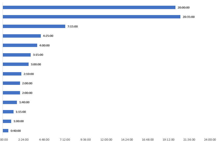
Here's an example of what I need (on excel):
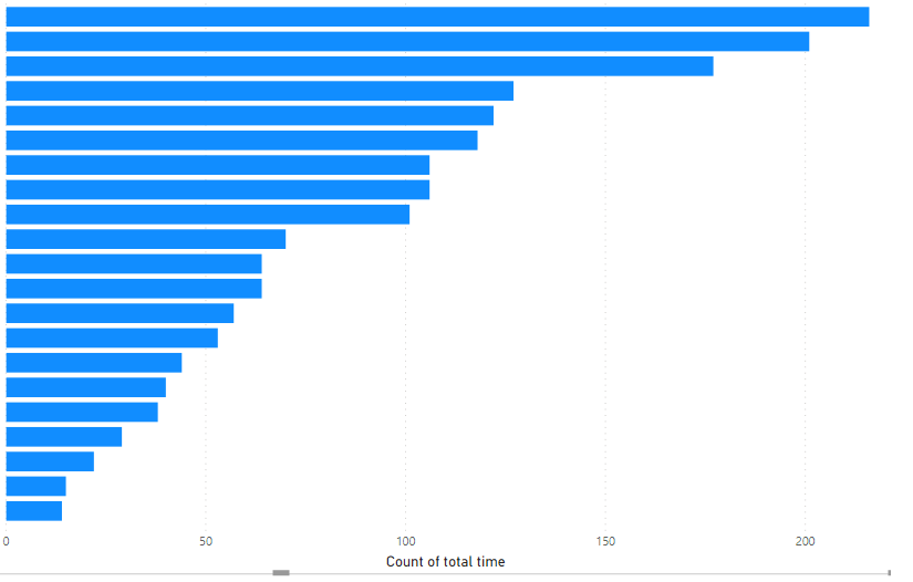
And here's what I managed to do (though it's not what I want):
Solved! Go to Solution.
- Mark as New
- Bookmark
- Subscribe
- Mute
- Subscribe to RSS Feed
- Permalink
- Report Inappropriate Content
Hello @joaoga1
you can create a new measure that gives you a text format as you need it. But as I think it's not possible to add this as label text, but only as tooltip. Here how the measure could look like (not tested)
Measure = sumx('table', hour('table'[time])) + TRUNC(sumx('table', MINUTE('table'[time]))/60) & ":" & mod(sumx('table', MINUTE('table'[time])), 60) & ":00"
If this post helps or solves your problem, please mark it as solution (to help other users find useful content and to acknowledge the work of users that helped you)
Kudoes are nice too
Have fun
Jimmy
- Mark as New
- Bookmark
- Subscribe
- Mute
- Subscribe to RSS Feed
- Permalink
- Report Inappropriate Content
Hi @joaoga1 ,
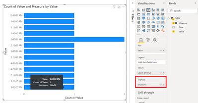
Just put the measure in the Tooltip field:
Best Regards,
Community Support Team _ Yingjie Li
If this post helps, then please consider Accept it as the solution to help the other members find it more quickly.
- Mark as New
- Bookmark
- Subscribe
- Mute
- Subscribe to RSS Feed
- Permalink
- Report Inappropriate Content
I don't think you can do exactly that. A couple things to consider
1. you could make your chart with a hours value in decimal form as suggested, and then have a second column/measure with the desired format that you use as a Tooltip
2. You could do the same as #1 but make a custom bar chart with Charticulator to add a text label that shows your time in desired format permanently (not a hover tooltip).
Can You Say "Charticulator"? - I Knew You Could - Portland Power BI UG - YouTube
Pat
Did I answer your question? Mark my post as a solution! Kudos are also appreciated!
To learn more about Power BI, follow me on Twitter or subscribe on YouTube.
@mahoneypa HoosierBI on YouTube
- Mark as New
- Bookmark
- Subscribe
- Mute
- Subscribe to RSS Feed
- Permalink
- Report Inappropriate Content
Hello @joaoga1
Datetime-formats cannot be summed. You have to create a measure like this
TimeValue = sumx('Table', hour('Table'[Hours])) +(sumx('table', MINUTE('Table'[Hours]))/60) + +(sumx('table', SECOND('Table'[Hours]))/60/60)This gives you a digital version of your datetime like 19,5 so you can put it in the gannt.
If this post helps or solves your problem, please mark it as solution (to help other users find useful content and to acknowledge the work of users that helped you)
Kudoes are nice too
Have fun
Jimmy
- Mark as New
- Bookmark
- Subscribe
- Mute
- Subscribe to RSS Feed
- Permalink
- Report Inappropriate Content
Jimmy thanks for the answer, it really helped!
Altough, I need to visualize the amount of hours in the format of (hh:mm:ss) on the chart, is there any way I can do that?
- Mark as New
- Bookmark
- Subscribe
- Mute
- Subscribe to RSS Feed
- Permalink
- Report Inappropriate Content
Hello @joaoga1
you can create a new measure that gives you a text format as you need it. But as I think it's not possible to add this as label text, but only as tooltip. Here how the measure could look like (not tested)
Measure = sumx('table', hour('table'[time])) + TRUNC(sumx('table', MINUTE('table'[time]))/60) & ":" & mod(sumx('table', MINUTE('table'[time])), 60) & ":00"
If this post helps or solves your problem, please mark it as solution (to help other users find useful content and to acknowledge the work of users that helped you)
Kudoes are nice too
Have fun
Jimmy
- Mark as New
- Bookmark
- Subscribe
- Mute
- Subscribe to RSS Feed
- Permalink
- Report Inappropriate Content
Thanks again Jimmy, but how do I add it as a tooltip?
- Mark as New
- Bookmark
- Subscribe
- Mute
- Subscribe to RSS Feed
- Permalink
- Report Inappropriate Content
Hi @joaoga1 ,
Just put the measure in the Tooltip field:
Best Regards,
Community Support Team _ Yingjie Li
If this post helps, then please consider Accept it as the solution to help the other members find it more quickly.
Helpful resources

Microsoft Fabric Learn Together
Covering the world! 9:00-10:30 AM Sydney, 4:00-5:30 PM CET (Paris/Berlin), 7:00-8:30 PM Mexico City

Power BI Monthly Update - April 2024
Check out the April 2024 Power BI update to learn about new features.


