- Power BI forums
- Updates
- News & Announcements
- Get Help with Power BI
- Desktop
- Service
- Report Server
- Power Query
- Mobile Apps
- Developer
- DAX Commands and Tips
- Custom Visuals Development Discussion
- Health and Life Sciences
- Power BI Spanish forums
- Translated Spanish Desktop
- Power Platform Integration - Better Together!
- Power Platform Integrations (Read-only)
- Power Platform and Dynamics 365 Integrations (Read-only)
- Training and Consulting
- Instructor Led Training
- Dashboard in a Day for Women, by Women
- Galleries
- Community Connections & How-To Videos
- COVID-19 Data Stories Gallery
- Themes Gallery
- Data Stories Gallery
- R Script Showcase
- Webinars and Video Gallery
- Quick Measures Gallery
- 2021 MSBizAppsSummit Gallery
- 2020 MSBizAppsSummit Gallery
- 2019 MSBizAppsSummit Gallery
- Events
- Ideas
- Custom Visuals Ideas
- Issues
- Issues
- Events
- Upcoming Events
- Community Blog
- Power BI Community Blog
- Custom Visuals Community Blog
- Community Support
- Community Accounts & Registration
- Using the Community
- Community Feedback
Register now to learn Fabric in free live sessions led by the best Microsoft experts. From Apr 16 to May 9, in English and Spanish.
- Power BI forums
- Forums
- Get Help with Power BI
- Desktop
- conditional format line chart
- Subscribe to RSS Feed
- Mark Topic as New
- Mark Topic as Read
- Float this Topic for Current User
- Bookmark
- Subscribe
- Printer Friendly Page
- Mark as New
- Bookmark
- Subscribe
- Mute
- Subscribe to RSS Feed
- Permalink
- Report Inappropriate Content
conditional format line chart
Hi
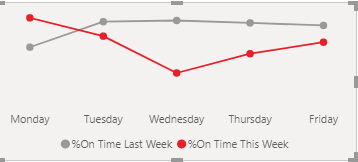
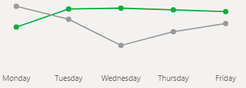
Just wondering how one would go about coloring line chart for example in my graph below we did worst this week compared to last week it should be red and when we do better it should be green. Most tutorial show use of legend but I want to colour one of the lines and the whole line not just parts of the line that don't meet the condition.
EXAMPLE:
Bad week
Good week
Solved! Go to Solution.
- Mark as New
- Bookmark
- Subscribe
- Mute
- Subscribe to RSS Feed
- Permalink
- Report Inappropriate Content
Hi @Anonymous
you would want to create a measure for week category
Example Good Week = IF(GoodWEEK, Green, Red)
then use the measure in the conditional format of your Graph
Regards
Amine Jerbi
If I answered your question, please mark this thread as accepted
and you can follow me on
My Website, LinkedIn and Facebook
- Mark as New
- Bookmark
- Subscribe
- Mute
- Subscribe to RSS Feed
- Permalink
- Report Inappropriate Content
Hi @Anonymous ,
It is a great pity that conditional formatting applies only to the values of Table or Matrix visuals, and doesn't apply to any subtotals, grand totals, or the Total row.
Please refer this document about conditional format :Considerations and limitations of conditional format
If you want to apply to Line Chart, as far as I know, it is not supported yet currently. We also not found an effective solution to meet your requirement.
Perhaps you can submit the requirement to ideas and add your comments there to make this feature coming sooner: https://ideas.powerbi.com/forums/265200-power-bi-ideas.
It is a place for customers provide feedback about Microsoft Office products.
In additional, you can also vote for this need: https://ideas.powerbi.com/ideas/idea/?ideaid=4d30fed8-4890-46ad-aec3-1b65a6724d9b.
If a feedback is high voted there by other customers, it will be promising that Microsoft Product Team will take it into consideration when designing the next version in the future.
Best Regards,
Link Chen
If this post helps then please consider Accept it as the solution to help the other members find it more quickly.
- Mark as New
- Bookmark
- Subscribe
- Mute
- Subscribe to RSS Feed
- Permalink
- Report Inappropriate Content
Hi @Anonymous
you would want to create a measure for week category
Example Good Week = IF(GoodWEEK, Green, Red)
then use the measure in the conditional format of your Graph
Regards
Amine Jerbi
If I answered your question, please mark this thread as accepted
and you can follow me on
My Website, LinkedIn and Facebook
- Mark as New
- Bookmark
- Subscribe
- Mute
- Subscribe to RSS Feed
- Permalink
- Report Inappropriate Content
@Anonymous , conditional formatting is only possible when you use one measure(value) and no legend. That too you need to do it in bar visual and make it as line visual with marker.
If above is true create a color measure and use that in conditional formatting with Field value option
Color sales = if(AVERAGE(Sales[Sales Amount])<170,"green","red")
refer :
https://radacad.com/dax-and-conditional-formatting-better-together-find-the-biggest-and-smallest-numbers-in-the-column
https://docs.microsoft.com/en-us/power-bi/desktop-conditional-table-formatting#color-by-color-values
Microsoft Power BI Learning Resources, 2023 !!
Learn Power BI - Full Course with Dec-2022, with Window, Index, Offset, 100+ Topics !!
Did I answer your question? Mark my post as a solution! Appreciate your Kudos !! Proud to be a Super User! !!
Helpful resources

Microsoft Fabric Learn Together
Covering the world! 9:00-10:30 AM Sydney, 4:00-5:30 PM CET (Paris/Berlin), 7:00-8:30 PM Mexico City

Power BI Monthly Update - April 2024
Check out the April 2024 Power BI update to learn about new features.

| User | Count |
|---|---|
| 105 | |
| 94 | |
| 75 | |
| 63 | |
| 62 |
| User | Count |
|---|---|
| 137 | |
| 105 | |
| 104 | |
| 80 | |
| 63 |


