- Power BI forums
- Updates
- News & Announcements
- Get Help with Power BI
- Desktop
- Service
- Report Server
- Power Query
- Mobile Apps
- Developer
- DAX Commands and Tips
- Custom Visuals Development Discussion
- Health and Life Sciences
- Power BI Spanish forums
- Translated Spanish Desktop
- Power Platform Integration - Better Together!
- Power Platform Integrations (Read-only)
- Power Platform and Dynamics 365 Integrations (Read-only)
- Training and Consulting
- Instructor Led Training
- Dashboard in a Day for Women, by Women
- Galleries
- Community Connections & How-To Videos
- COVID-19 Data Stories Gallery
- Themes Gallery
- Data Stories Gallery
- R Script Showcase
- Webinars and Video Gallery
- Quick Measures Gallery
- 2021 MSBizAppsSummit Gallery
- 2020 MSBizAppsSummit Gallery
- 2019 MSBizAppsSummit Gallery
- Events
- Ideas
- Custom Visuals Ideas
- Issues
- Issues
- Events
- Upcoming Events
- Community Blog
- Power BI Community Blog
- Custom Visuals Community Blog
- Community Support
- Community Accounts & Registration
- Using the Community
- Community Feedback
Register now to learn Fabric in free live sessions led by the best Microsoft experts. From Apr 16 to May 9, in English and Spanish.
- Power BI forums
- Forums
- Get Help with Power BI
- Desktop
- X axis doenst show all values
- Subscribe to RSS Feed
- Mark Topic as New
- Mark Topic as Read
- Float this Topic for Current User
- Bookmark
- Subscribe
- Printer Friendly Page
- Mark as New
- Bookmark
- Subscribe
- Mute
- Subscribe to RSS Feed
- Permalink
- Report Inappropriate Content
X axis doenst show all values
Hello everyone,
I've a issue with my grouped column diagram.
First of all the diagram didnt show all values of the lines. I have made adjustment in the visual to have a 100% coverage. Thats fixed.
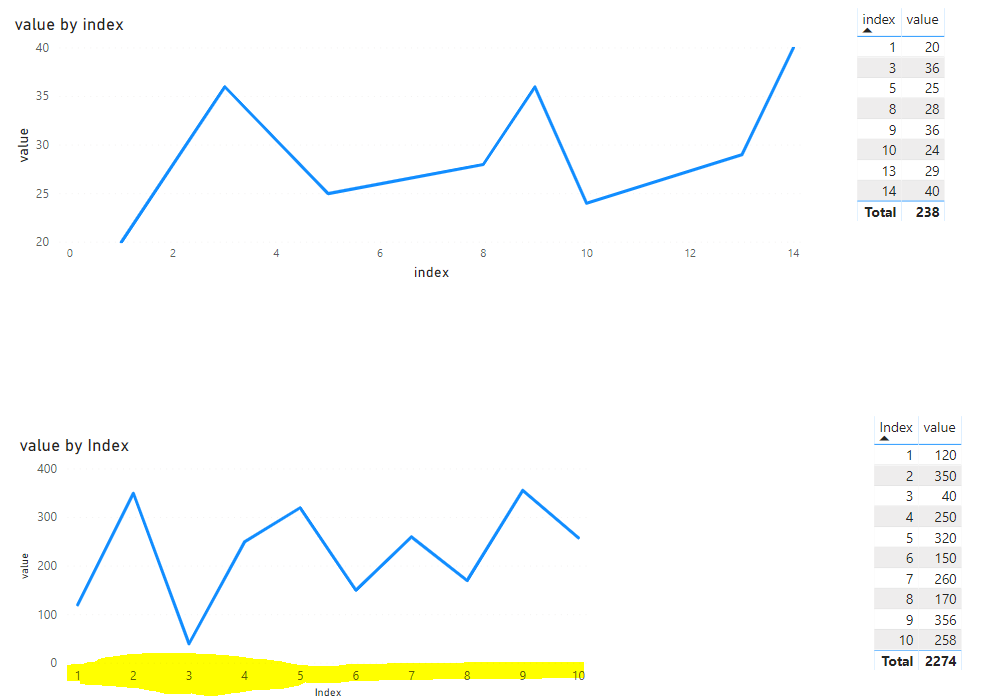
But im still having problems with my X axis. it doesnt show all values and the diagram doenst look nice now.
the x axis goes per 2 instead of per 1.
like this 2 4 6 8 10
It has to be 1 2 3 4 5 6 7 9 10
Someone experienced the same issue?
Any help i appreciate
Peter
Solved! Go to Solution.
- Mark as New
- Bookmark
- Subscribe
- Mute
- Subscribe to RSS Feed
- Permalink
- Report Inappropriate Content
Hi @Anonymous ,
For your scenario, I think that is the standard behavior for the charts.
By my tests, if you have each value for the value of X axis, you could achieve that by increasing the width of your chart, which works like below.
In addition, you could try to change the type of X axis to be Categorical as a workaround.
If that cannot achieve your desired output, I'm afraid that you'd better post your idea in power bi ideas forum and add your comments there to improve Power BI and make this feature coming sooner.
Best Regards,
Cherry
If this post helps, then please consider Accept it as the solution to help the other members find it more quickly.
- Mark as New
- Bookmark
- Subscribe
- Mute
- Subscribe to RSS Feed
- Permalink
- Report Inappropriate Content
@v-piga-msft That did the trick.
i made the adjustments on the visual X axis and sort column and sort ascending/descending
- Mark as New
- Bookmark
- Subscribe
- Mute
- Subscribe to RSS Feed
- Permalink
- Report Inappropriate Content
Hi @Anonymous ,
For your scenario, I think that is the standard behavior for the charts.
By my tests, if you have each value for the value of X axis, you could achieve that by increasing the width of your chart, which works like below.
In addition, you could try to change the type of X axis to be Categorical as a workaround.
If that cannot achieve your desired output, I'm afraid that you'd better post your idea in power bi ideas forum and add your comments there to improve Power BI and make this feature coming sooner.
Best Regards,
Cherry
If this post helps, then please consider Accept it as the solution to help the other members find it more quickly.
- Mark as New
- Bookmark
- Subscribe
- Mute
- Subscribe to RSS Feed
- Permalink
- Report Inappropriate Content
@v-piga-msft That did the trick.
i made the adjustments on the visual X axis and sort column and sort ascending/descending
Helpful resources

Microsoft Fabric Learn Together
Covering the world! 9:00-10:30 AM Sydney, 4:00-5:30 PM CET (Paris/Berlin), 7:00-8:30 PM Mexico City

Power BI Monthly Update - April 2024
Check out the April 2024 Power BI update to learn about new features.

| User | Count |
|---|---|
| 105 | |
| 97 | |
| 80 | |
| 67 | |
| 63 |
| User | Count |
|---|---|
| 147 | |
| 110 | |
| 108 | |
| 85 | |
| 64 |

