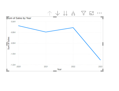
- Power BI forums
- Updates
- News & Announcements
- Get Help with Power BI
- Desktop
- Service
- Report Server
- Power Query
- Mobile Apps
- Developer
- DAX Commands and Tips
- Custom Visuals Development Discussion
- Health and Life Sciences
- Power BI Spanish forums
- Translated Spanish Desktop
- Power Platform Integration - Better Together!
- Power Platform Integrations (Read-only)
- Power Platform and Dynamics 365 Integrations (Read-only)
- Training and Consulting
- Instructor Led Training
- Dashboard in a Day for Women, by Women
- Galleries
- Community Connections & How-To Videos
- COVID-19 Data Stories Gallery
- Themes Gallery
- Data Stories Gallery
- R Script Showcase
- Webinars and Video Gallery
- Quick Measures Gallery
- 2021 MSBizAppsSummit Gallery
- 2020 MSBizAppsSummit Gallery
- 2019 MSBizAppsSummit Gallery
- Events
- Ideas
- Custom Visuals Ideas
- Issues
- Issues
- Events
- Upcoming Events
- Community Blog
- Power BI Community Blog
- Custom Visuals Community Blog
- Community Support
- Community Accounts & Registration
- Using the Community
- Community Feedback
Register now to learn Fabric in free live sessions led by the best Microsoft experts. From Apr 16 to May 9, in English and Spanish.
- Power BI forums
- Forums
- Get Help with Power BI
- Desktop
- What is the best way of transforming this data?
- Subscribe to RSS Feed
- Mark Topic as New
- Mark Topic as Read
- Float this Topic for Current User
- Bookmark
- Subscribe
- Printer Friendly Page
- Mark as New
- Bookmark
- Subscribe
- Mute
- Subscribe to RSS Feed
- Permalink
- Report Inappropriate Content
What is the best way of transforming this data?
Hello all. I was wondering if I could get some help on how best to transform some data.
I have an export from some accounts software that I would like to create some Power BI visualisations on.
This is a sample of the data from the Excel sheet. It shows different account codes and descriptions, along with totals for each of those accounts for 2023, 2022, 2021 and 2020.
| Account | Description | Year End 30/6/2023 | Year End 30/6/2022 | Year End 30/6/2021 | Year End 30/6/2020 |
| 1 | Sales | -1314413.96 | -1105903.5 | -1093038.37 | -950788.89 |
| 7 | Third-party sales | -6729.29 | 5229.13 | -4343.42 | -2221.34 |
| 44 | Wages | 143008.39 | 526602.99 | 448520.9 | 425935.17 |
| 53 | Sub contractors | 10498 | 9305 | 4350 | 2115.99 |
| 131 | Bank account interest | -473.61 | -35.04 | -120.65 | -76.28 |
| 229 | Rent | 28000 | 28000 | 28000 | 28000 |
| 230 | Rates and water | 3543.37 | 4304.98 | 3302.46 | 2916.25 |
| 232 | Insurance | 21613.66 | 17394.7 | 16806.56 | 15286.22 |
| 233 | Light and heat | 4678.09 | 4123.23 | 3487.26 | 2288.92 |
For example I would like to create a line chart visual which shows the increase in sales from 2020 to 2023.
Many thanks in advance.
Solved! Go to Solution.
- Mark as New
- Bookmark
- Subscribe
- Mute
- Subscribe to RSS Feed
- Permalink
- Report Inappropriate Content
In Power Query select the first two columns and then rightclick on the headers and select "unpivot other columns. This way you willl transform the table in such a way that you will get columns: Account, Description, YearEnd, ValueOfYearEnd. This way you can easily create visuals in Power BI Desktop.
Kudos and Mark as solution appreciated.
- Mark as New
- Bookmark
- Subscribe
- Mute
- Subscribe to RSS Feed
- Permalink
- Report Inappropriate Content
Follow these steps in Power Query Editor (refer the attached pbix file),
-
Unpivot Columns: In this step, all columns except "Account" and "Description" needs to be unpivoted.
-
Extract Text Using Range: Here, a transformation is applied to the "Attribute" column. It extracts a substring of text from each cell in the "Attribute" column, starting from the 9th character and spanning 18 characters.
-
Rename Columns: Rename the "Attribute" column to "Date" and the "Value" column to "Sales".
-
Change Data Type with Locale: Finally, the "Date" column needs to be transformed into a date type with a specified locale (English India).
- Then, Close and Apply the changes.
- Mark as New
- Bookmark
- Subscribe
- Mute
- Subscribe to RSS Feed
- Permalink
- Report Inappropriate Content
@Arul Thank you for responding.
In the sample data, only the first row relates to the Sales account. The other 8 rows are unrelated to the first row.
From looking at the steps and the .pbix file all the values have been placed into the Sales column.
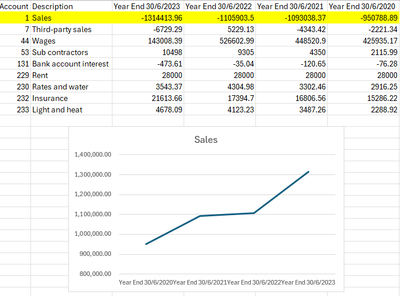
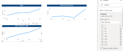
For account code '1 - Sales' the line chart would show the 4 years across the X-Axis and the values of -950788.89, -1093038.37, -1105903.50, -1314413.96 plotted on the Y-Axis.
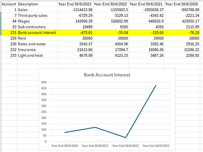
For account code 131 - Bank account interest, the line chart would show the 4 years across the X-Axis and the values of -76.28, -120.65, -35.04 and -473.61 plotted on the Y-Axis.
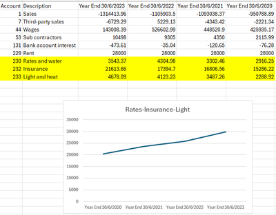
For account codes 230 - Rates and water, 232 - Insurance, and 233 Light and heat, these would need to be grouped so the total for each year would be the three yearly figures for each of the three accounts combined.
This is how each graph would look (mocked up in Excel):
Sales:
Bank Account Interest:
Rates-Insurance-Light:
- Mark as New
- Bookmark
- Subscribe
- Mute
- Subscribe to RSS Feed
- Permalink
- Report Inappropriate Content
- Mark as New
- Bookmark
- Subscribe
- Mute
- Subscribe to RSS Feed
- Permalink
- Report Inappropriate Content
In Power Query select the first two columns and then rightclick on the headers and select "unpivot other columns. This way you willl transform the table in such a way that you will get columns: Account, Description, YearEnd, ValueOfYearEnd. This way you can easily create visuals in Power BI Desktop.
Kudos and Mark as solution appreciated.
- Mark as New
- Bookmark
- Subscribe
- Mute
- Subscribe to RSS Feed
- Permalink
- Report Inappropriate Content
Helpful resources

Microsoft Fabric Learn Together
Covering the world! 9:00-10:30 AM Sydney, 4:00-5:30 PM CET (Paris/Berlin), 7:00-8:30 PM Mexico City

Power BI Monthly Update - April 2024
Check out the April 2024 Power BI update to learn about new features.

| User | Count |
|---|---|
| 105 | |
| 96 | |
| 75 | |
| 63 | |
| 62 |
| User | Count |
|---|---|
| 137 | |
| 105 | |
| 104 | |
| 80 | |
| 63 |
