- Power BI forums
- Updates
- News & Announcements
- Get Help with Power BI
- Desktop
- Service
- Report Server
- Power Query
- Mobile Apps
- Developer
- DAX Commands and Tips
- Custom Visuals Development Discussion
- Health and Life Sciences
- Power BI Spanish forums
- Translated Spanish Desktop
- Power Platform Integration - Better Together!
- Power Platform Integrations (Read-only)
- Power Platform and Dynamics 365 Integrations (Read-only)
- Training and Consulting
- Instructor Led Training
- Dashboard in a Day for Women, by Women
- Galleries
- Community Connections & How-To Videos
- COVID-19 Data Stories Gallery
- Themes Gallery
- Data Stories Gallery
- R Script Showcase
- Webinars and Video Gallery
- Quick Measures Gallery
- 2021 MSBizAppsSummit Gallery
- 2020 MSBizAppsSummit Gallery
- 2019 MSBizAppsSummit Gallery
- Events
- Ideas
- Custom Visuals Ideas
- Issues
- Issues
- Events
- Upcoming Events
- Community Blog
- Power BI Community Blog
- Custom Visuals Community Blog
- Community Support
- Community Accounts & Registration
- Using the Community
- Community Feedback
Register now to learn Fabric in free live sessions led by the best Microsoft experts. From Apr 16 to May 9, in English and Spanish.
- Power BI forums
- Forums
- Get Help with Power BI
- Desktop
- Visualization to compare two values for same perso...
- Subscribe to RSS Feed
- Mark Topic as New
- Mark Topic as Read
- Float this Topic for Current User
- Bookmark
- Subscribe
- Printer Friendly Page
- Mark as New
- Bookmark
- Subscribe
- Mute
- Subscribe to RSS Feed
- Permalink
- Report Inappropriate Content
Visualization to compare two values for same person, from same row
I have a dataset where each provider has a separate row with the following columns (plus others):
| NPI (id/key) | Total Visits | 99212 visits | 99213 visits | 99214 visits | 99215 visits | 99212 peer | 99213 peer | 99214 peer | 99215 peer |
NPI is related to a Provider lookup table with fullnames. Providers code their office visits as either 992... 12, 13, 14, or 15. I created a measure to calculate the utilization rate for the various codes, meaning of the total visits x% are 99212, y% are 99213, etc. The columns with the code number and 'peer' are peer group utilization rates, i.e. the rate at which a provider's peer group utilizes each code. Those are data in the dataset, not measures.
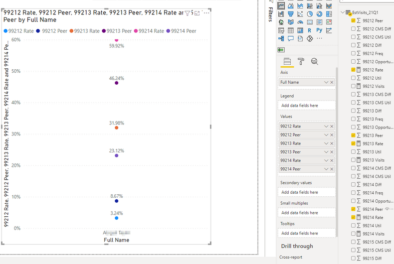
I want to set up a visualization that compares the actual utilization rate with the peer utilization rate for a given provider. Line chart in Power BI sets all the values on the y axis and the name on the x axis, so I just have a chart showing the values as dots situated above the name, like this:
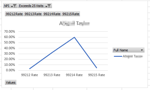
What I want is the values (code utilization rates) to appear along the x axis, something like this:
I don't need to use a line chart, I just need a way to show the provider utilization rate and peer group utilization rate for each code separately, as it were. Is there something I need to do in the data model, or another measure to create, or some other visual I should use to accomplish this?
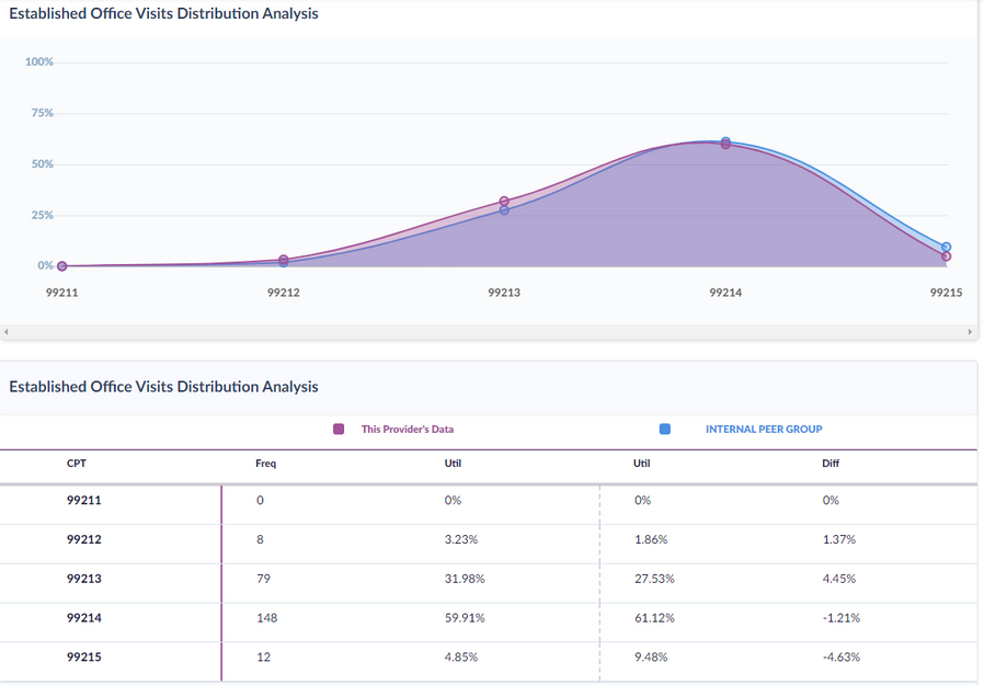
Basically, I'm looking for a way to emulate the following in Power BI:
Solved! Go to Solution.
- Mark as New
- Bookmark
- Subscribe
- Mute
- Subscribe to RSS Feed
- Permalink
- Report Inappropriate Content
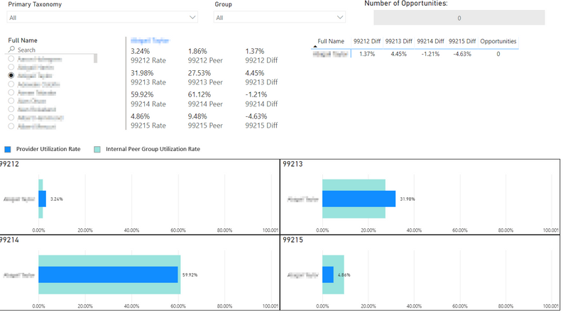
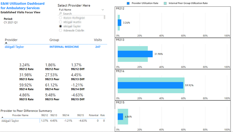
So my alternative solution was to simply create four separate visuals per provider - one for each code. I used Bullet Chart by OKVIZ. Here is the end result:
- Mark as New
- Bookmark
- Subscribe
- Mute
- Subscribe to RSS Feed
- Permalink
- Report Inappropriate Content
So my alternative solution was to simply create four separate visuals per provider - one for each code. I used Bullet Chart by OKVIZ. Here is the end result:
- Mark as New
- Bookmark
- Subscribe
- Mute
- Subscribe to RSS Feed
- Permalink
- Report Inappropriate Content
Updated version with rearranged visuals:
- Mark as New
- Bookmark
- Subscribe
- Mute
- Subscribe to RSS Feed
- Permalink
- Report Inappropriate Content
Hi @cathoms ,
Great, can you share your solution and mark it as an answer so that people with the same problem can quickly find a solution.
Best Regards
Lucien
- Mark as New
- Bookmark
- Subscribe
- Mute
- Subscribe to RSS Feed
- Permalink
- Report Inappropriate Content
I figured out an alternative using multiple visuals.
- Mark as New
- Bookmark
- Subscribe
- Mute
- Subscribe to RSS Feed
- Permalink
- Report Inappropriate Content
Hi
Could you pls share your pbix file? Remember to remove confident data.
Best Regards
Lucien
Helpful resources

Microsoft Fabric Learn Together
Covering the world! 9:00-10:30 AM Sydney, 4:00-5:30 PM CET (Paris/Berlin), 7:00-8:30 PM Mexico City

Power BI Monthly Update - April 2024
Check out the April 2024 Power BI update to learn about new features.

| User | Count |
|---|---|
| 102 | |
| 101 | |
| 78 | |
| 69 | |
| 63 |
| User | Count |
|---|---|
| 141 | |
| 106 | |
| 101 | |
| 85 | |
| 72 |
