- Power BI forums
- Updates
- News & Announcements
- Get Help with Power BI
- Desktop
- Service
- Report Server
- Power Query
- Mobile Apps
- Developer
- DAX Commands and Tips
- Custom Visuals Development Discussion
- Health and Life Sciences
- Power BI Spanish forums
- Translated Spanish Desktop
- Power Platform Integration - Better Together!
- Power Platform Integrations (Read-only)
- Power Platform and Dynamics 365 Integrations (Read-only)
- Training and Consulting
- Instructor Led Training
- Dashboard in a Day for Women, by Women
- Galleries
- Community Connections & How-To Videos
- COVID-19 Data Stories Gallery
- Themes Gallery
- Data Stories Gallery
- R Script Showcase
- Webinars and Video Gallery
- Quick Measures Gallery
- 2021 MSBizAppsSummit Gallery
- 2020 MSBizAppsSummit Gallery
- 2019 MSBizAppsSummit Gallery
- Events
- Ideas
- Custom Visuals Ideas
- Issues
- Issues
- Events
- Upcoming Events
- Community Blog
- Power BI Community Blog
- Custom Visuals Community Blog
- Community Support
- Community Accounts & Registration
- Using the Community
- Community Feedback
Earn a 50% discount on the DP-600 certification exam by completing the Fabric 30 Days to Learn It challenge.
- Power BI forums
- Forums
- Get Help with Power BI
- Desktop
- Visual to make a Linechart clearer/ filter columns
- Subscribe to RSS Feed
- Mark Topic as New
- Mark Topic as Read
- Float this Topic for Current User
- Bookmark
- Subscribe
- Printer Friendly Page
- Mark as New
- Bookmark
- Subscribe
- Mute
- Subscribe to RSS Feed
- Permalink
- Report Inappropriate Content
Visual to make a Linechart clearer/ filter columns
Hi guys,
is it possible to filter the lines in Power Bi with a visual?
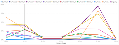
The lines in the line chart represent different locations (each line is a column). But as you can see it is very confusing, there is a visual with which I can quickly display only 2 or 3 lines. So I am looking for a more elegant solution than having to delete or add the columns one by one to the line chart.
greetings Lukas
Solved! Go to Solution.
- Mark as New
- Bookmark
- Subscribe
- Mute
- Subscribe to RSS Feed
- Permalink
- Report Inappropriate Content
Hi @Anonymous ,
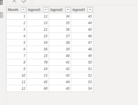
I have create a simple sample data for your reference. Here is my sample data:
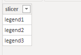
First we need to create a new table that contains all value your want to show in legend:
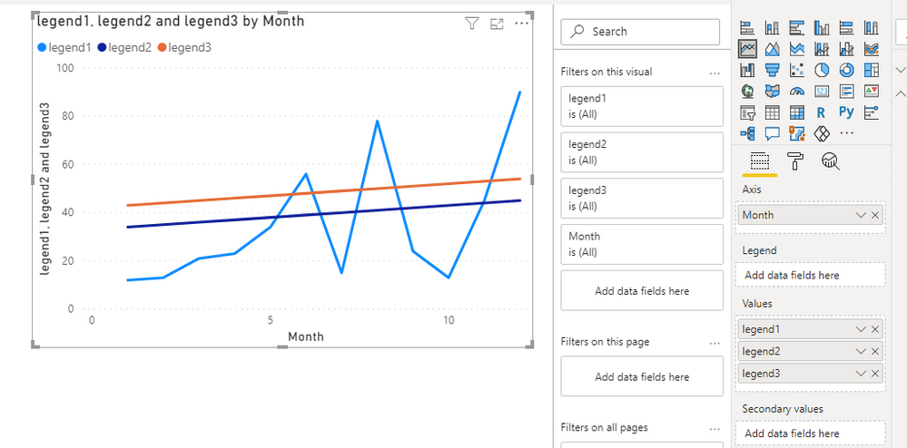
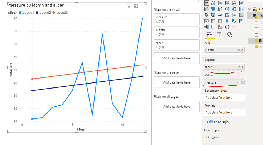
Then use the column in the new table for legend of line chart and the following measure as Value of line chart:
measure = SWITCH(SELECTEDVALUE(Slicer[slicer]),"legend1",SUM('Table'[legend1]),"legend2",SUM('Table'[legend2]),"legend3",SUM('Table'[legend3]))
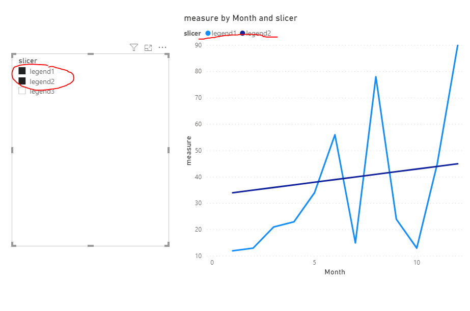
Then you can use the slicer for controlling the legends you want to show:
For more details, please refer to the pbix file: https://qiuyunus-my.sharepoint.com/:u:/g/personal/pbipro_qiuyunus_onmicrosoft_com/Eb1bSm7LP61DgMLXwhMnfiIBrLwO_3-DUZn-Y2NS241NFw?e=gZhTRd
If this post help, please consider accept it as the solution to help other member find it more quickly.
Best Regards,
Dedmon Dai
- Mark as New
- Bookmark
- Subscribe
- Mute
- Subscribe to RSS Feed
- Permalink
- Report Inappropriate Content
So the link helped a bit but with this trick I can only show one line at a time. But it would be useful if you could display several lines at the same time to compare the different values.
Thanks a lot
- Mark as New
- Bookmark
- Subscribe
- Mute
- Subscribe to RSS Feed
- Permalink
- Report Inappropriate Content
Hi @Anonymous ,
I have create a simple sample data for your reference. Here is my sample data:
First we need to create a new table that contains all value your want to show in legend:
Then use the column in the new table for legend of line chart and the following measure as Value of line chart:
measure = SWITCH(SELECTEDVALUE(Slicer[slicer]),"legend1",SUM('Table'[legend1]),"legend2",SUM('Table'[legend2]),"legend3",SUM('Table'[legend3]))
Then you can use the slicer for controlling the legends you want to show:
For more details, please refer to the pbix file: https://qiuyunus-my.sharepoint.com/:u:/g/personal/pbipro_qiuyunus_onmicrosoft_com/Eb1bSm7LP61DgMLXwhMnfiIBrLwO_3-DUZn-Y2NS241NFw?e=gZhTRd
If this post help, please consider accept it as the solution to help other member find it more quickly.
Best Regards,
Dedmon Dai
- Mark as New
- Bookmark
- Subscribe
- Mute
- Subscribe to RSS Feed
- Permalink
- Report Inappropriate Content
@Anonymous , If the line is because of legend, you can control it by a slicer .
Otherwise you have to create an independent table of all measure name and create all measures like
Projectvalue =
var _flag = countx(allselected(Measure), 'Measure'[Measure] in {"Project Value"})+0
return
if(_flag>0, sum(data[Project Value]), blank())
Forecast =
var _flag = countx(allselected(Measure), 'Measure'[Measure] in {"Forecasted Project Value"})+0
return
if(_flag>0, sum(data[Forecasted Project Value]), blank())
Also refer
measure slicer
https://radacad.com/change-the-column-or-measure-value-in-a-power-bi-visual-by-selection-of-the-slicer-parameter-table-pattern
https://community.powerbi.com/t5/Desktop/Slicer-MTD-QTD-YTD-to-filter-dates-using-the-slicer/td-p/500115
Microsoft Power BI Learning Resources, 2023 !!
Learn Power BI - Full Course with Dec-2022, with Window, Index, Offset, 100+ Topics !!
Did I answer your question? Mark my post as a solution! Appreciate your Kudos !! Proud to be a Super User! !!
