- Power BI forums
- Updates
- News & Announcements
- Get Help with Power BI
- Desktop
- Service
- Report Server
- Power Query
- Mobile Apps
- Developer
- DAX Commands and Tips
- Custom Visuals Development Discussion
- Health and Life Sciences
- Power BI Spanish forums
- Translated Spanish Desktop
- Power Platform Integration - Better Together!
- Power Platform Integrations (Read-only)
- Power Platform and Dynamics 365 Integrations (Read-only)
- Training and Consulting
- Instructor Led Training
- Dashboard in a Day for Women, by Women
- Galleries
- Community Connections & How-To Videos
- COVID-19 Data Stories Gallery
- Themes Gallery
- Data Stories Gallery
- R Script Showcase
- Webinars and Video Gallery
- Quick Measures Gallery
- 2021 MSBizAppsSummit Gallery
- 2020 MSBizAppsSummit Gallery
- 2019 MSBizAppsSummit Gallery
- Events
- Ideas
- Custom Visuals Ideas
- Issues
- Issues
- Events
- Upcoming Events
- Community Blog
- Power BI Community Blog
- Custom Visuals Community Blog
- Community Support
- Community Accounts & Registration
- Using the Community
- Community Feedback
Register now to learn Fabric in free live sessions led by the best Microsoft experts. From Apr 16 to May 9, in English and Spanish.
- Power BI forums
- Forums
- Get Help with Power BI
- Desktop
- Tables are showing, but graphs and other visualiza...
- Subscribe to RSS Feed
- Mark Topic as New
- Mark Topic as Read
- Float this Topic for Current User
- Bookmark
- Subscribe
- Printer Friendly Page
- Mark as New
- Bookmark
- Subscribe
- Mute
- Subscribe to RSS Feed
- Permalink
- Report Inappropriate Content
Tables are showing, but graphs and other visualizations are blank or looking weird
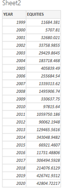
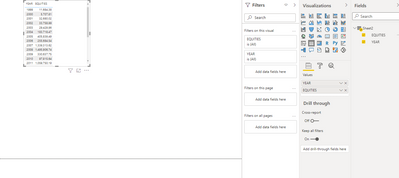
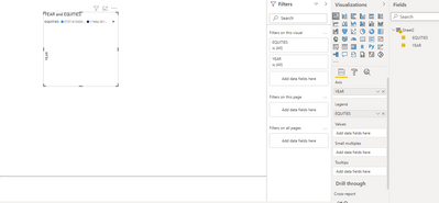
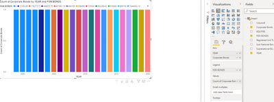
When i put a table on PowerBi, everything looks normal, but when i want to visualize the data, it turns out blank. Or if i put the columns into 'Value', it ends up looking weird.
I am just trying to compare various data across different years. Why is it so hard? Any help please?
@vanessafvg @v-jiascu-msft @v-qiuyu-msft @Hardik @amitchandak @parry2k @selimovd @jamesdales @Anonymous @v-kelly-msft @v-deddai1-msft
Solved! Go to Solution.
- Mark as New
- Bookmark
- Subscribe
- Mute
- Subscribe to RSS Feed
- Permalink
- Report Inappropriate Content
Hi @Anonymous ,
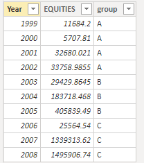
I created some data:
You have blank data above, because you put the [EQUITES] field on Legend, resulting in no data in Value.
1. Display the value (sum, count, etc.) on the Y axis and group by data on the X axis
2. Legend represents that we can use different colors and different categories to represent our bar graph
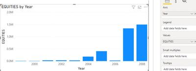
If you want to display the annual EQUITES for comparison, you can place the Year field in Axis for grouping, and place [EQUITES] in Value for value.
Legend uses different colors to distinguish categories. For example, if we place the group field in Legend, at this time, it will group according to the group field and display different colors without affecting the grouping by Year.
For more functions of the stacked column chart, you can view it in the following link:
https://www.c-sharpcorner.com/article/introduction-to-power-bi-visuals-part-2-stacked-column-chart/
https://www.tutorialgateway.org/power-bi-stacked-bar-chart/
Best Regards,
Liu Yang
If this post helps, then please consider Accept it as the solution to help the other members find it more quickly
- Mark as New
- Bookmark
- Subscribe
- Mute
- Subscribe to RSS Feed
- Permalink
- Report Inappropriate Content
Hey @Anonymous ,
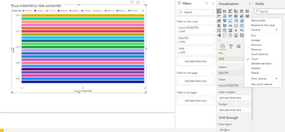
looks like the column "EQUITIES" is formatted as text and not as a number. So it just counts the amount of rows what is 1 for every year.
Change the format to decimal number and it should work.
- Mark as New
- Bookmark
- Subscribe
- Mute
- Subscribe to RSS Feed
- Permalink
- Report Inappropriate Content
If i change the format to decimal, do i have to leave the "summation" option on? Because nothing is really changing.
Helpful resources

Microsoft Fabric Learn Together
Covering the world! 9:00-10:30 AM Sydney, 4:00-5:30 PM CET (Paris/Berlin), 7:00-8:30 PM Mexico City

Power BI Monthly Update - April 2024
Check out the April 2024 Power BI update to learn about new features.

| User | Count |
|---|---|
| 105 | |
| 101 | |
| 79 | |
| 73 | |
| 65 |
| User | Count |
|---|---|
| 141 | |
| 107 | |
| 100 | |
| 82 | |
| 74 |
