- Power BI forums
- Updates
- News & Announcements
- Get Help with Power BI
- Desktop
- Service
- Report Server
- Power Query
- Mobile Apps
- Developer
- DAX Commands and Tips
- Custom Visuals Development Discussion
- Health and Life Sciences
- Power BI Spanish forums
- Translated Spanish Desktop
- Power Platform Integration - Better Together!
- Power Platform Integrations (Read-only)
- Power Platform and Dynamics 365 Integrations (Read-only)
- Training and Consulting
- Instructor Led Training
- Dashboard in a Day for Women, by Women
- Galleries
- Community Connections & How-To Videos
- COVID-19 Data Stories Gallery
- Themes Gallery
- Data Stories Gallery
- R Script Showcase
- Webinars and Video Gallery
- Quick Measures Gallery
- 2021 MSBizAppsSummit Gallery
- 2020 MSBizAppsSummit Gallery
- 2019 MSBizAppsSummit Gallery
- Events
- Ideas
- Custom Visuals Ideas
- Issues
- Issues
- Events
- Upcoming Events
- Community Blog
- Power BI Community Blog
- Custom Visuals Community Blog
- Community Support
- Community Accounts & Registration
- Using the Community
- Community Feedback
Register now to learn Fabric in free live sessions led by the best Microsoft experts. From Apr 16 to May 9, in English and Spanish.
- Power BI forums
- Forums
- Get Help with Power BI
- Desktop
- Slicer Date Interaction with Line Chart
- Subscribe to RSS Feed
- Mark Topic as New
- Mark Topic as Read
- Float this Topic for Current User
- Bookmark
- Subscribe
- Printer Friendly Page
- Mark as New
- Bookmark
- Subscribe
- Mute
- Subscribe to RSS Feed
- Permalink
- Report Inappropriate Content
Slicer Date Interaction with Line Chart
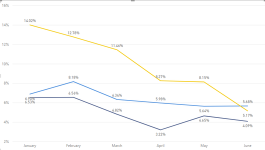
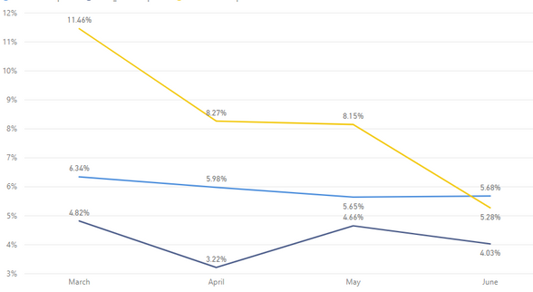
I have this line chart below, all my data is correctly presented with data from Jan 1 to today:
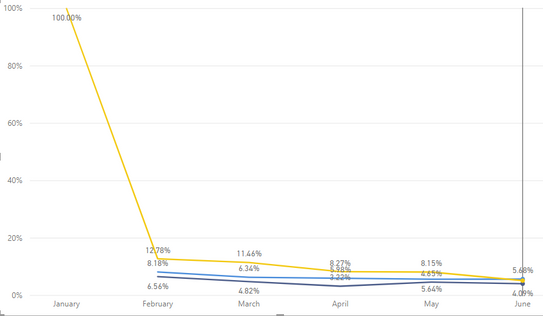
However, when I change the slicer to February 1, I get the graph below:
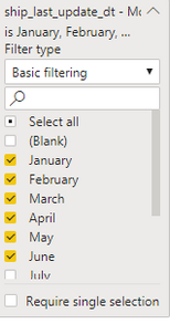
It's because of the date filter for the line chart in the picture shown below. I have January selected, so January continues to be displayed on my line graph as 100% yellow line.
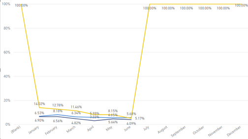
If I select all the dates, or none of the dates, I am left with:
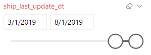
I was wondering if it would be possible to hide dates that are not selected with the slicer. The slicer is interacting with other elements on the page so it isn't really ideal or realistic to show the year to date at all times.
Solved! Go to Solution.
- Mark as New
- Bookmark
- Subscribe
- Mute
- Subscribe to RSS Feed
- Permalink
- Report Inappropriate Content
I figured it out. Thanks for pointing out it would be in the formula and not the visual filters.
The "1 - Expression" was what was throwing the months off, since the formula had no data to subtract in July, Aug, etc... the expression was resulting in 1 or 100%.
I had to create another expression for the yellow line and now the slicer seems to be affecting the line chart the way I would like it to.
- Mark as New
- Bookmark
- Subscribe
- Mute
- Subscribe to RSS Feed
- Permalink
- Report Inappropriate Content
That's not January data showing at 100%. That's Blank data, where there is no month.
You can probably fix this by setting a visual level filter with advanced filtering set so that [month] is not (Blank).
This seems likely to be caused by whatever measure you're using to determine the value of the yellow line. If you can show us that expression, we should be able to fix this without monkeying about with visual level filters.
- Mark as New
- Bookmark
- Subscribe
- Mute
- Subscribe to RSS Feed
- Permalink
- Report Inappropriate Content
It's 100% January in the middle visual, that's because I have January selected in the visual level filter, but the slicer (not shown) starts at 2/1. It's Blank in the 3rd because I set the slicer back to 1/1 and selected all months.
I agree it seems to be in that yellow line, i will see if i can post anything helpful, I'm not the best at power bi and i didn't make these measures so let me see what i can provide
- Mark as New
- Bookmark
- Subscribe
- Mute
- Subscribe to RSS Feed
- Permalink
- Report Inappropriate Content
You should be able to check the Values section of the Fields tab, to the right of the report. One of them should be the field used to create the yellow line.
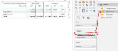
For example, to figure out how Increased or Decreased is determined, I clicked the visual, and found the corresponding calculated column.
Then at the top, it displayed the expression:
If you can share that expression, we can figure out why it gives a value of 100% when there's no data.
- Mark as New
- Bookmark
- Subscribe
- Mute
- Subscribe to RSS Feed
- Permalink
- Report Inappropriate Content
I figured it out. Thanks for pointing out it would be in the formula and not the visual filters.
The "1 - Expression" was what was throwing the months off, since the formula had no data to subtract in July, Aug, etc... the expression was resulting in 1 or 100%.
I had to create another expression for the yellow line and now the slicer seems to be affecting the line chart the way I would like it to.
- Mark as New
- Bookmark
- Subscribe
- Mute
- Subscribe to RSS Feed
- Permalink
- Report Inappropriate Content
Helpful resources

Microsoft Fabric Learn Together
Covering the world! 9:00-10:30 AM Sydney, 4:00-5:30 PM CET (Paris/Berlin), 7:00-8:30 PM Mexico City

Power BI Monthly Update - April 2024
Check out the April 2024 Power BI update to learn about new features.

| User | Count |
|---|---|
| 96 | |
| 95 | |
| 83 | |
| 70 | |
| 66 |
| User | Count |
|---|---|
| 118 | |
| 106 | |
| 93 | |
| 79 | |
| 72 |

