- Power BI forums
- Updates
- News & Announcements
- Get Help with Power BI
- Desktop
- Service
- Report Server
- Power Query
- Mobile Apps
- Developer
- DAX Commands and Tips
- Custom Visuals Development Discussion
- Health and Life Sciences
- Power BI Spanish forums
- Translated Spanish Desktop
- Power Platform Integration - Better Together!
- Power Platform Integrations (Read-only)
- Power Platform and Dynamics 365 Integrations (Read-only)
- Training and Consulting
- Instructor Led Training
- Dashboard in a Day for Women, by Women
- Galleries
- Community Connections & How-To Videos
- COVID-19 Data Stories Gallery
- Themes Gallery
- Data Stories Gallery
- R Script Showcase
- Webinars and Video Gallery
- Quick Measures Gallery
- 2021 MSBizAppsSummit Gallery
- 2020 MSBizAppsSummit Gallery
- 2019 MSBizAppsSummit Gallery
- Events
- Ideas
- Custom Visuals Ideas
- Issues
- Issues
- Events
- Upcoming Events
- Community Blog
- Power BI Community Blog
- Custom Visuals Community Blog
- Community Support
- Community Accounts & Registration
- Using the Community
- Community Feedback
Register now to learn Fabric in free live sessions led by the best Microsoft experts. From Apr 16 to May 9, in English and Spanish.
- Power BI forums
- Forums
- Get Help with Power BI
- Desktop
- Showing all data in line chart without scroll bar
- Subscribe to RSS Feed
- Mark Topic as New
- Mark Topic as Read
- Float this Topic for Current User
- Bookmark
- Subscribe
- Printer Friendly Page
- Mark as New
- Bookmark
- Subscribe
- Mute
- Subscribe to RSS Feed
- Permalink
- Report Inappropriate Content
Showing all data in line chart without scroll bar
Hi Power BI community,
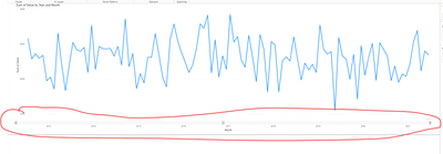
I'd like to present line chart of movement over the past 10 years for year-month granurality. However, horizontal space is not enough and horizontal scroll bar appears even though it is unwanted. I don't need to see all the year month (could be every other year-month), and I'd like to get rid of the horizontal scroll bar. Please could anyone let me know how I can modify the visual to show the whole picture without an awkward horizontal scroll bar?
Thanks for your help.
- Mark as New
- Bookmark
- Subscribe
- Mute
- Subscribe to RSS Feed
- Permalink
- Report Inappropriate Content
Hi @DataNinja777
There is no option to change the proportions of the charts and pixels that they need except for the minimum category which you can only modify to larger, not to smaller.
The steps that you can apply as alternatives :
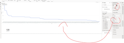
1. Use a continuous axis instead of a categorical"
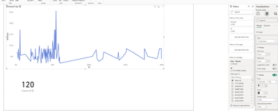
2. Resize the canvas width to the pixels that you need for all 120 points of 10 years:
If this post helps, then please consider Accepting it as the solution to help the other
members find it more quickly
- Mark as New
- Bookmark
- Subscribe
- Mute
- Subscribe to RSS Feed
- Permalink
- Report Inappropriate Content
Thank you @Ritaf1983 for the instruction.
By tinkering with canvas section, I managed to get rid of the scroll bar by widening the horizontal length.
In my line chart visual, the selections do not seem to be same as your 1st screen print, and I couldn't see the "continuous axis".
My remaining issue is that
I'd like to get the mmm-yyyy granurality line chart while only showing the year label as showing all mmm-yyyy will be too clattered looking.
Thank a lot for your help!
- Mark as New
- Bookmark
- Subscribe
- Mute
- Subscribe to RSS Feed
- Permalink
- Report Inappropriate Content
Hi @DataNinja777
Unfortunately, we can't show on /off or have different formats for hierarchy levels for the graph axes.
So there is no option ti "hide the labels".
2 alternatives ( as usual 🙂 )
1. Instead of using the automatic hierarchy, use the year column and month column, it less pixels so it will look much better :
2. you can hide it in a White shape...but if the user needs to drill up / down it can be a problem:
Result :
The pbix with both options is attached.
If this post helps, then please consider Accepting it as the solution to help the other
members find it more quickly
Helpful resources

Microsoft Fabric Learn Together
Covering the world! 9:00-10:30 AM Sydney, 4:00-5:30 PM CET (Paris/Berlin), 7:00-8:30 PM Mexico City

Power BI Monthly Update - April 2024
Check out the April 2024 Power BI update to learn about new features.

| User | Count |
|---|---|
| 114 | |
| 105 | |
| 78 | |
| 68 | |
| 63 |
| User | Count |
|---|---|
| 148 | |
| 107 | |
| 106 | |
| 83 | |
| 70 |


