- Power BI forums
- Updates
- News & Announcements
- Get Help with Power BI
- Desktop
- Service
- Report Server
- Power Query
- Mobile Apps
- Developer
- DAX Commands and Tips
- Custom Visuals Development Discussion
- Health and Life Sciences
- Power BI Spanish forums
- Translated Spanish Desktop
- Power Platform Integration - Better Together!
- Power Platform Integrations (Read-only)
- Power Platform and Dynamics 365 Integrations (Read-only)
- Training and Consulting
- Instructor Led Training
- Dashboard in a Day for Women, by Women
- Galleries
- Community Connections & How-To Videos
- COVID-19 Data Stories Gallery
- Themes Gallery
- Data Stories Gallery
- R Script Showcase
- Webinars and Video Gallery
- Quick Measures Gallery
- 2021 MSBizAppsSummit Gallery
- 2020 MSBizAppsSummit Gallery
- 2019 MSBizAppsSummit Gallery
- Events
- Ideas
- Custom Visuals Ideas
- Issues
- Issues
- Events
- Upcoming Events
- Community Blog
- Power BI Community Blog
- Custom Visuals Community Blog
- Community Support
- Community Accounts & Registration
- Using the Community
- Community Feedback
Register now to learn Fabric in free live sessions led by the best Microsoft experts. From Apr 16 to May 9, in English and Spanish.
- Power BI forums
- Forums
- Get Help with Power BI
- Desktop
- Show values only for a single day
- Subscribe to RSS Feed
- Mark Topic as New
- Mark Topic as Read
- Float this Topic for Current User
- Bookmark
- Subscribe
- Printer Friendly Page
- Mark as New
- Bookmark
- Subscribe
- Mute
- Subscribe to RSS Feed
- Permalink
- Report Inappropriate Content
Show values only for a single day
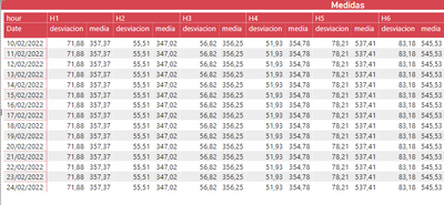
Good morning, in the attached table I am calculating the mean and deviation for the date range shown and per hour. My goal is to display those two values for each hour only for the last day of the range so that I don't see duplicate values for every day.
Solved! Go to Solution.
- Mark as New
- Bookmark
- Subscribe
- Mute
- Subscribe to RSS Feed
- Permalink
- Report Inappropriate Content
Hi @Syndicate_Admin ,
Please try below steps:
1. create some measures with below dax formula
Measure = MAXX('Table',[Date])Hour1 =
VAR cur_date = [Measure]
VAR tmp =
FILTER ( ALL ( 'Table' ), 'Table'[Date] <= cur_date )
RETURN
AVERAGEX ( tmp, [H1] )
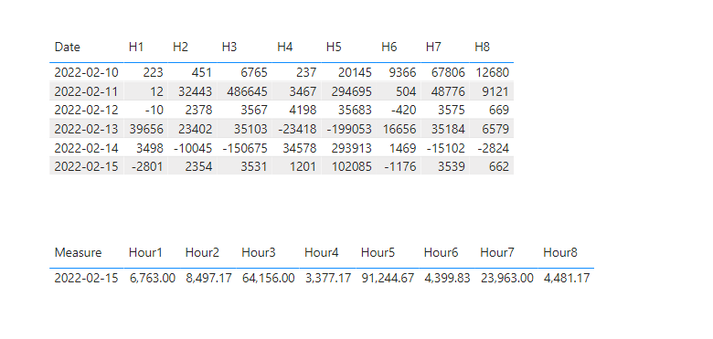
There are 8 measures that named "Hour 1-8", they are very likely.
2. add the measure to the table visual
Please refer the attached .pbix file.
Best regards,
Community Support Team_ Binbin Yu
If this post helps, then please consider Accept it as the solution to help the other members find it more quickly.
- Mark as New
- Bookmark
- Subscribe
- Mute
- Subscribe to RSS Feed
- Permalink
- Report Inappropriate Content
Hi @Syndicate_Admin ,
Please set the filter in the "Filter Pane" for the table visual according to your needs.
Best regards,
Community Support Team_ Binbin Yu
If this post helps, then please consider Accept it as the solution to help the other members find it more quickly.
- Mark as New
- Bookmark
- Subscribe
- Mute
- Subscribe to RSS Feed
- Permalink
- Report Inappropriate Content
Hello, maybe I did not express myself well. My goal is to calculate the average spread for the date range shown in the table and per hour. Now, with the formula I have it shows me the same value for every day and if I do what you put me before, in the average I see the same value as the spread.
Attached photo of the formula and table.
Thanks a lot.
- Mark as New
- Bookmark
- Subscribe
- Mute
- Subscribe to RSS Feed
- Permalink
- Report Inappropriate Content
Hi @Syndicate_Admin ,
Please provide the desensitized example data, the calculate logic and a screenshot of your desired results.
Thanks for your efforts & time in advance.
Best regards,
Community Support Team_ Binbin Yu
- Mark as New
- Bookmark
- Subscribe
- Mute
- Subscribe to RSS Feed
- Permalink
- Report Inappropriate Content
I have created in excel a reduced version of what I have in the report, I hope this helps you to understand the calculations. My goal is to find the table in yellow, that is, to show the average per hour for the date range.
Thanks a lot.
- Mark as New
- Bookmark
- Subscribe
- Mute
- Subscribe to RSS Feed
- Permalink
- Report Inappropriate Content
Hi @Syndicate_Admin ,
Please try below steps:
1. create some measures with below dax formula
Measure = MAXX('Table',[Date])Hour1 =
VAR cur_date = [Measure]
VAR tmp =
FILTER ( ALL ( 'Table' ), 'Table'[Date] <= cur_date )
RETURN
AVERAGEX ( tmp, [H1] )
There are 8 measures that named "Hour 1-8", they are very likely.
2. add the measure to the table visual
Please refer the attached .pbix file.
Best regards,
Community Support Team_ Binbin Yu
If this post helps, then please consider Accept it as the solution to help the other members find it more quickly.
Helpful resources

Microsoft Fabric Learn Together
Covering the world! 9:00-10:30 AM Sydney, 4:00-5:30 PM CET (Paris/Berlin), 7:00-8:30 PM Mexico City

Power BI Monthly Update - April 2024
Check out the April 2024 Power BI update to learn about new features.

| User | Count |
|---|---|
| 104 | |
| 96 | |
| 79 | |
| 65 | |
| 62 |
| User | Count |
|---|---|
| 147 | |
| 116 | |
| 104 | |
| 88 | |
| 65 |


